

Termoli - Project Brief
00
Termoli
The brief was to redesign ApiNic’s existing identity, creating a more contemporary and cohesive brand system while preserving its connection to traditional Romanian apiculture.
The new identity needed to improve consistency across packaging and communication, support a growing range of products, and establish a stronger foundation for the brand’s future development.
Termoli is a coastal city shaped by the meeting of history, architecture and the Adriatic Sea.
The project proposes a contemporary identity rooted in these characteristics, creating a visual language capable of representing the city across tourism, culture and public communication.
Type
Brand identity
Place branding
Context
Terraviva
Branding Contest
Year
2025
Location
Termoli Italy
Role
Independent
Designer
Industry
Tourism
Culture
Entire project independently conceived, designed and producted.
Brand Strategy - Visual Identity - Packaging -Editorial Design - Motion Design - 3D Visualisation
Brand Strategy - Visual Identity - Place Branding - Symbol System - Motion Design - Wayfinding
I. Introduction
Termoli - Terraviva Contest
01
Terraviva Contest :
Rebranding Of Termoli
The Termoli project was developed in response to a rebranding competition by TerraViva, challenging designers to rethink the visual identity of the Italian coastal city.
The project called for an identity capable of representing Termoli's cultural heritage and territory while creating a contemporary system for communicating the city to residents and visitors.
The full brief of the contest https://www.terravivacompetitions.com/wp-content/uploads/Rebranding-Termoli_ENG.pdf
Termoli - About Termoli Town
02
Between Land
And Sea
Termoli is a historic coastal city on Italy's Adriatic coast, defined by the relationship between its medieval borgo, maritime landscape and contemporary urban life.
Termoli - Cultural Research
03
Reading
The Town
Research focused on the elements that give Termoli its distinctive character: its medieval architecture, coastal geography, cultural landmarks and relationship with the Adriatic.
These references became a visual archive from which the identity could be constructed. Rather than treating Termoli’s characteristics as decoration, the identity uses them as the foundation of its visual language.
II. The Identity
Termoli - Symbol Motion
04
Termoli - Town’s Motto
05
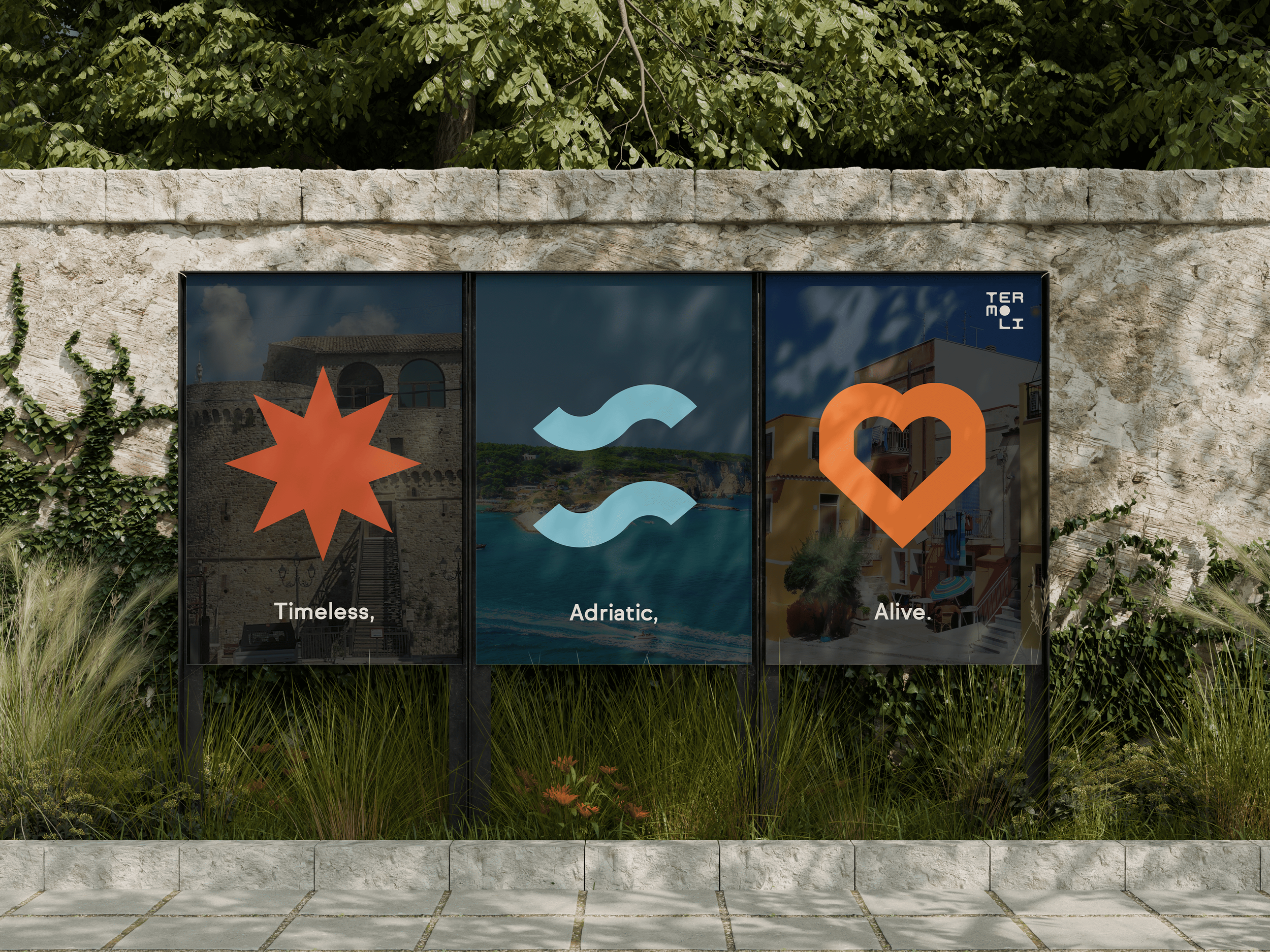
Adriatic
Inspired by the sea, the coastline and the maritime culture that shapes the city's identity.
Timeless
A reflection of Termoli's architectural heritage, historical landmarks and enduring character.
Alive
Celebrating the people, traditions and contemporary energy that bring Termoli to life.
Termoli - Logo Inspiration
06
From History
to Identity
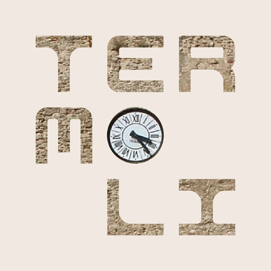
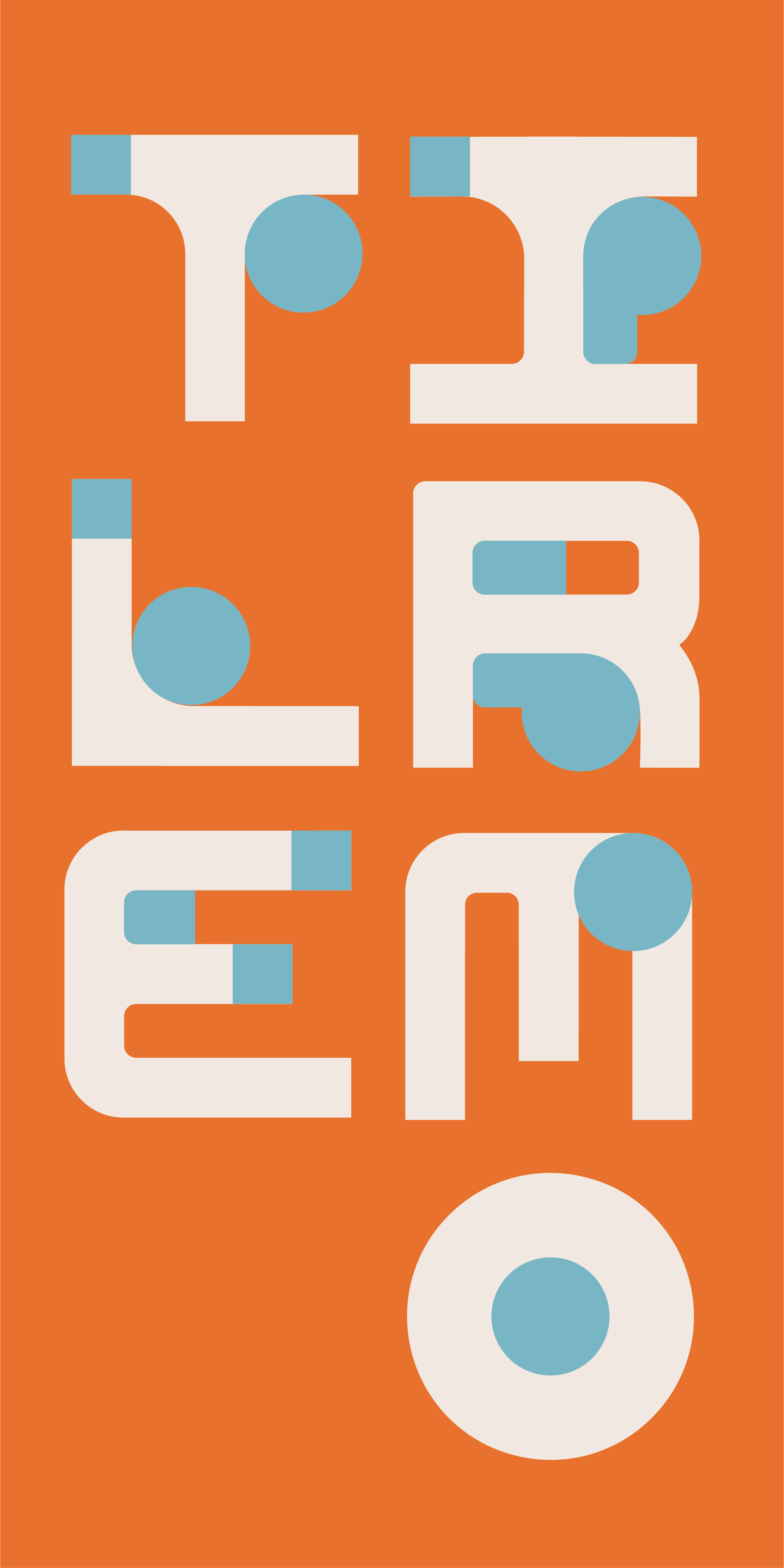
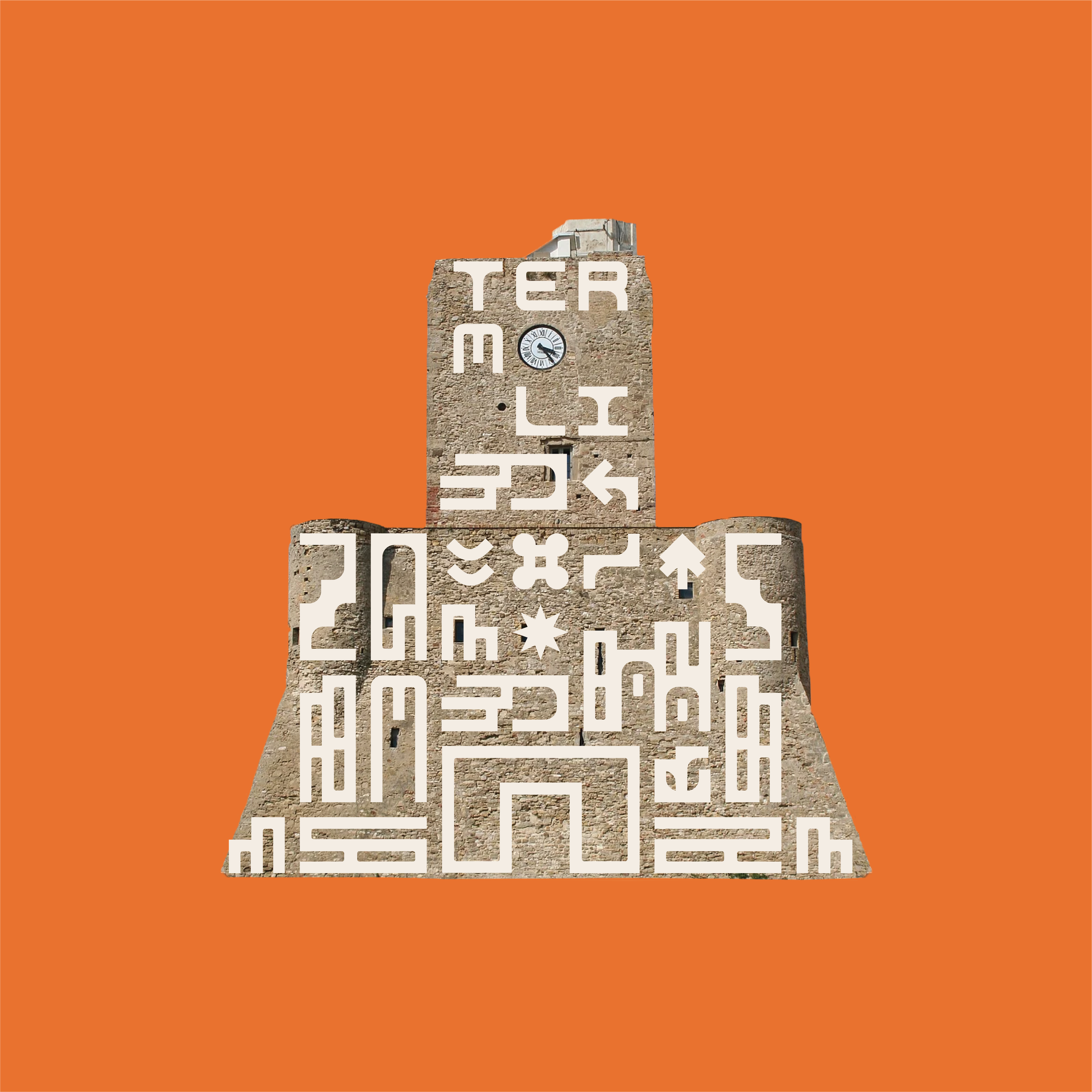
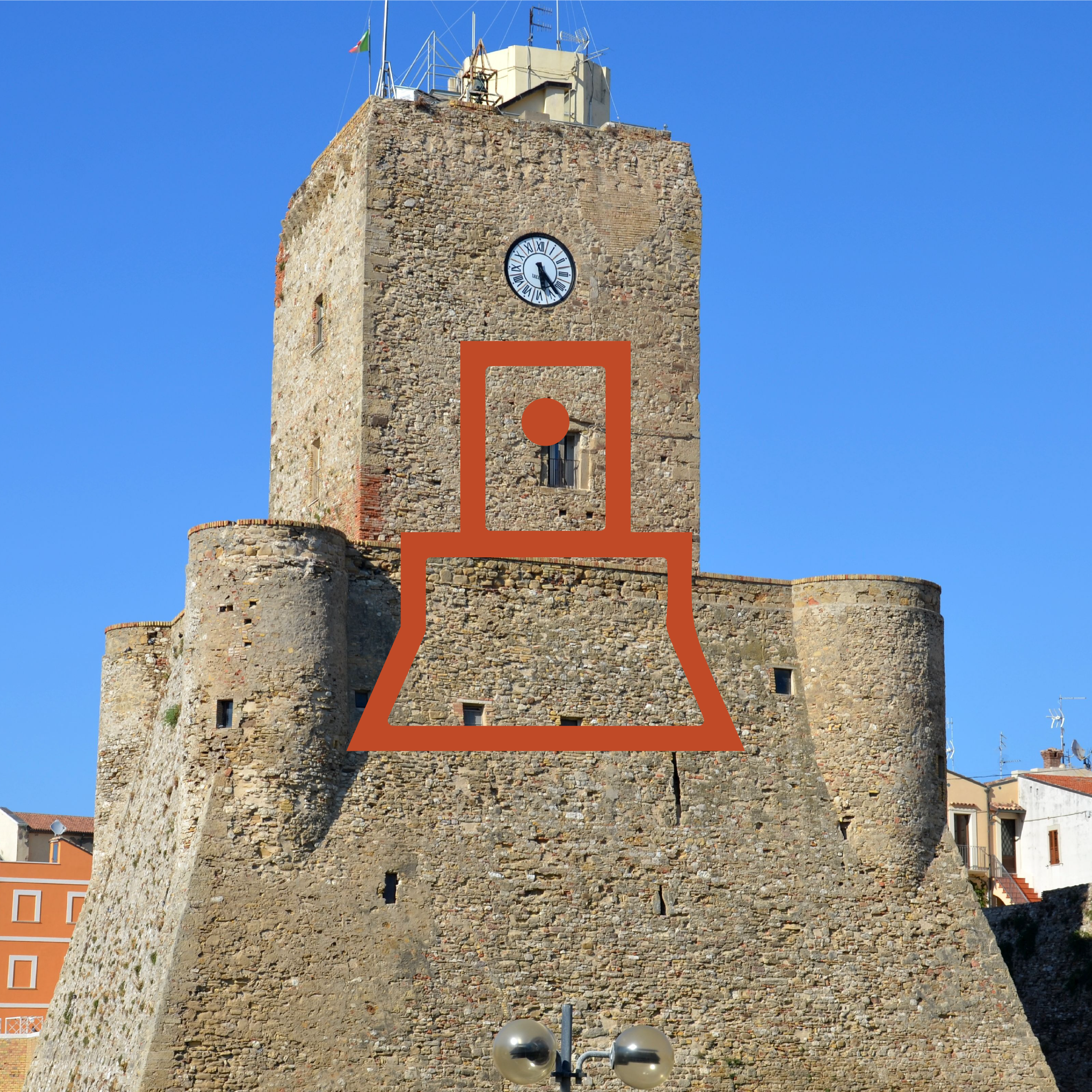
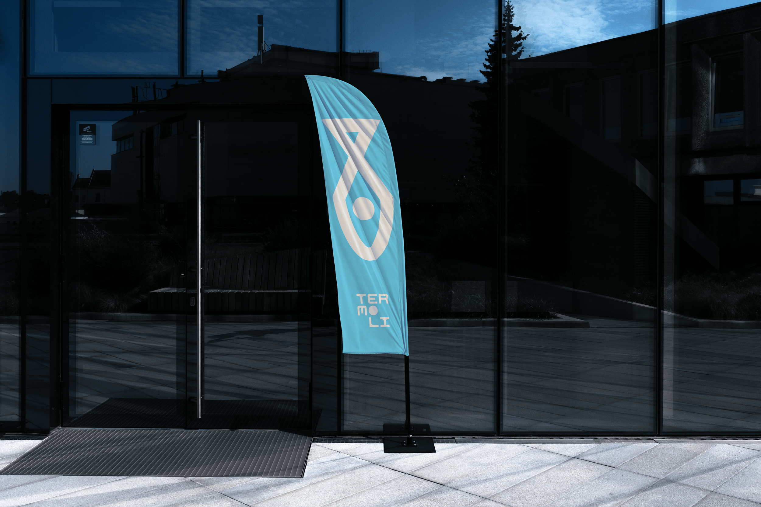
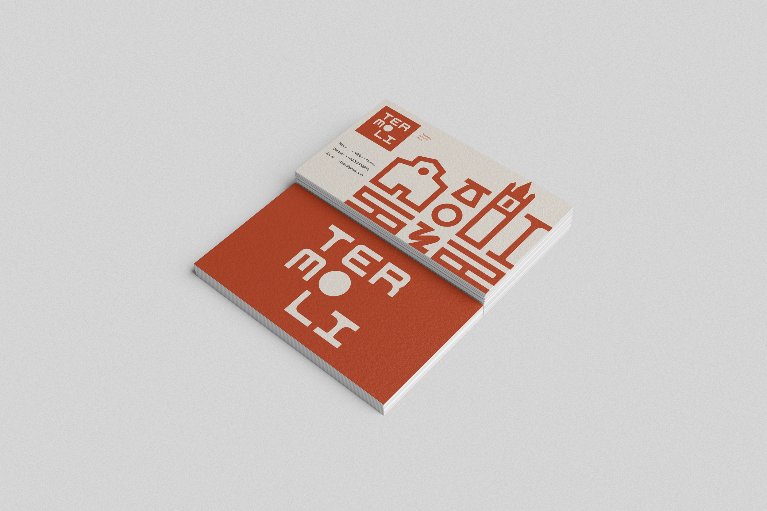
At the heart of the visual identity is a typographic system inspired by Termoli's architectural character, particularly the clock of Castello Svevo.
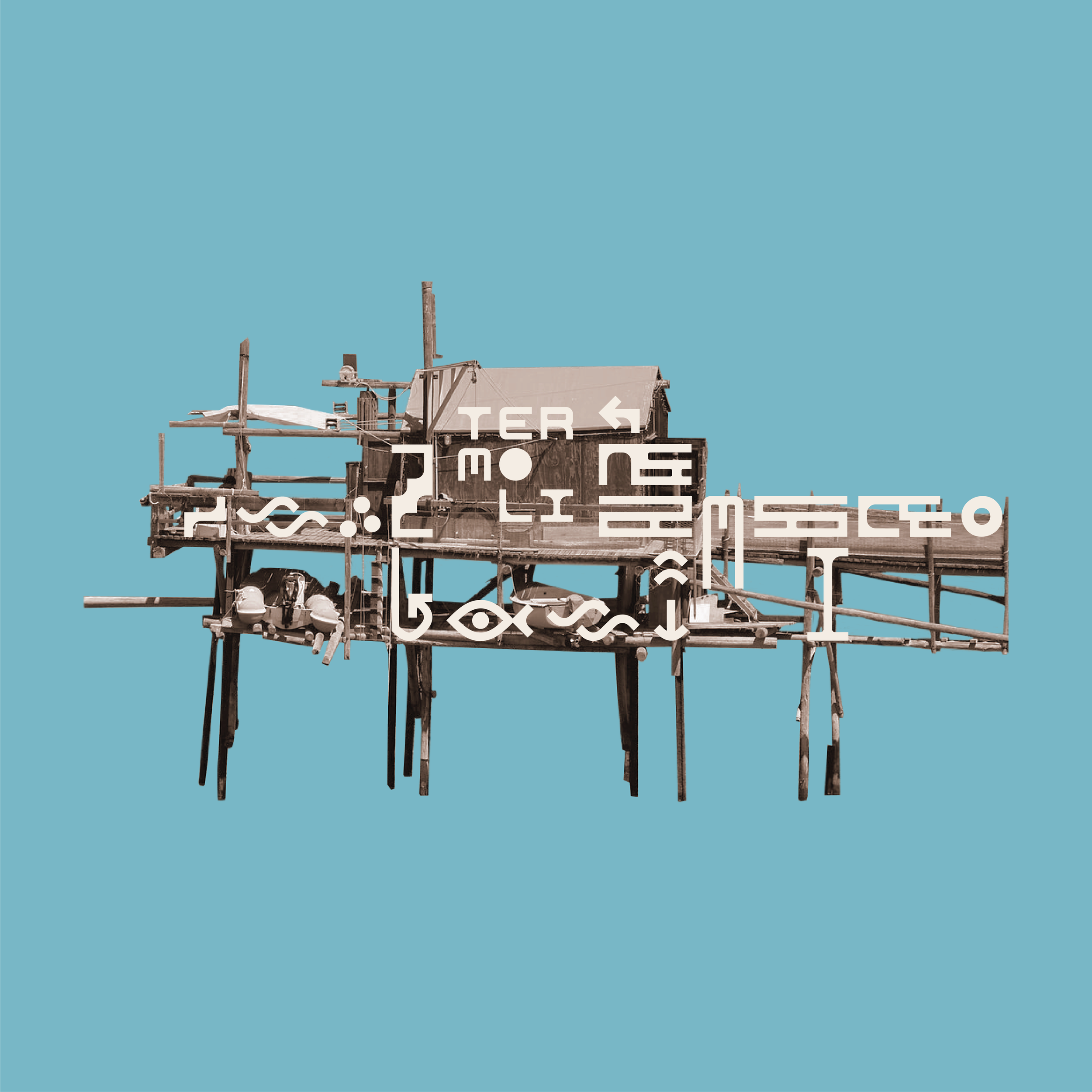
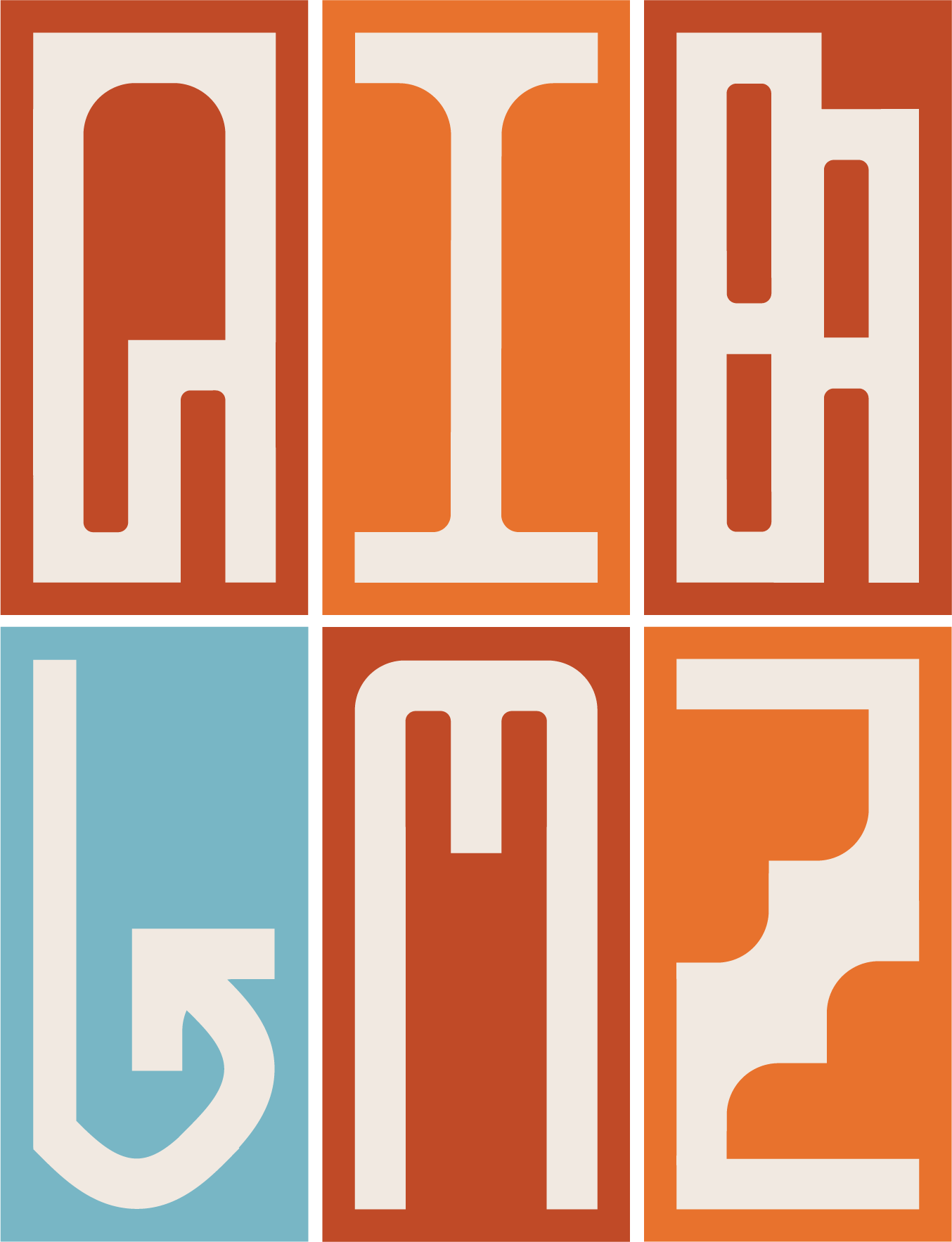
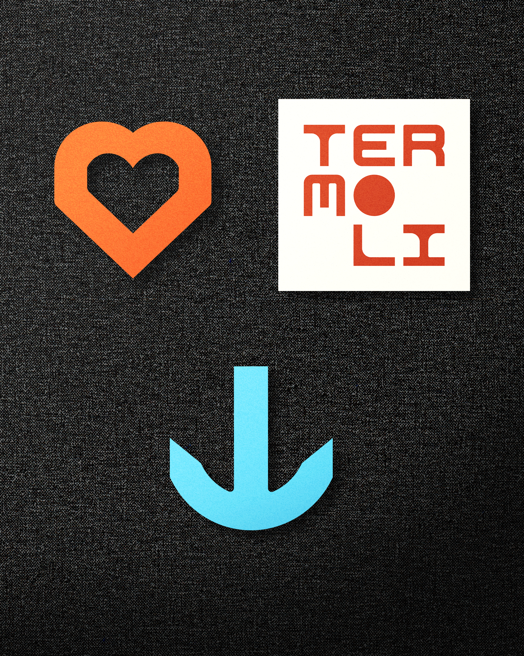
The city name becomes a distinctive geometric composition, divided into three elements: TER / MO / LI.
Architecture
Inspired Design
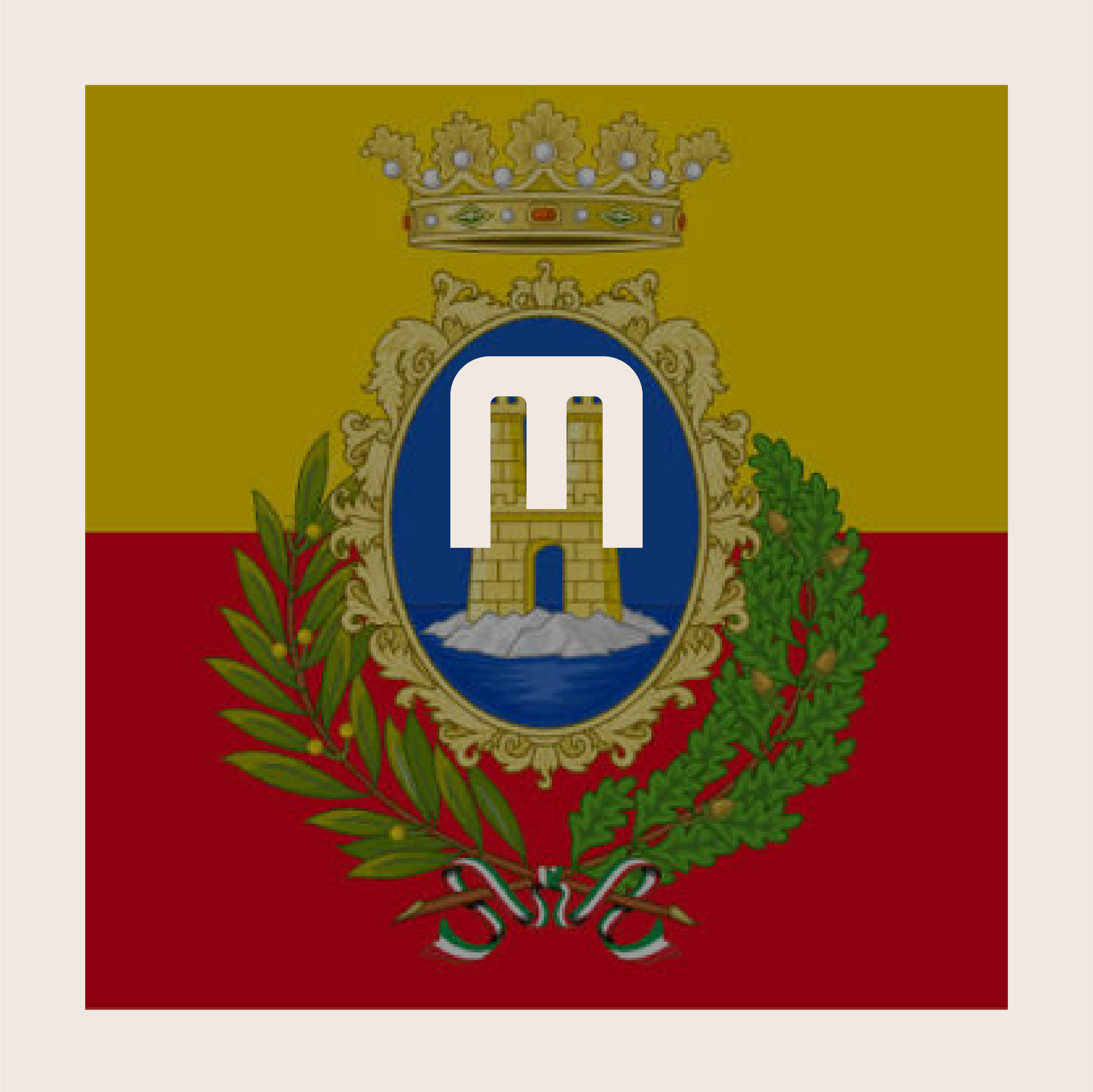
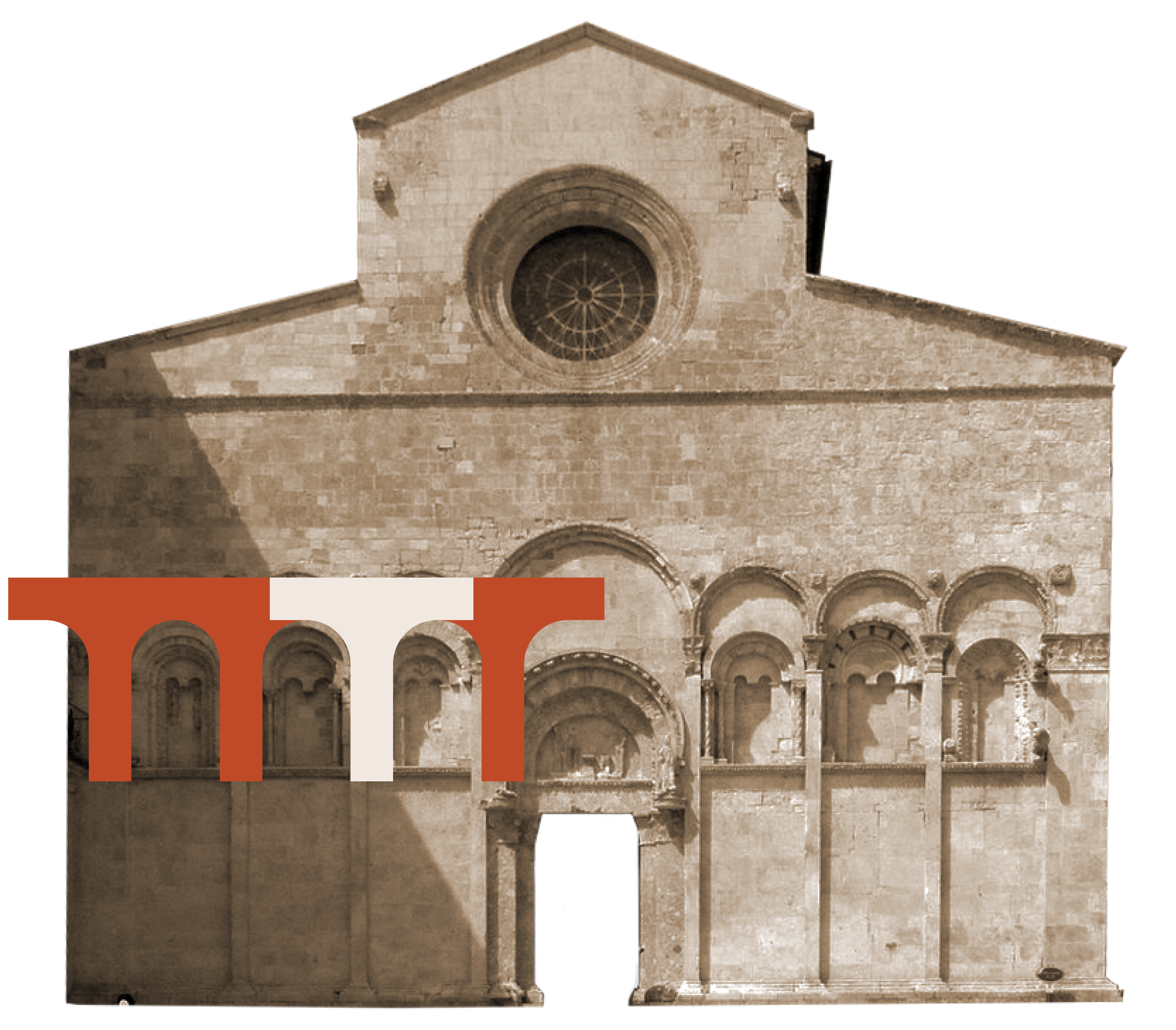
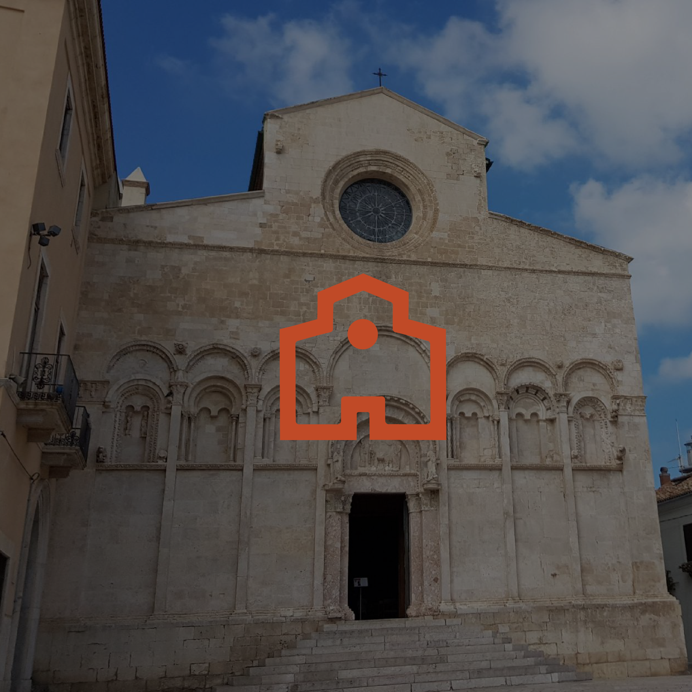
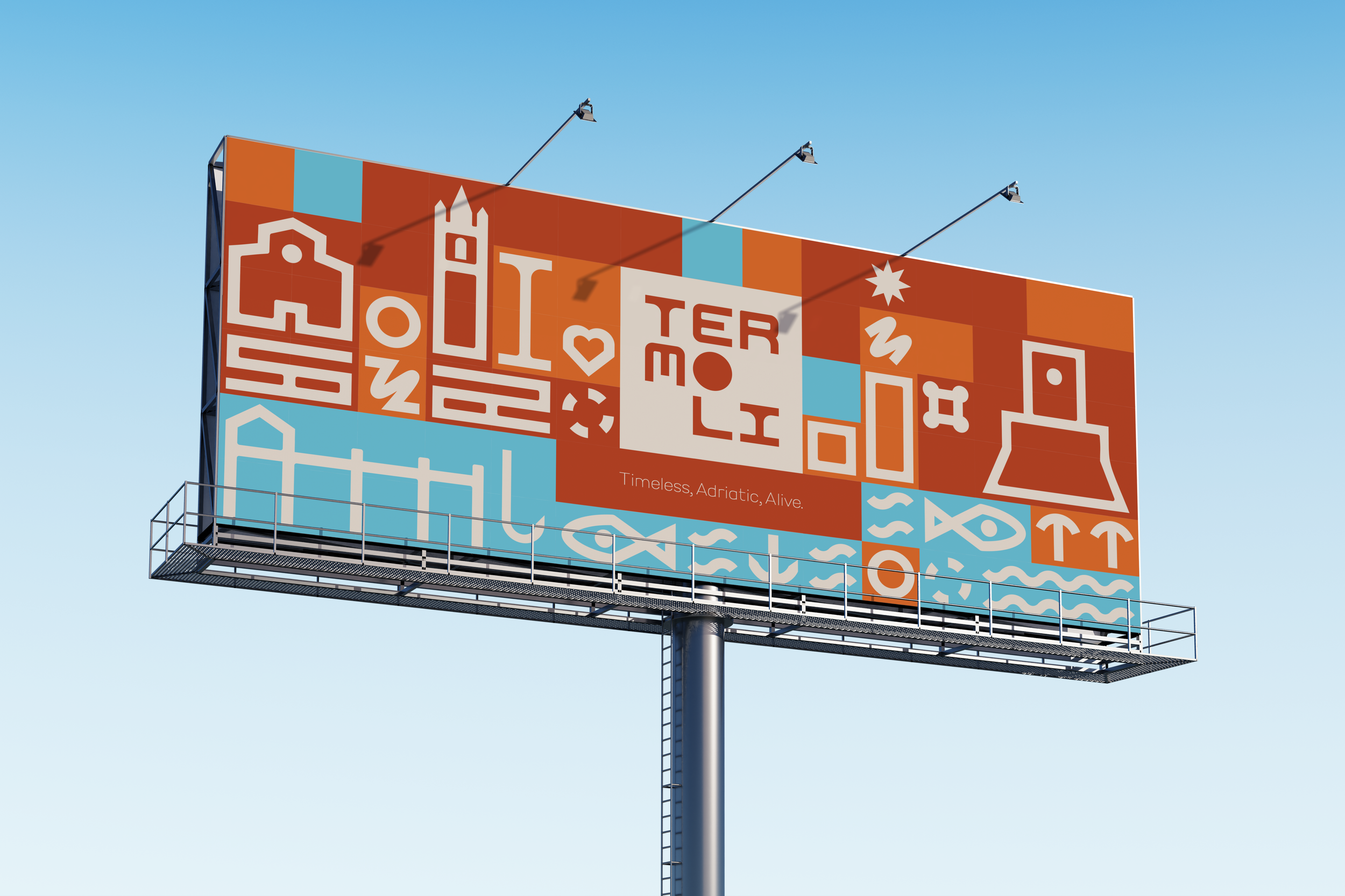
Inspired by Castello Svevo’s clock, the Cathedral of Santa Maria’s arches, and Termoli’s coat of arms, the logo transforms the city’s heritage into a distinctive geometric identity.
Termoli - Logo Construction
07
A Unified
Construction System
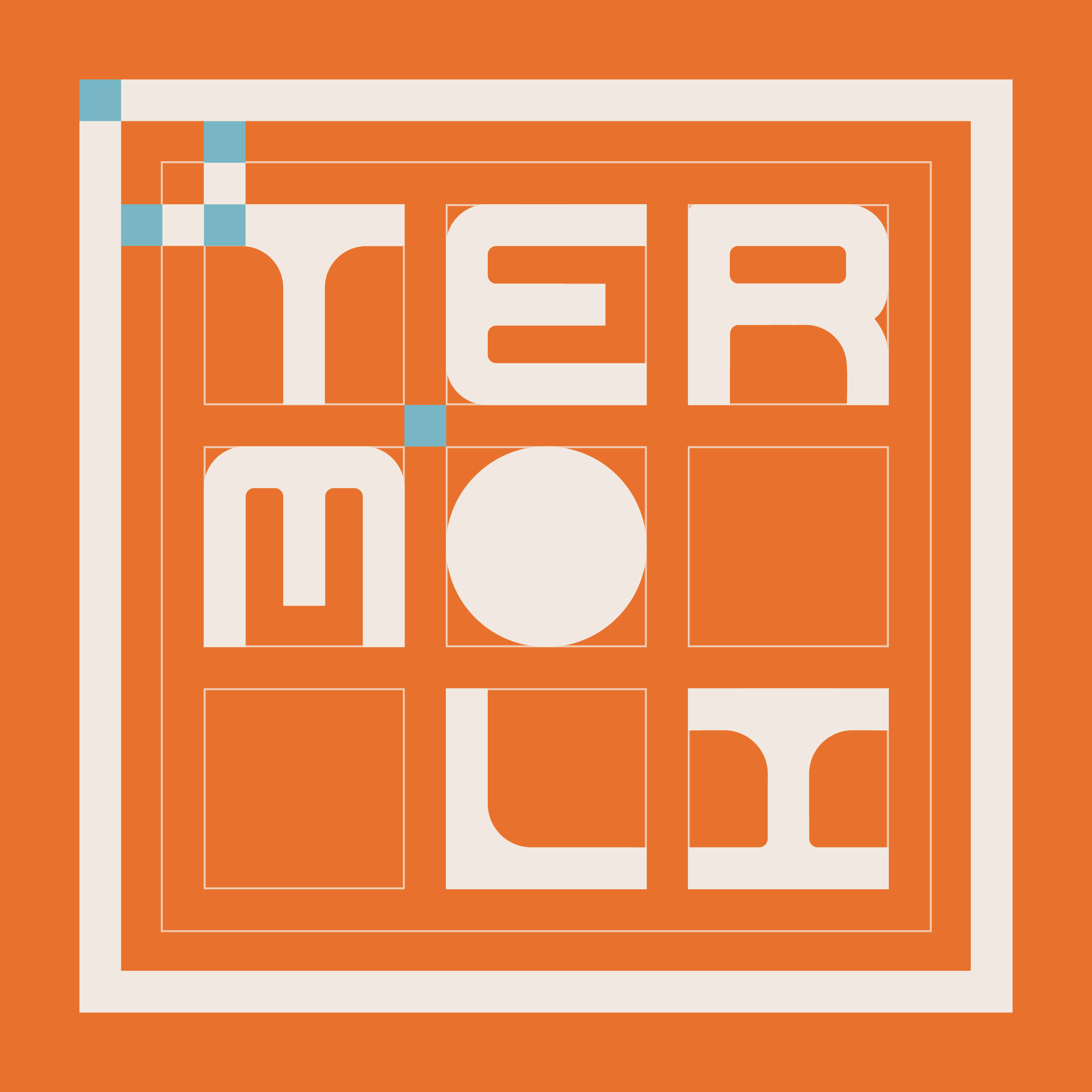
Every letterform and symbol follows the same rules of geometry, spacing, proportions, and stroke thickness.
This modular approach ensures visual consistency while allowing the symbolic alphabet to expand with new elements in the future.


Termoli - Color Palette
08
Color & Movement
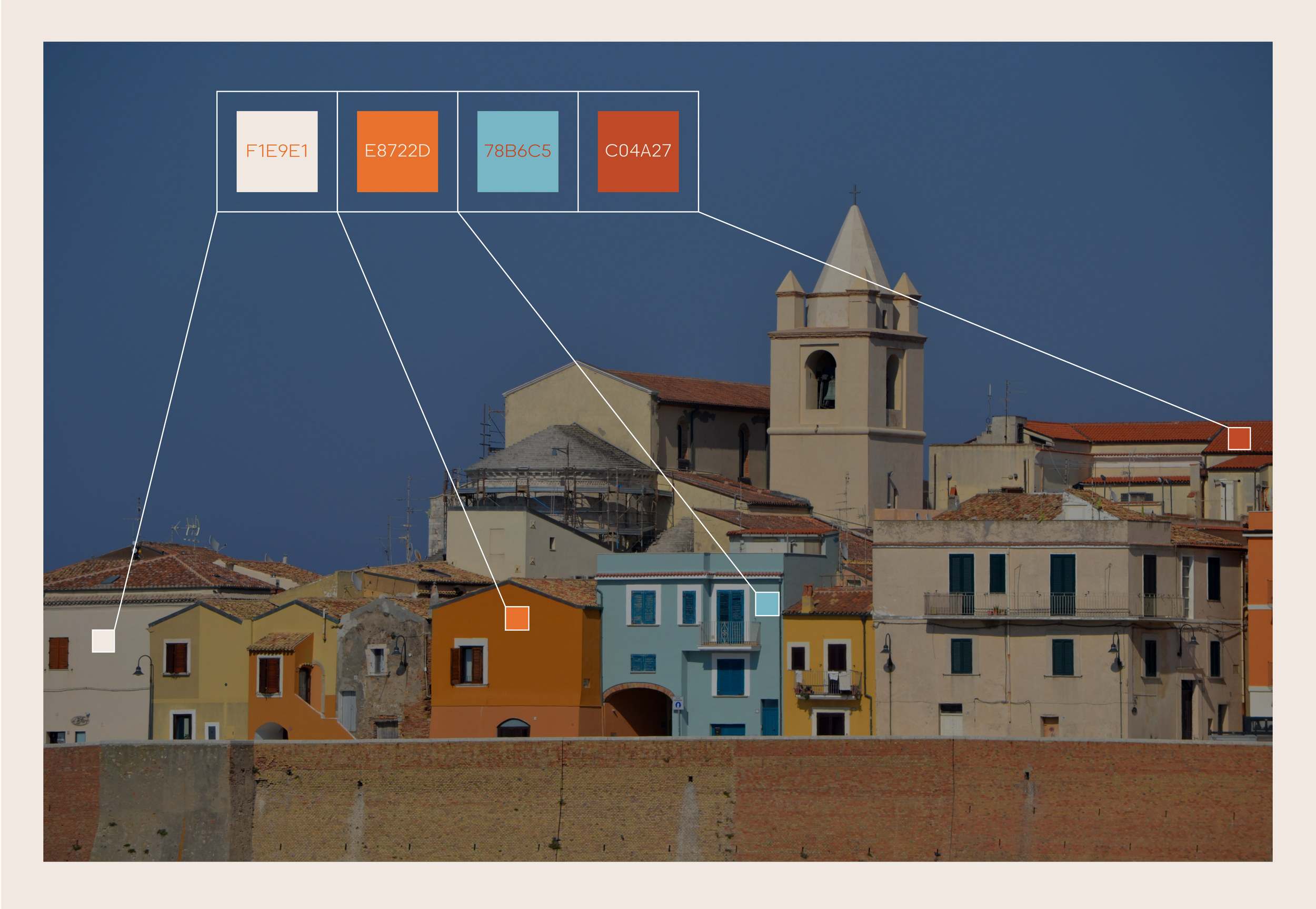
Inspired by the colourful façades of Termoli’s historic buildings, the palette reflects the city's architectural character.
Each colour also symbolically represents a defining aspect of Termoli, connecting the visual identity to the city itself.
III. Symbol System
Termoli - About The Symbols
09

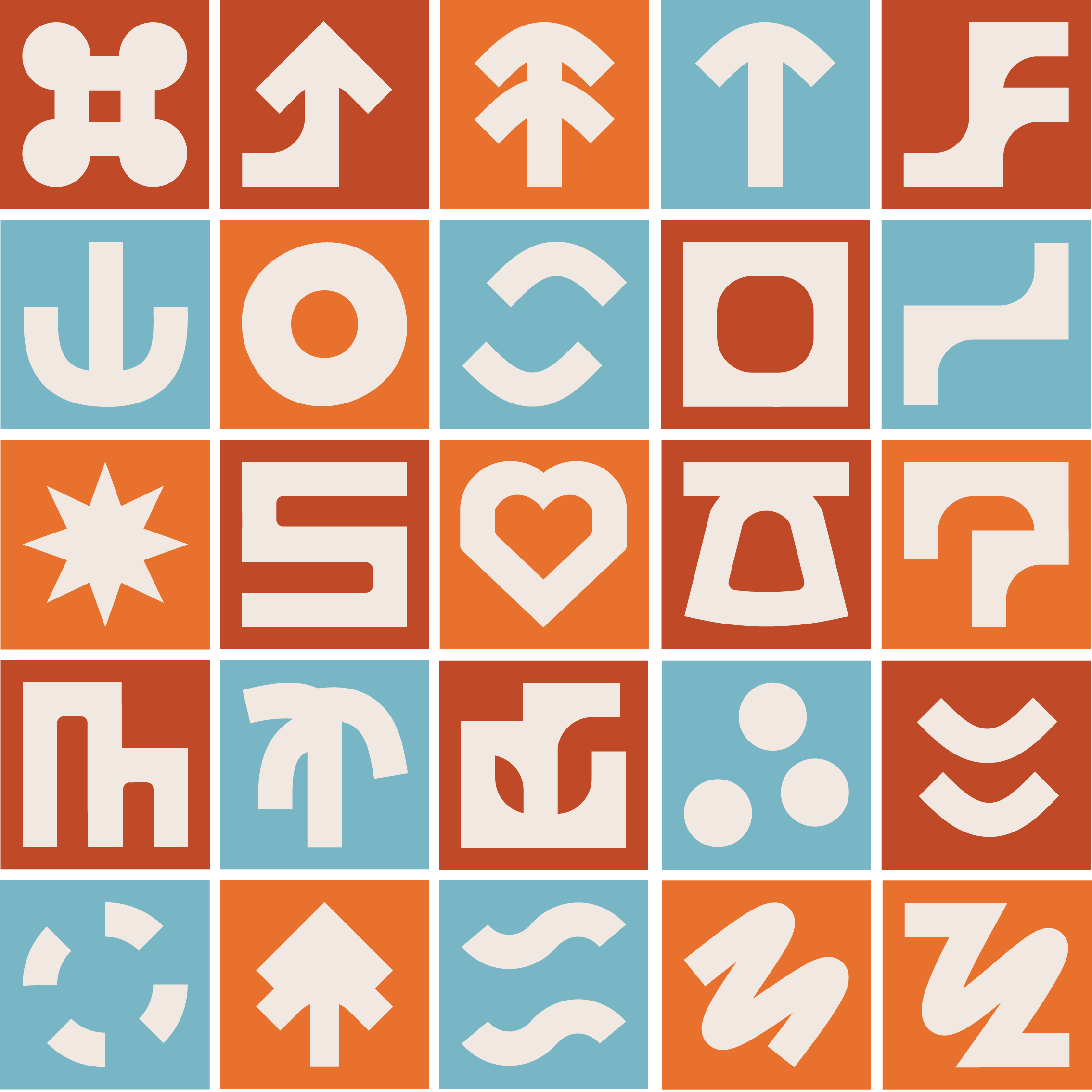
A Language of Symbols
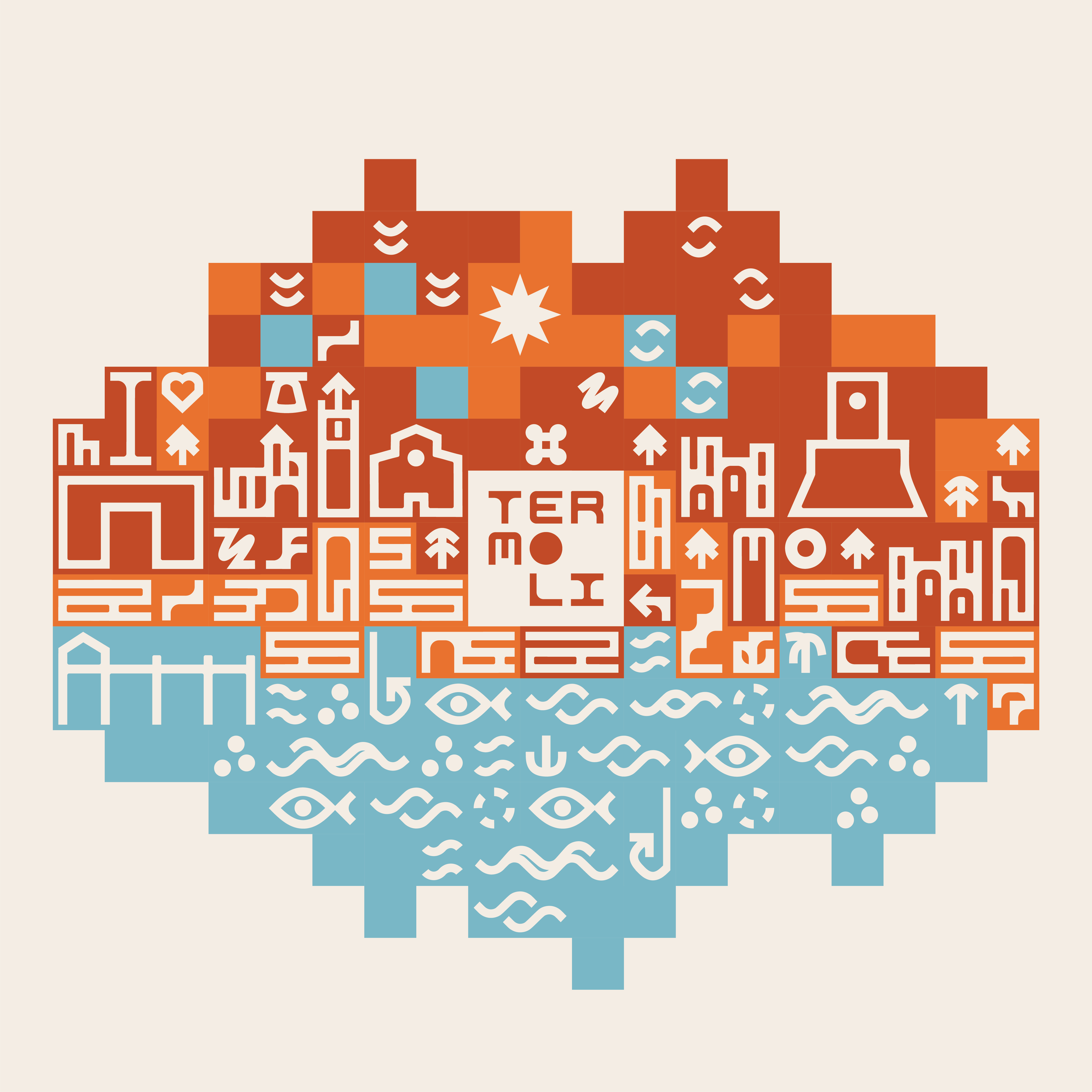
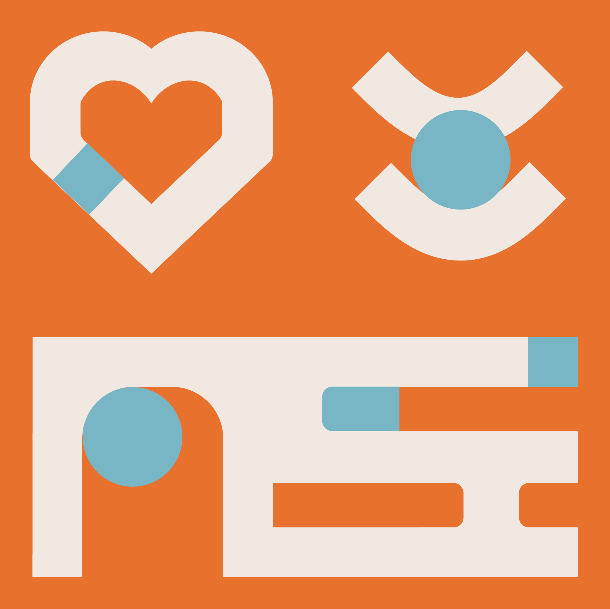
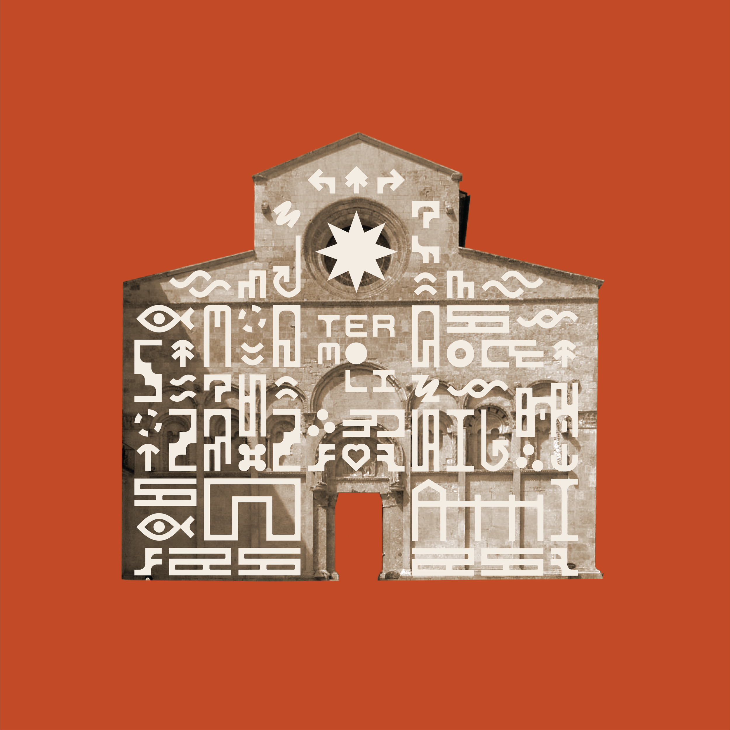
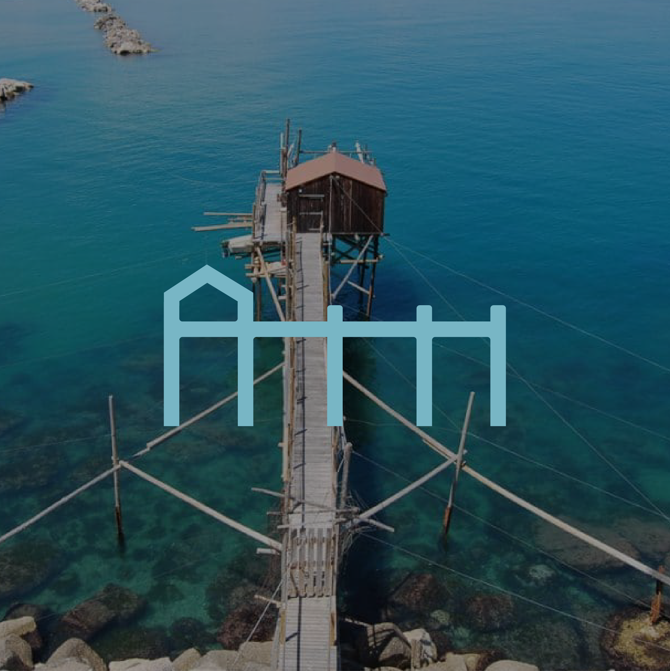
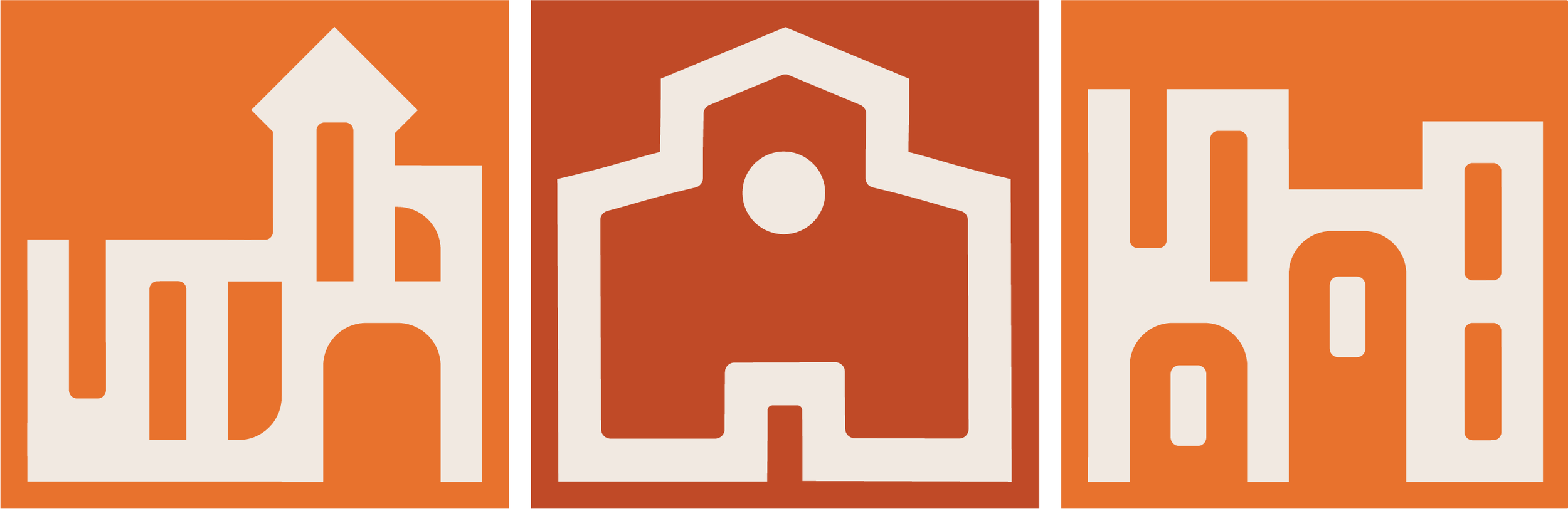
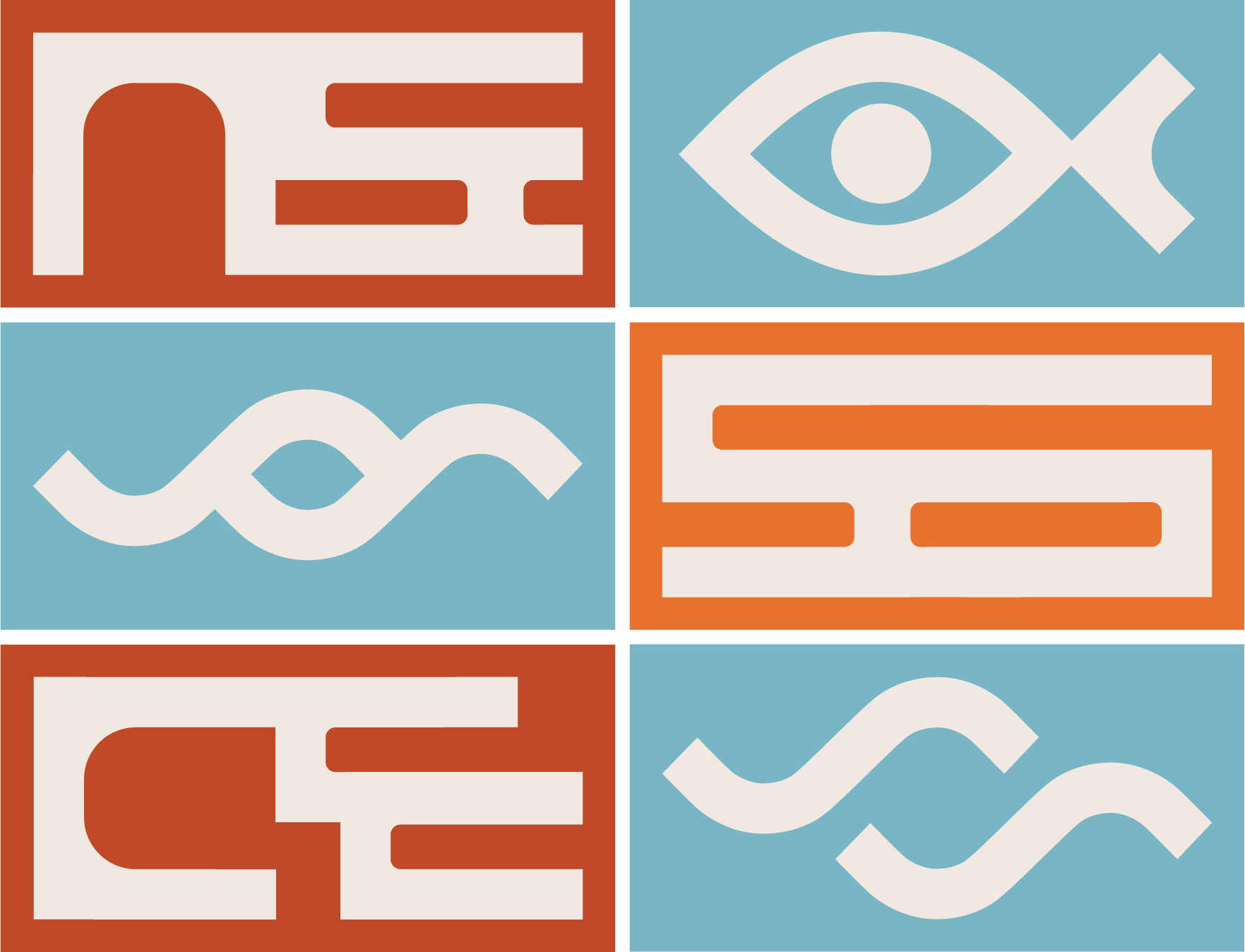
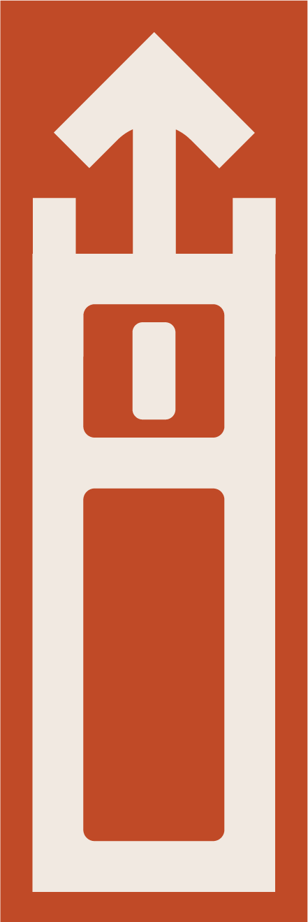
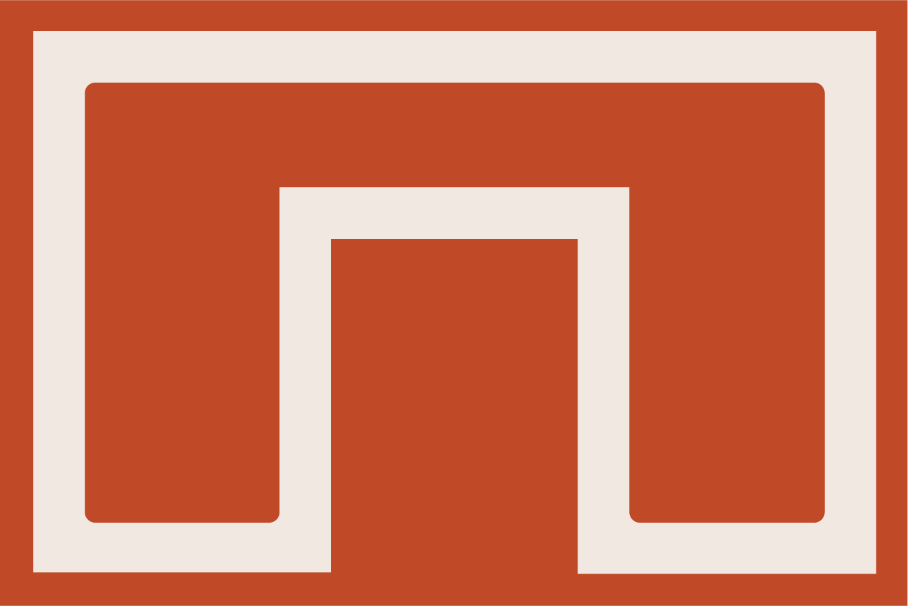
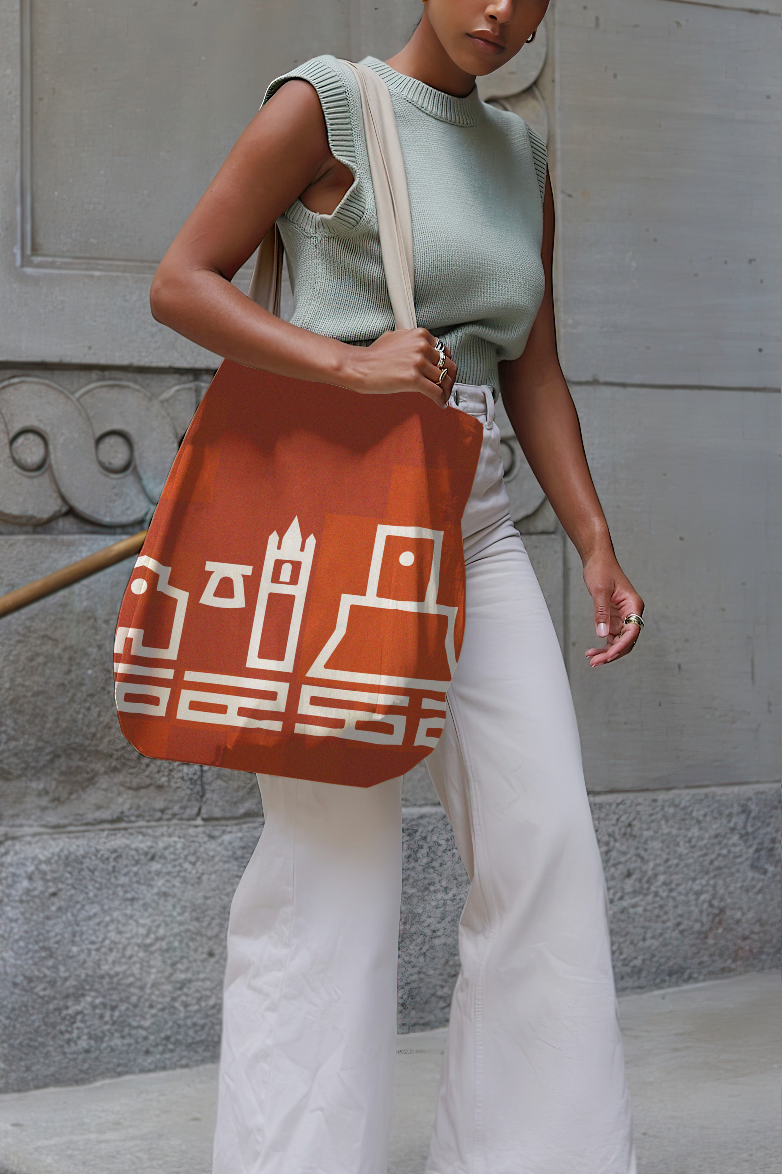
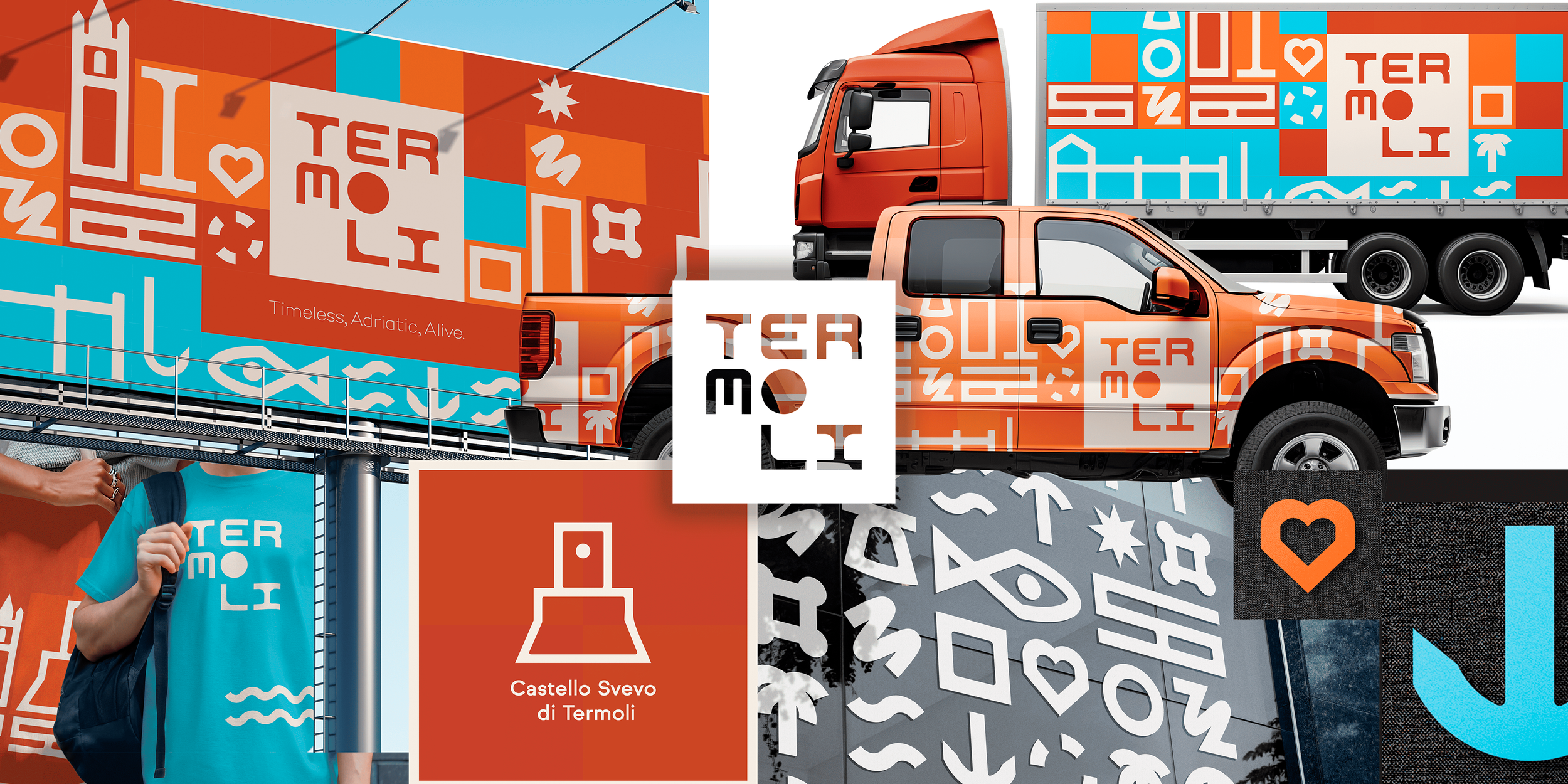
The geometry of the identity extends into a modular alphabet of symbols representing Termoli's landmarks, traditions, cultural experiences and everyday life.
Each symbol translates a characteristic element of the city into a simplified visual form.
Together, they create an adaptable graphic language that can communicate, guide and tell stories.
Termoli - Symbol Alphabet
10
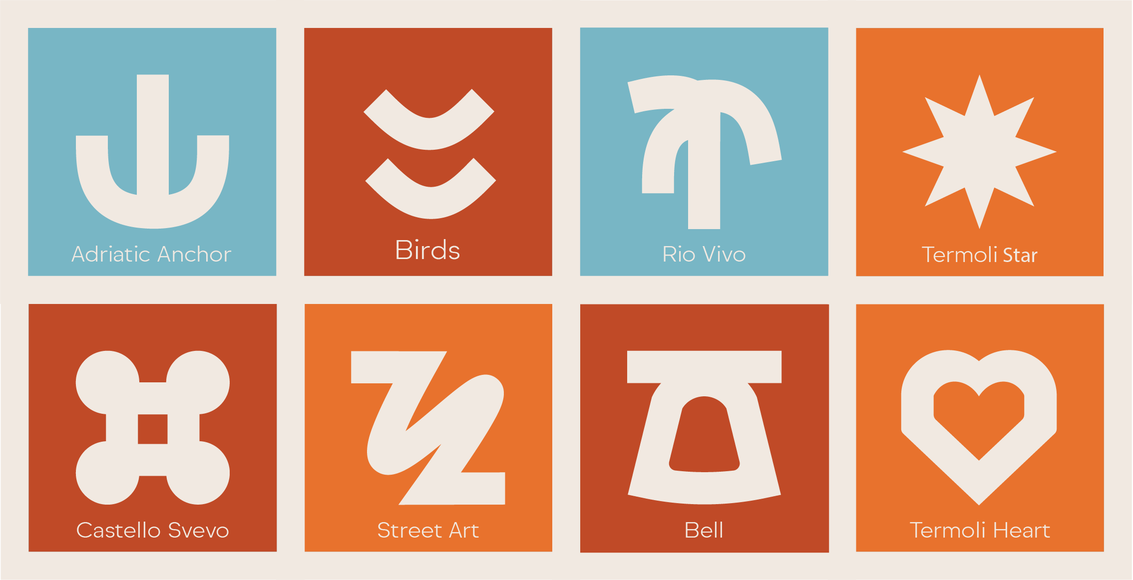
Termoli’s Alphabet
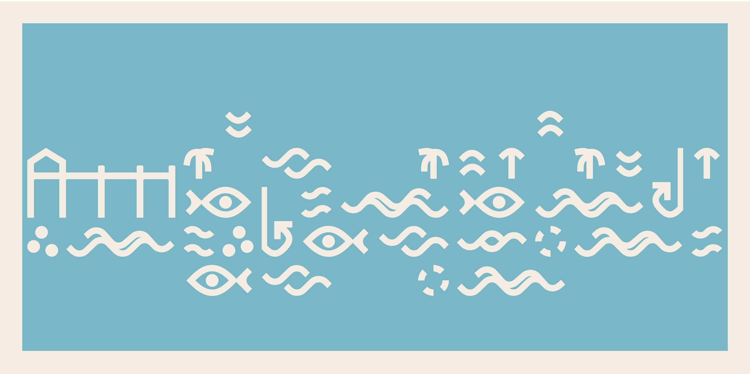
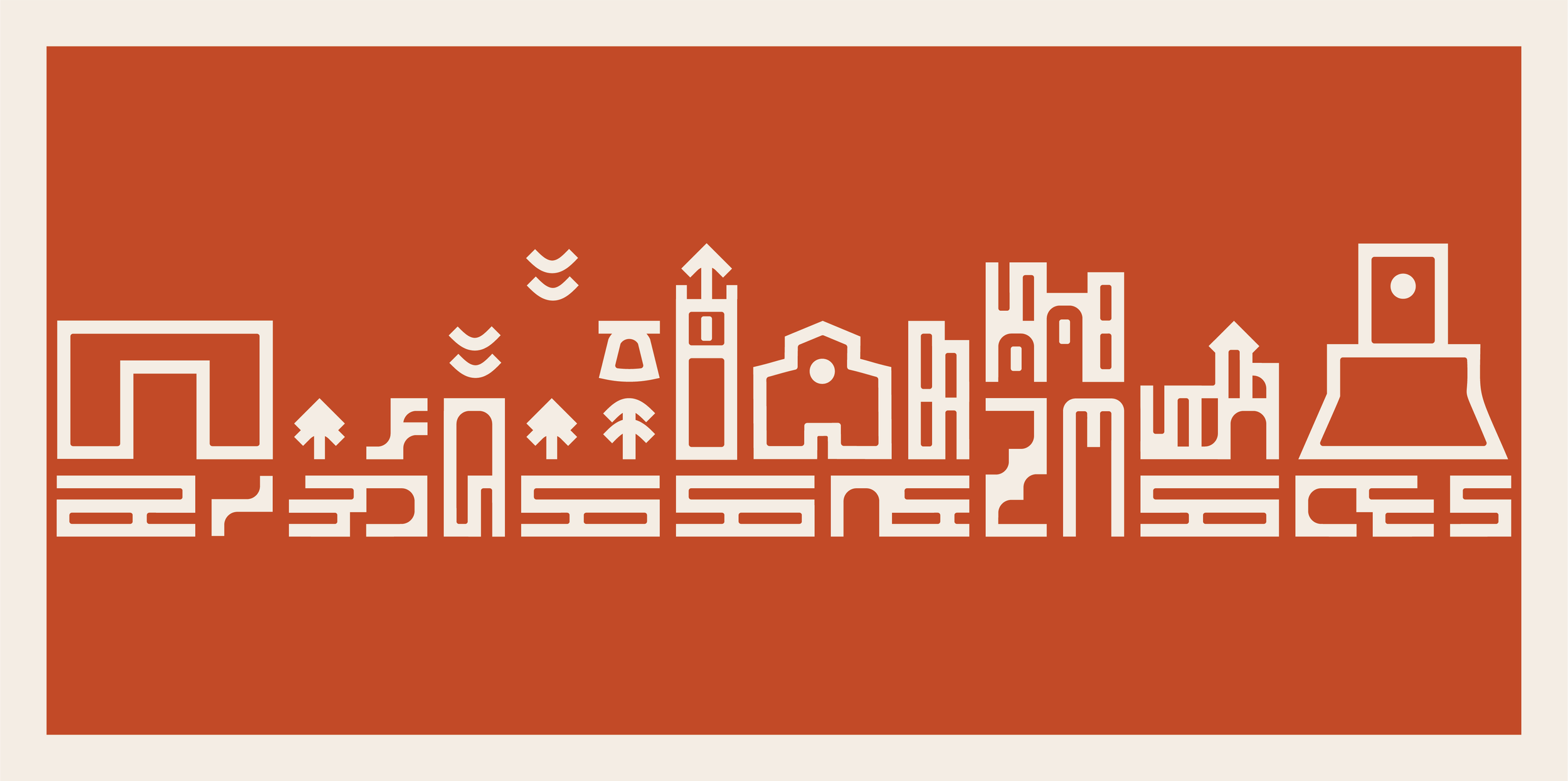
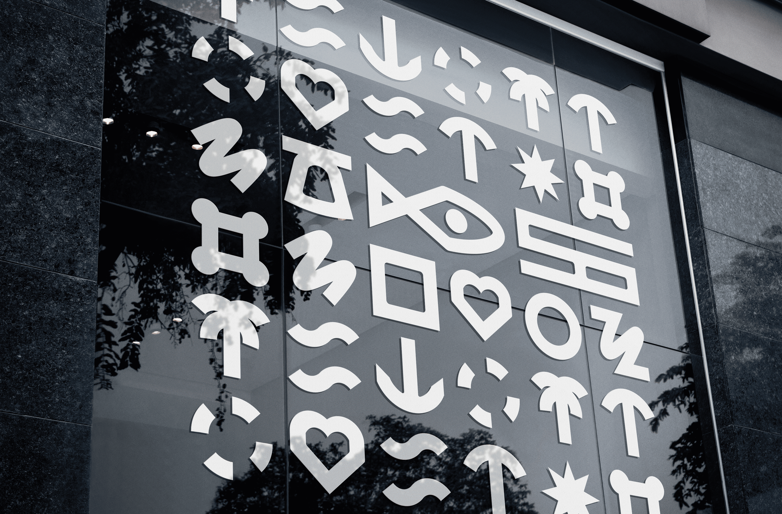
The alphabet consists of 45 unique symbols, designed to expand as the city's identity evolves. Each symbol carries a colour associated with the part of Termoli it represents.
Together, three interconnected visual alphabets form a unified system, allowing the city to communicate its diverse character through a consistent graphic language.


IV. Termoli Wayfinding
Termoli - Wayfinding Material
11
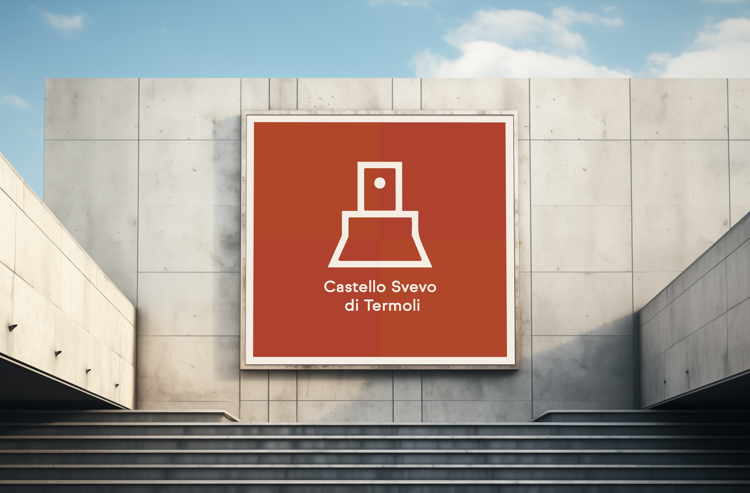
Discovering Termoli
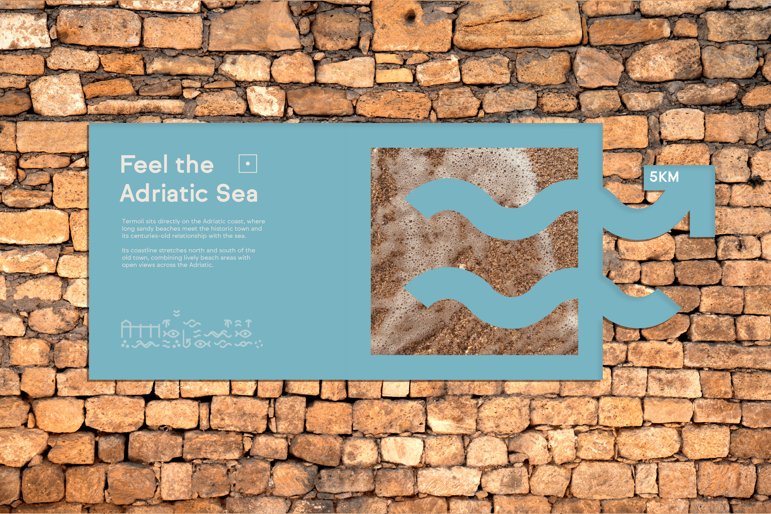
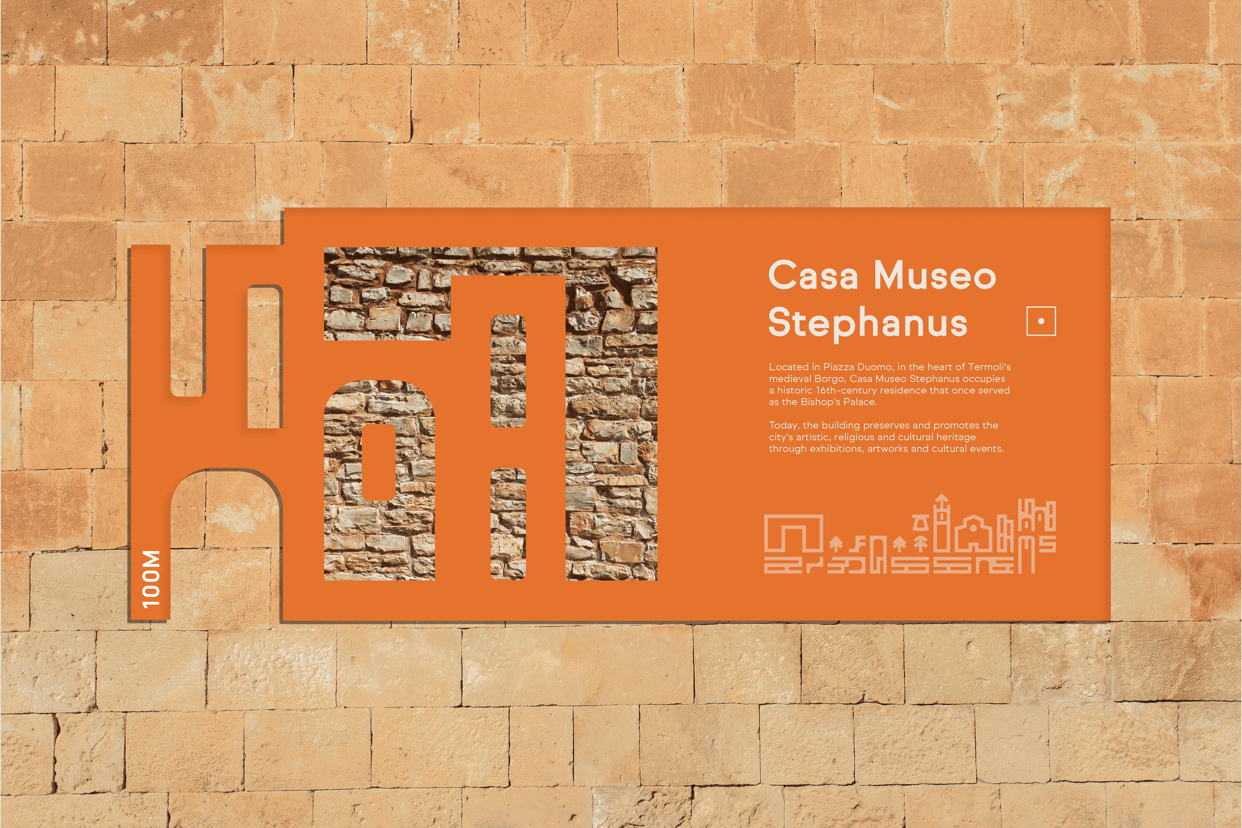
The identity extends beyond visual recognition into the visitor experience.
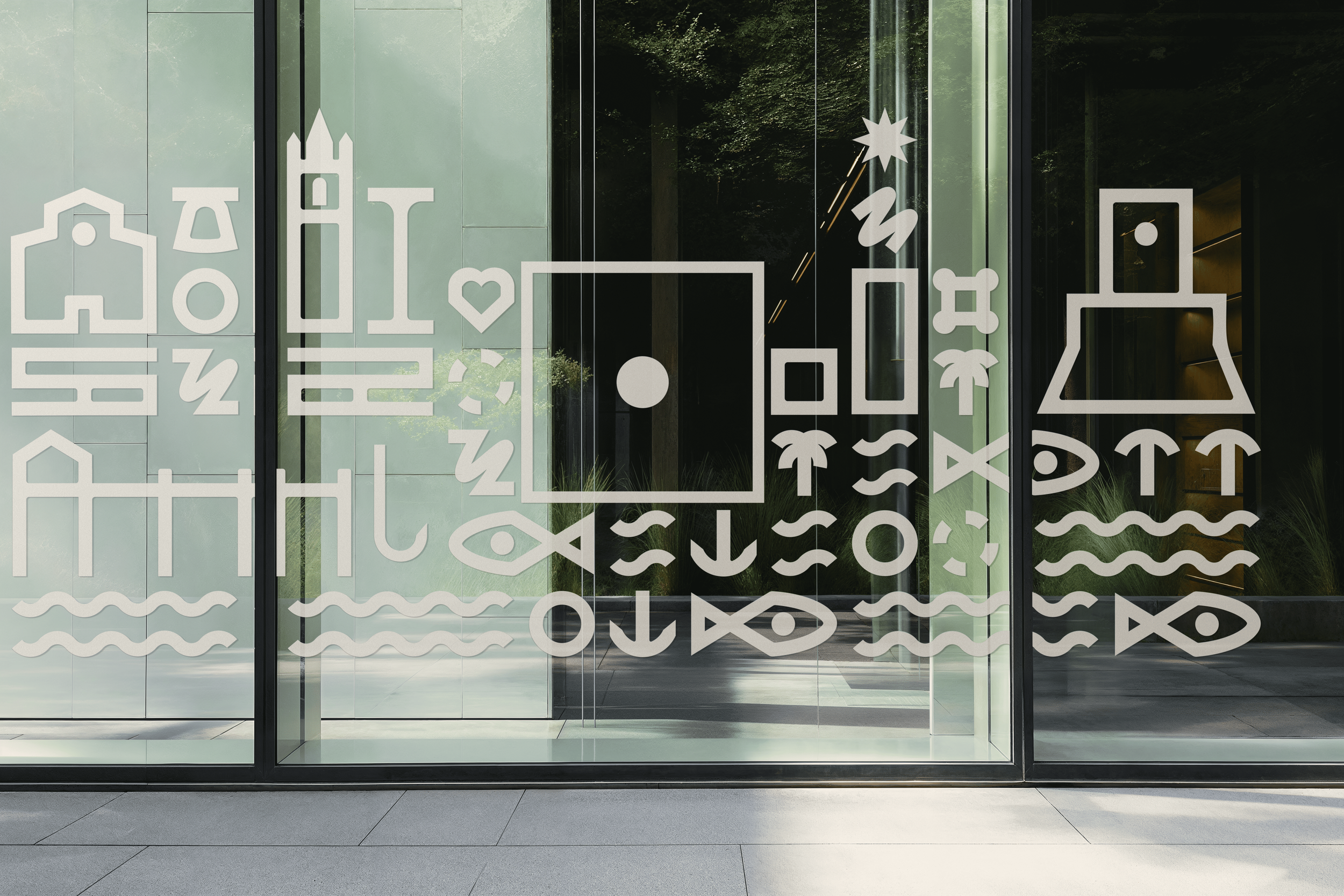
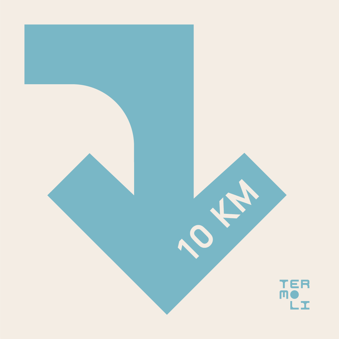
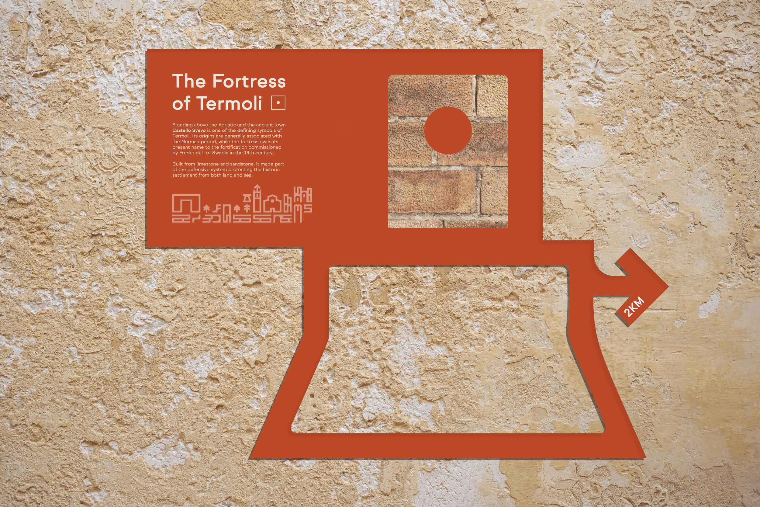
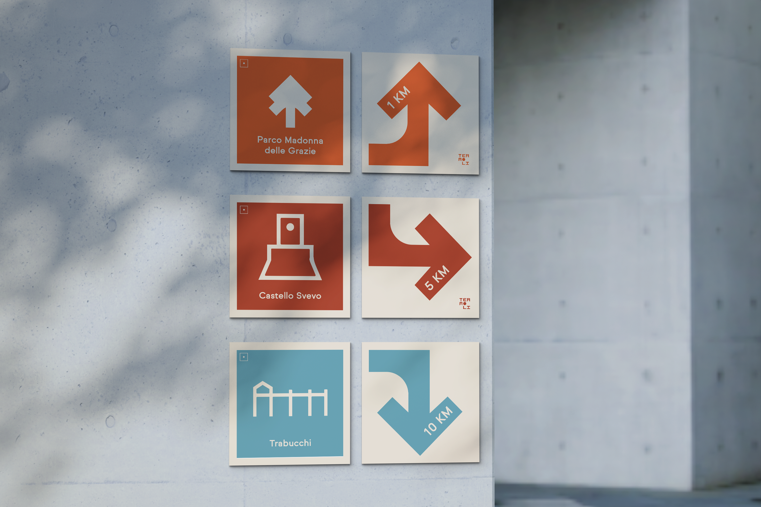
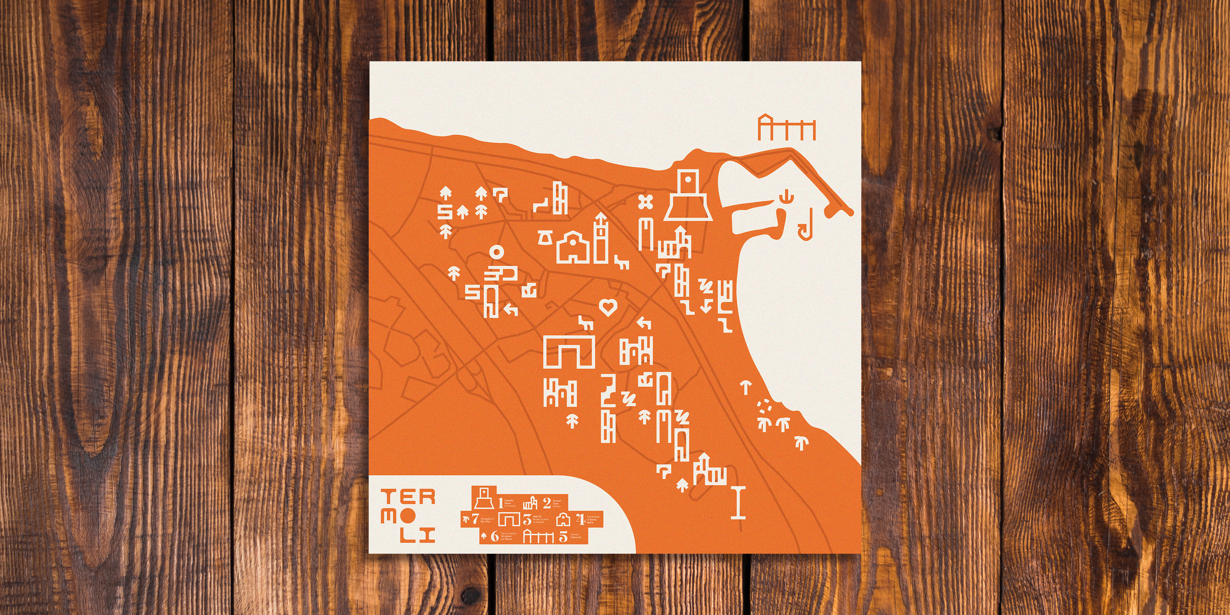
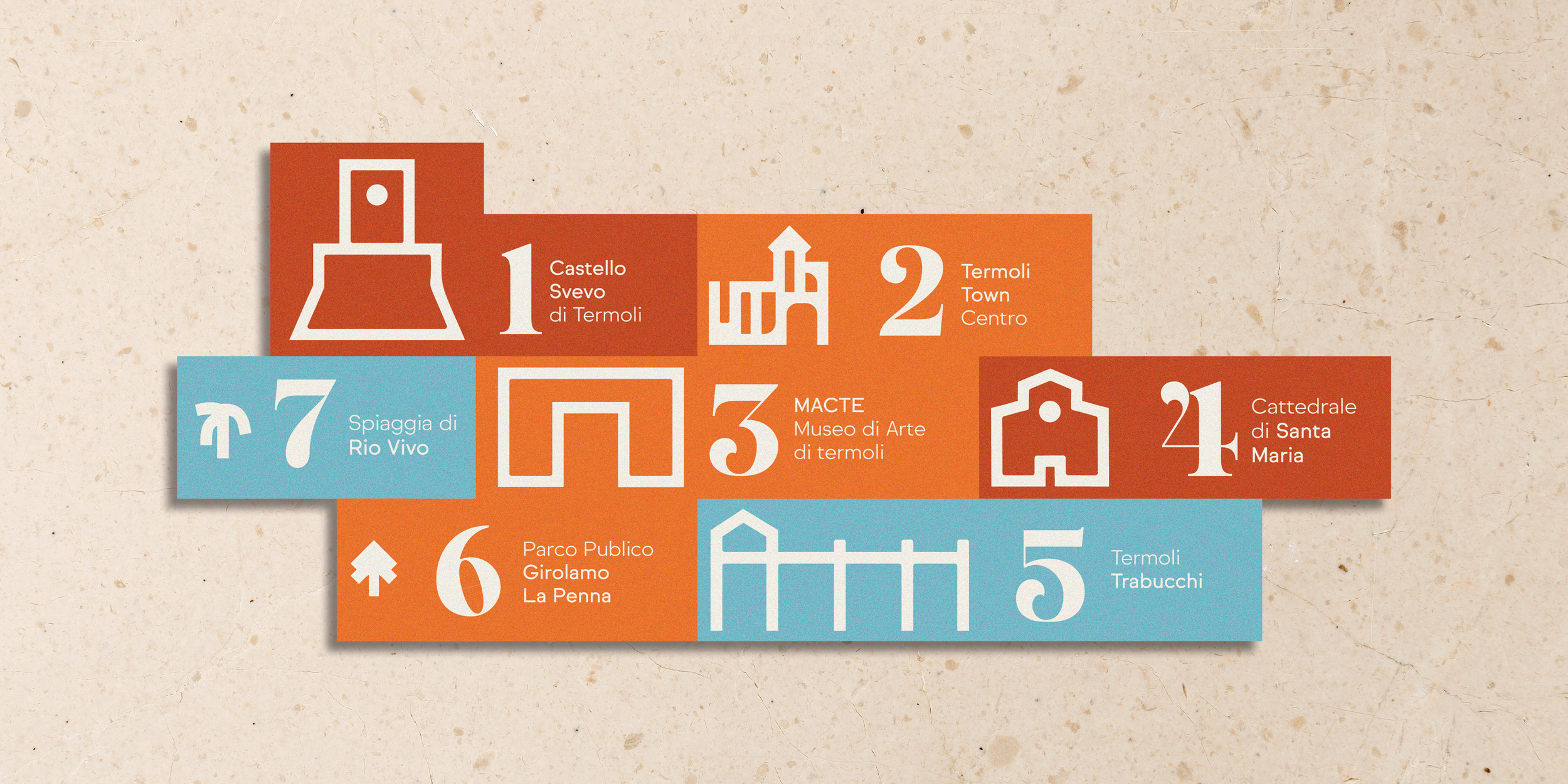
Maps, wayfinding elements and informational graphics use the modular symbol system to help visitors navigate the city, discover landmarks and explore cultural routes.
V. Adriatic, Timeless, Alive.
Termoli - Motion Design
12
Termoli - Materials
13
Let’s get in touch and expand your brand’s visual system together.