
ApiNic - Project Brief

00

ApiNic

The brief was to redesign ApiNic’s existing identity, creating a more contemporary and cohesive brand system while preserving its connection to traditional Romanian apiculture.

The new identity needed to improve consistency across packaging and communication, support a growing range of products, and establish a stronger foundation for the brand’s future development.

Type
Brand identity
Rebranding

Context
Client Project &
Graduation Thesis

Year
2025

Location
Romania

Role
Independent
Designer

Recognition
Selected at
Diploma Show
2025

Industry
Apiculture
Honey

Entire project independently conceived, designed and producted.

Brand Strategy - Visual Identity - Packaging - Editorial Design - Motion Design - 3D Visualisation

Brand Strategy - Visual Identity - Packaging -Editorial Design - Motion Design - 3D Visualisation

I. Introduction


ApiNic - About the brief and the company

01

ApiNic - Romanian Honey With Traditional Roots

ApiNic is a local apiculture business from Iași, Romania, producing a wide range of natural bee products and planning future expansion. ApiNic needed a refreshed identity to modernize its image, improve consistency, and stand out in the local honey market.

It is a family-owned Romanian honey producer founded in2014. The project focused on creating a contemporary visual identity rooted in authenticity, craftsmanship, and natural products.

The rebrand aimed to strengthen ApiNic’s market presence, improve product presentation, and connect the brand with a more modern audience.
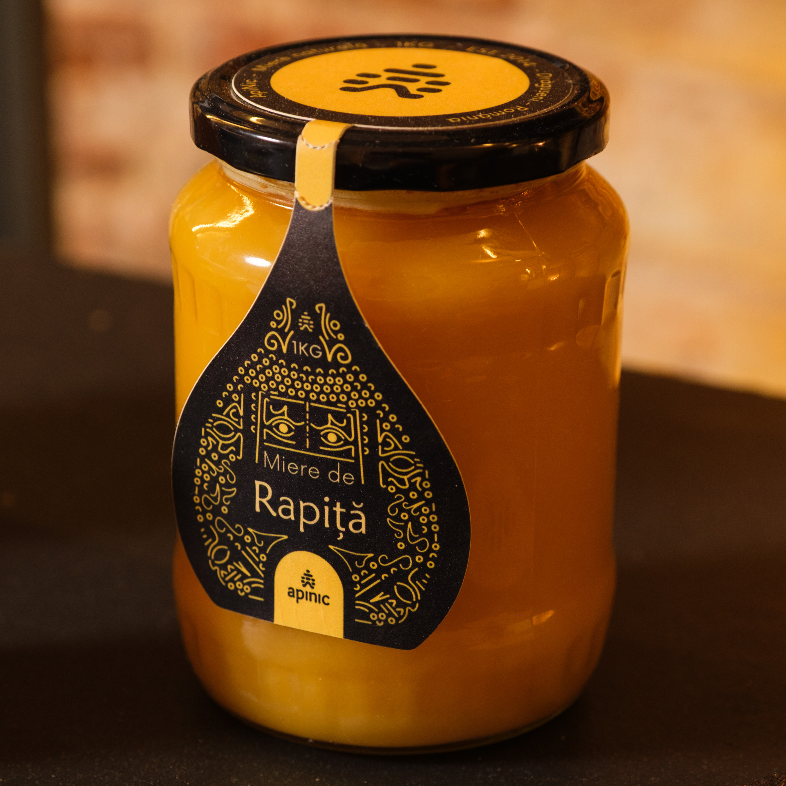
A glass jar with a black lid and a yellow label containing black decorative design and the words "Raptiä Mie de R" on it. The jar appears to contain a yellow substance, possibly honey or jam.

ApiNic - Diploma Show 2025

02

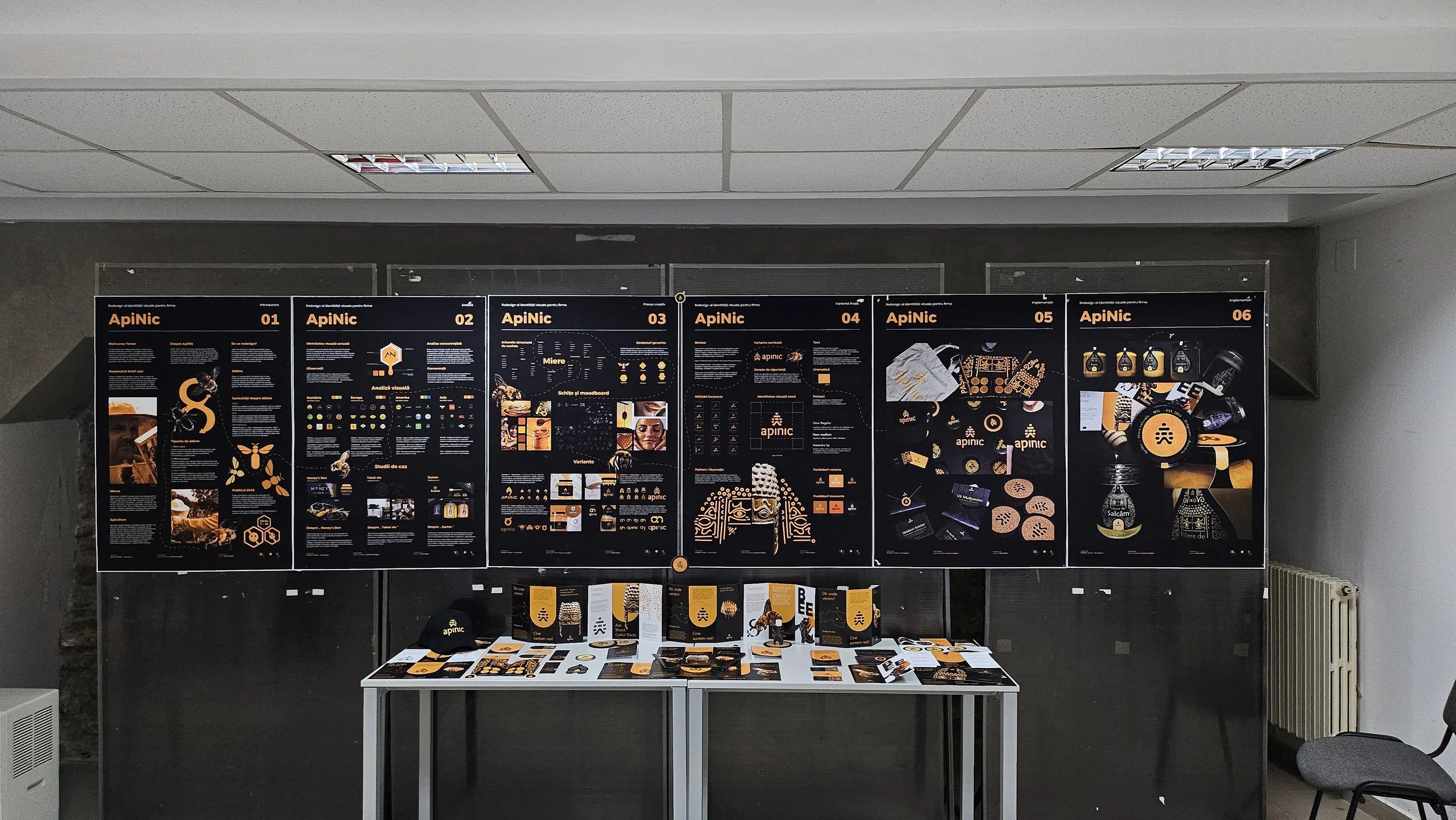
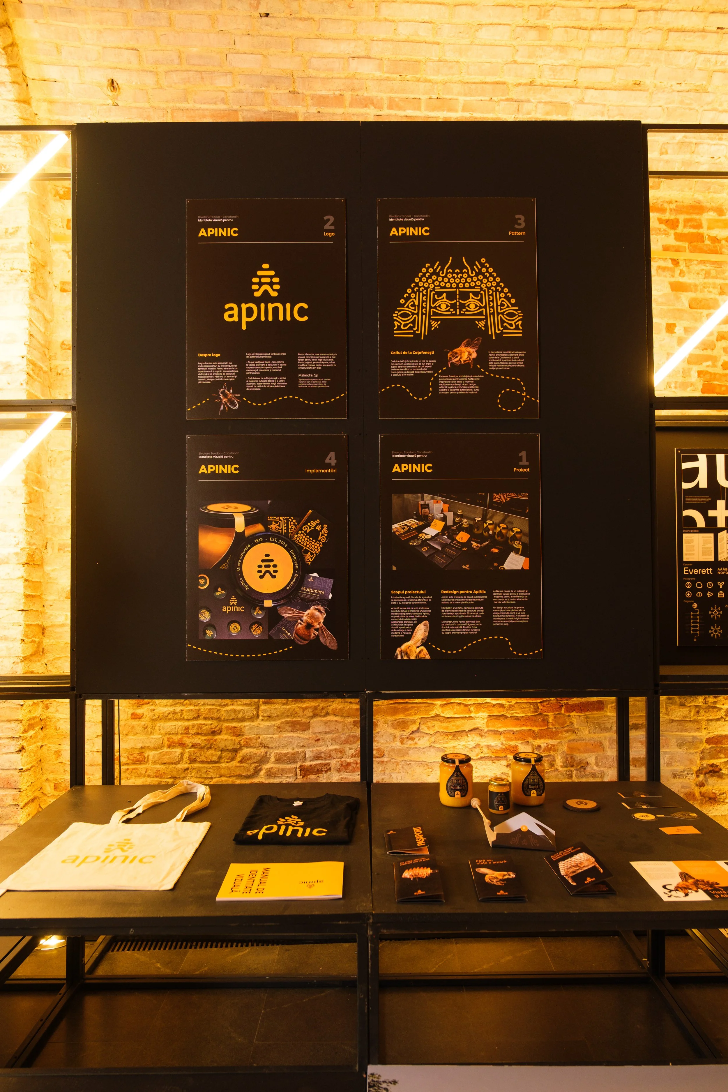
Presented at Diploma Show 2025

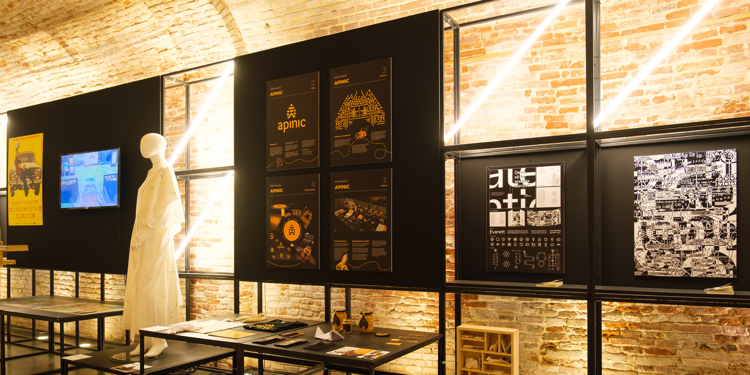
ApiNic was selected for exhibition at Diploma Show 2025, showcasing the project among emerging Romanian design work.
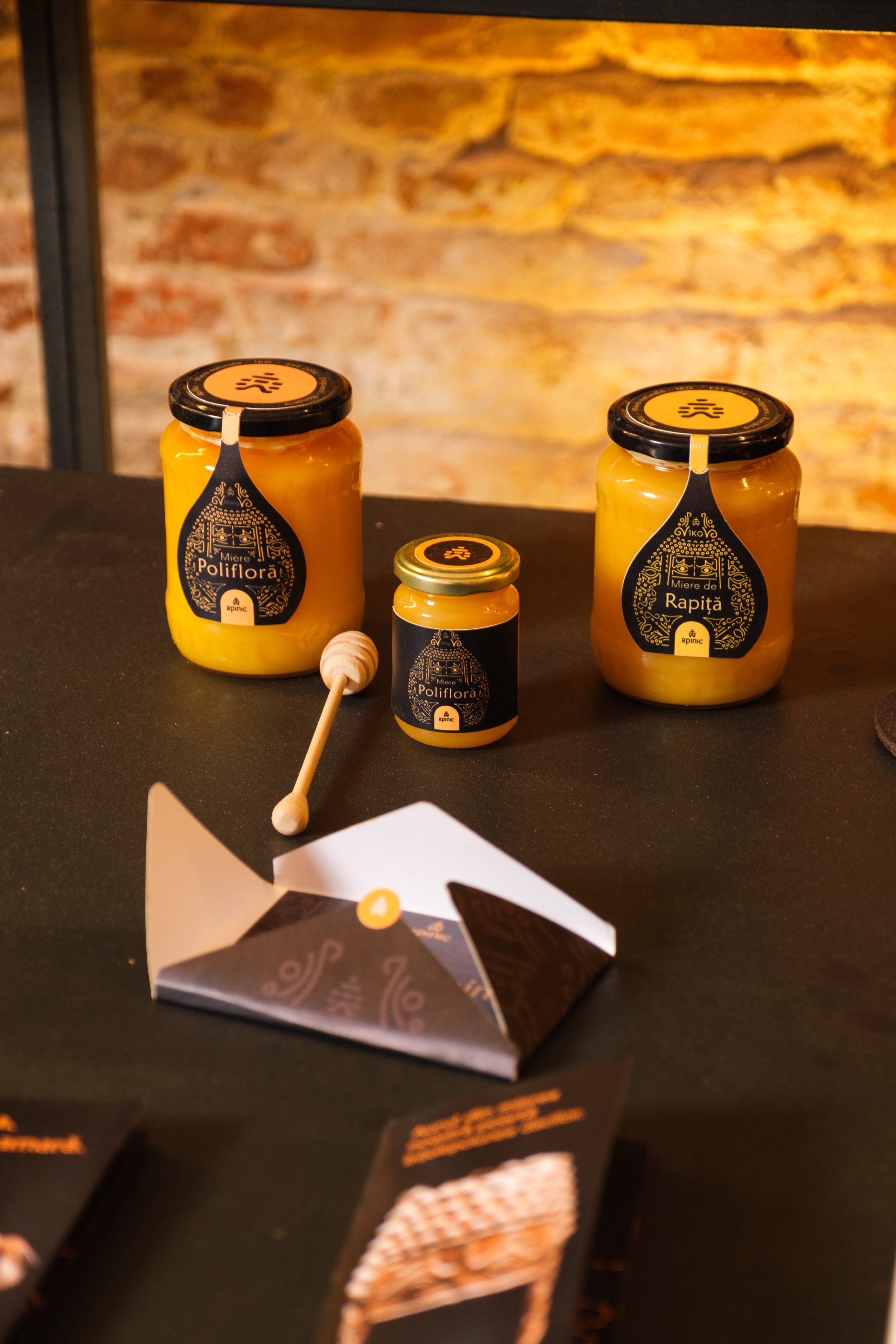
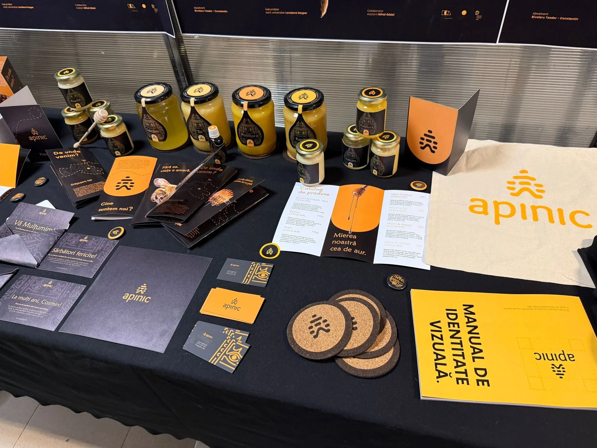
Three jars of honey labeled 'Poliflora', 'Rapti', and another smaller jar with black and gold labels and a honey dipper, set on a black surface against a brick wall background.
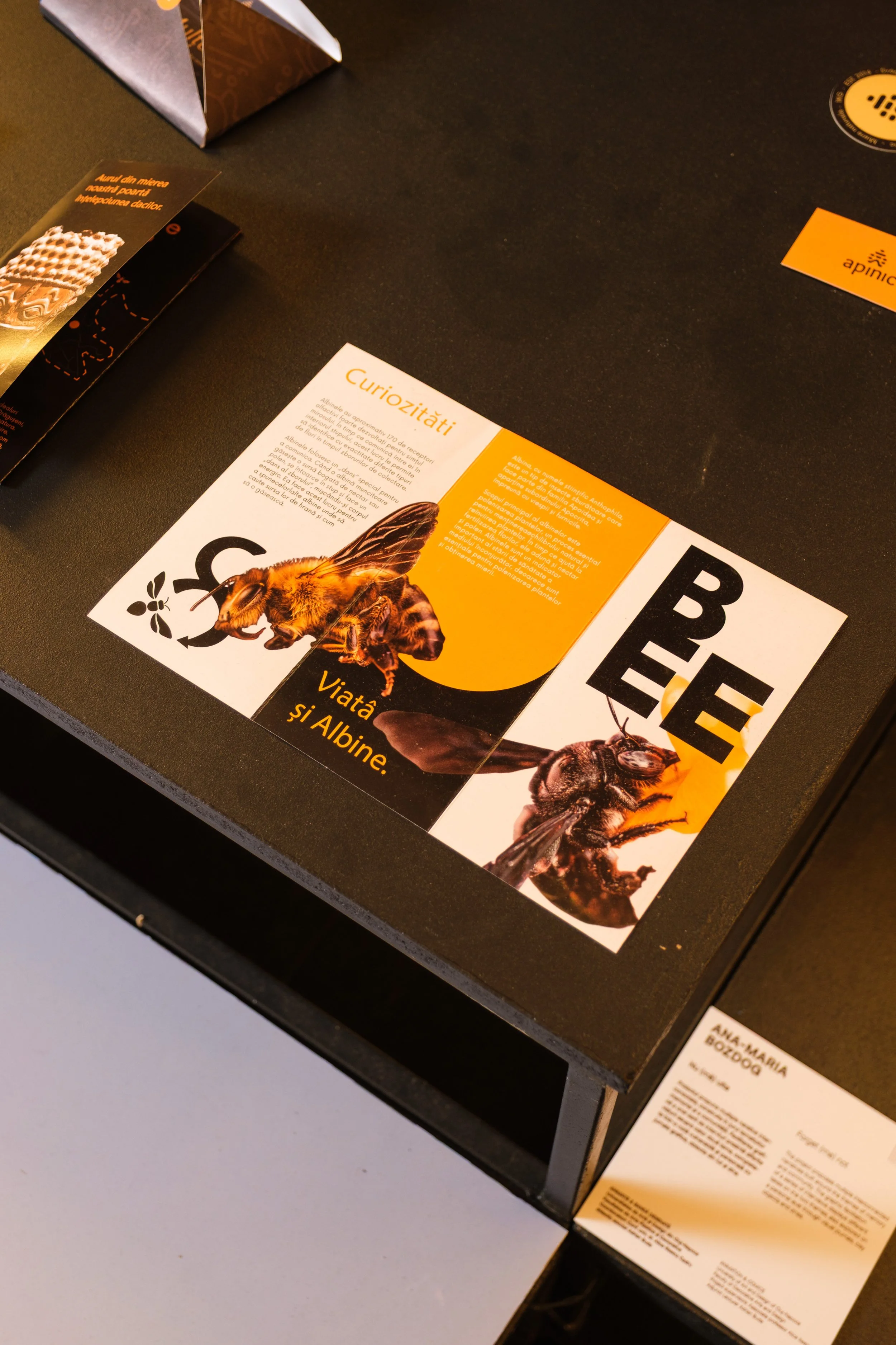
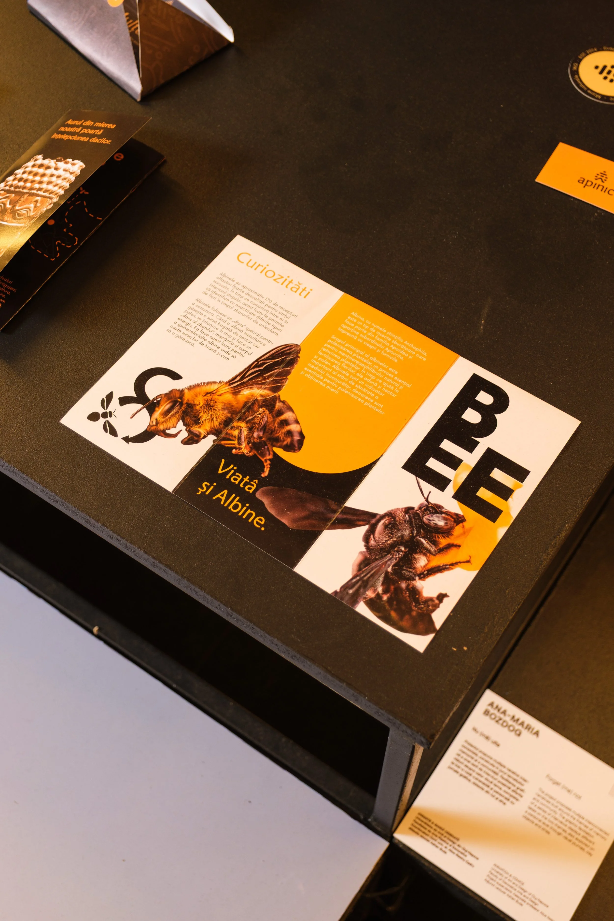
Informational display about bees and albine life, featuring a large image of a bee on a brochure on a black table with additional brochures and informational cards.
Exhibition space with a brick wall, black display panels featuring posters and artwork, a mannequin dressed in white, and a small table with pamphlets, in an art gallery setting.

II. The Visual

Identity


ApiNic - About The Logo Concept

03
Orange icon of a dumbbell with the words "Training and Coaching" in black.

Where Bees Meet History

The ApiNic symbol combines two forms rooted in the brand’s identity: the traditional beehive and the Helmet of Coțofenești. Their defining shapes were reduced and merged into a contemporary symbol, connecting apiculture with Romanian heritage.
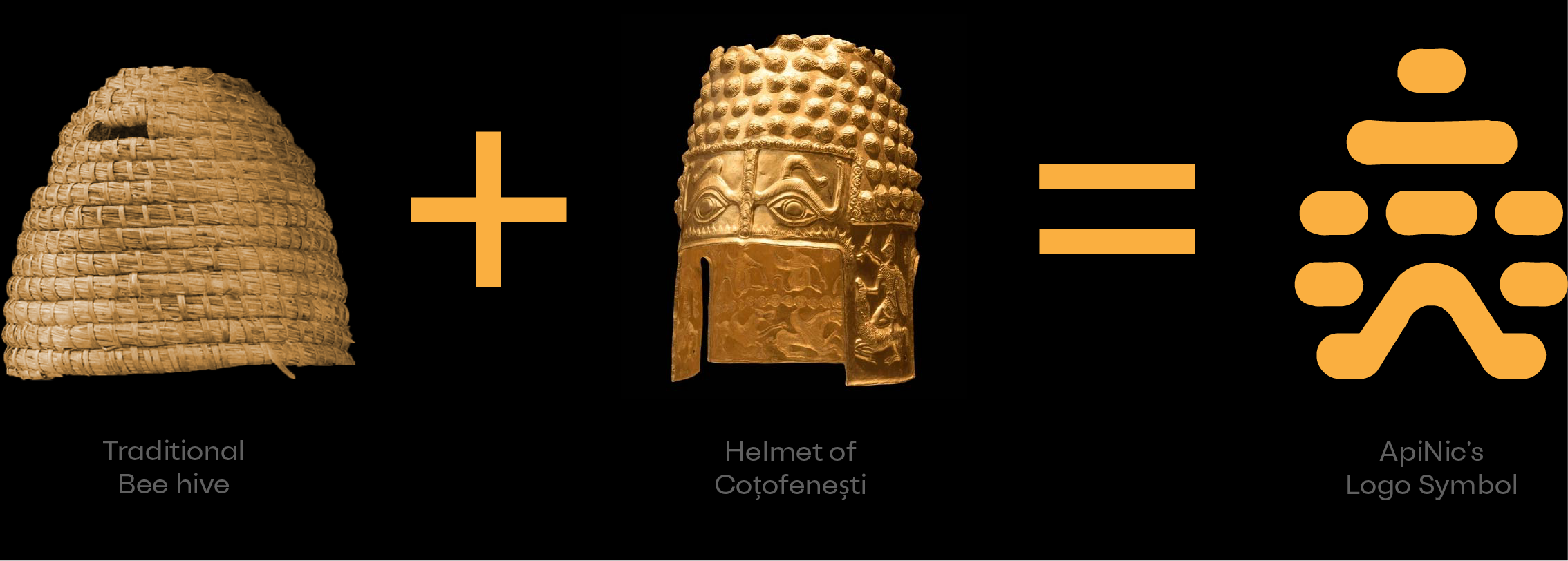
Diagram showing how a traditional bee hive plus a helmet of Çoṭofeništi equals the ApiNi's logo symbol.

ApiNic - The Logo’s Construction

04

Built Like Honey

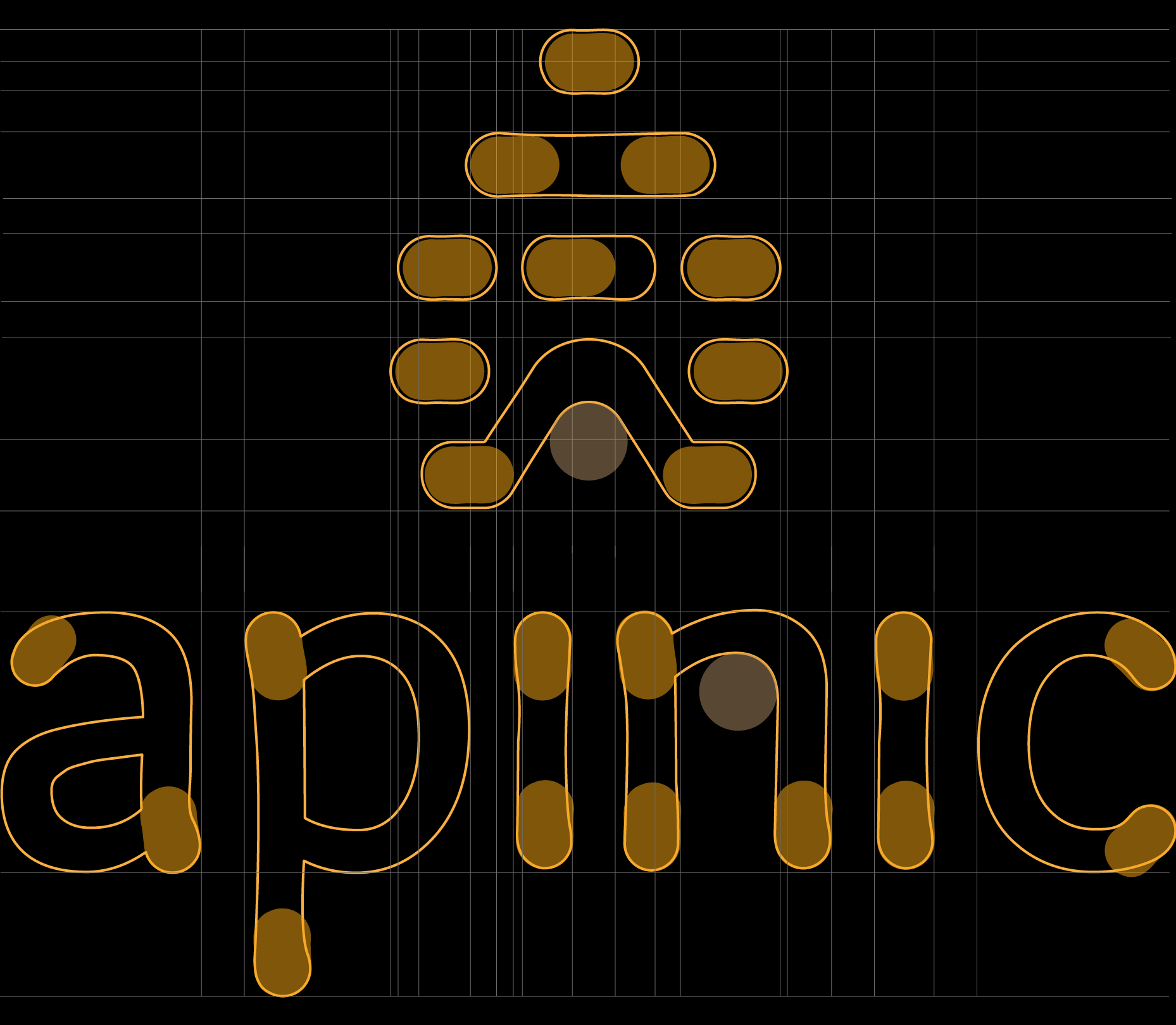
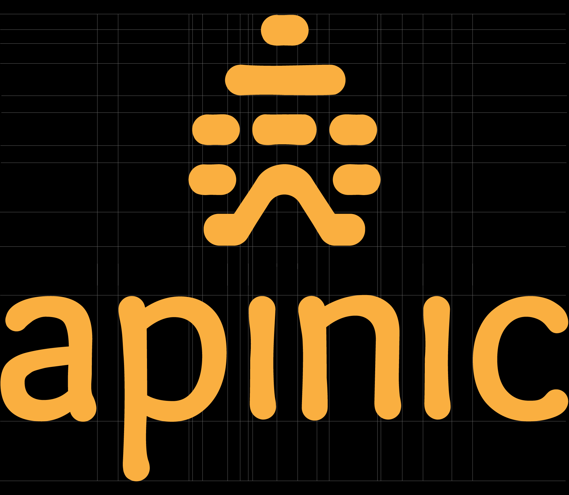
Inspired by the natural form of a honey drop, the logo balances geometric precision with subtle irregularities. Its softened, slightly imperfect curves give the identity an organic, human character while preserving a clean contemporary appearance.
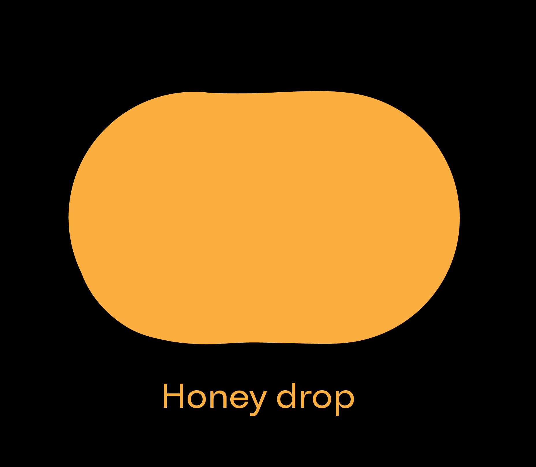
A stylized orange droplet shape with the text "Honey drop" written below it.
Close-up of a black background with a grid of faint white lines, featuring orange rounded rectangular and organic shapes and partial text that reads 'aplic' in large, rounded orange letters.
Close-up of a digital screen displaying the words "Happy New Year" in orange glowing text on a black background.

ApiNic - Typography System

05

Sweet-Looking Typography

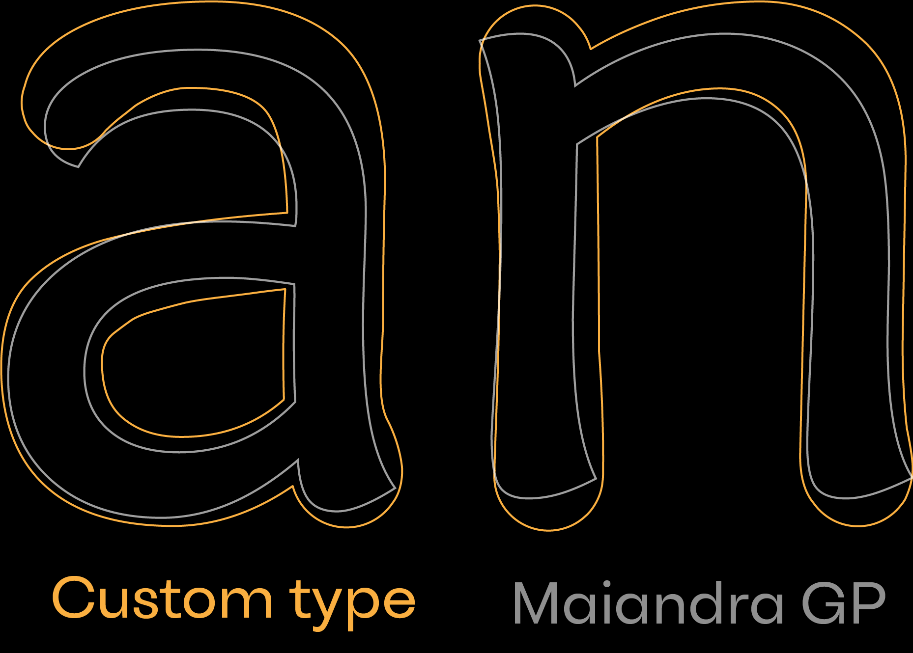
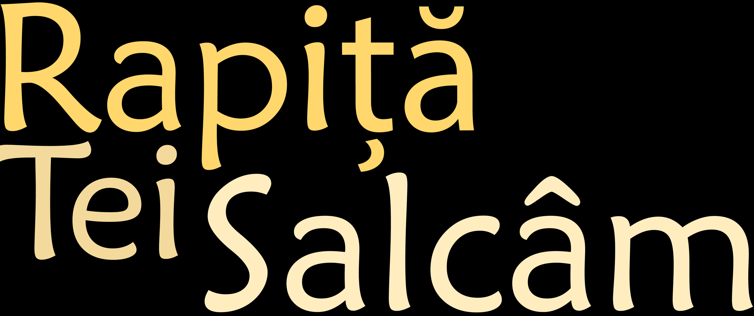
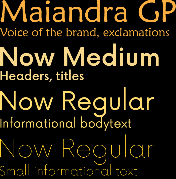
Maiandra GP was chosen as ApiNic’s expressive tyMaiandra GP brings an organic character to the identity, with soft forms that echo honey and the traditional beehive. The Now family provides a clean counterpart for editorial and informational typography.

The ApiNic wordmark was developed from Maiandra GP, with its letterforms redrawn and given drop-like terminals to connect it directly to the symbol.

Large orange uppercase and lowercase letter 'A' on a black background.
Typography sample text showcasing different fonts and sizes, including headers, titles, body text, and informational content.
Close-up of large neon number 20 with orange and white outlines against a black background, with partially visible additional text and words.
Word cloud with words 'kapita', 'télécsalán', and other Spanish words in yellow and cream colors on a black background.

ApiNic - Color System

06

Different Kind of Honey, Different Kind of Color

ApiNic’s palette is drawn from the natural colours of different varieties of honey. The primary yellow defines the overall identity, while secondary shades distinguish individual products through colours inspired by the honey they represent.
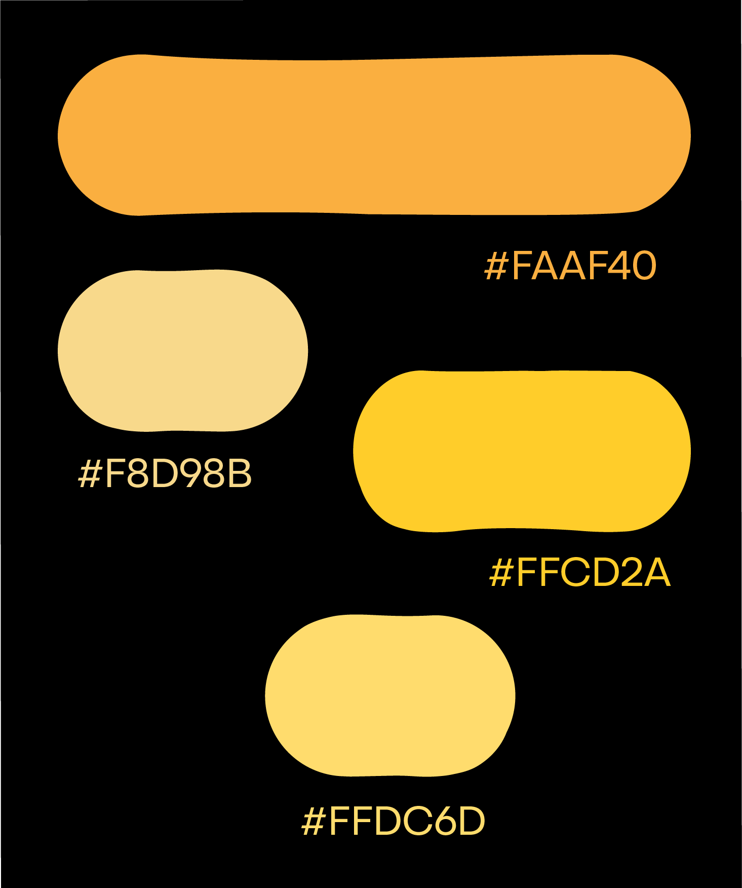
A digital color palette featuring yellow and orange shades with their hexadecimal codes on a black background.

ApiNic - Logo Creation Process

07

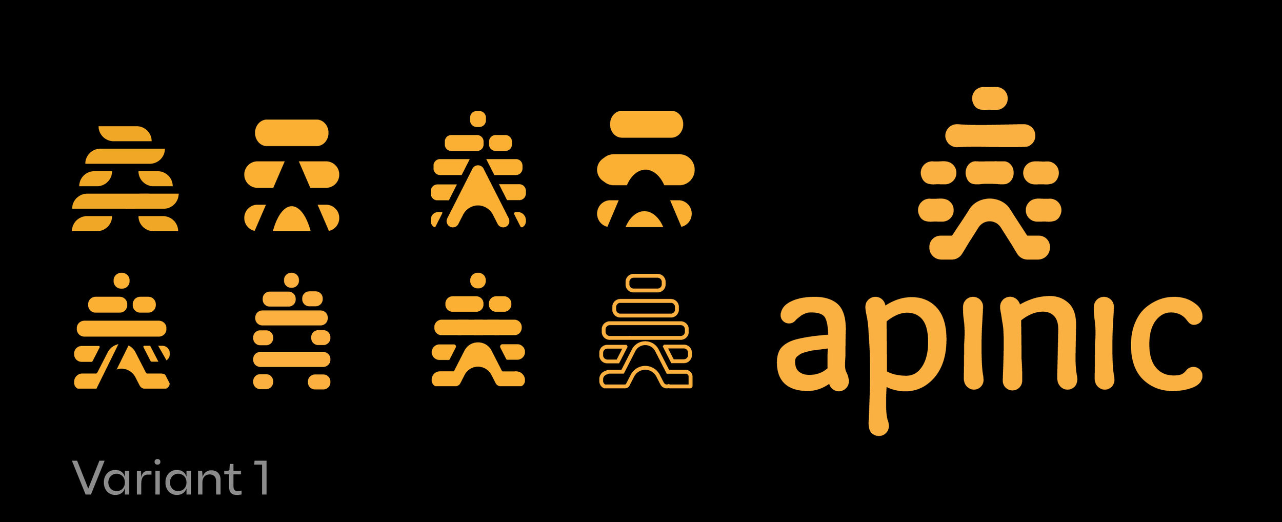
From Hundreds of Sketches To One Symbol

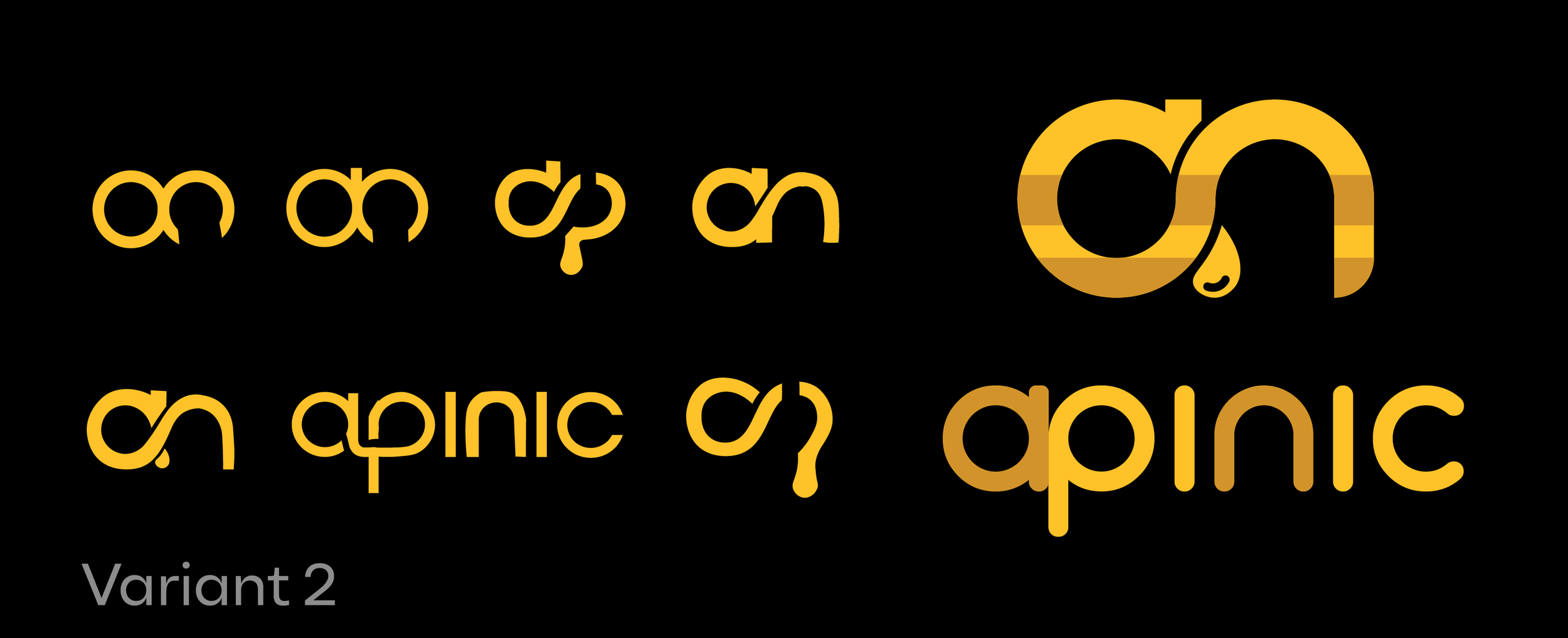
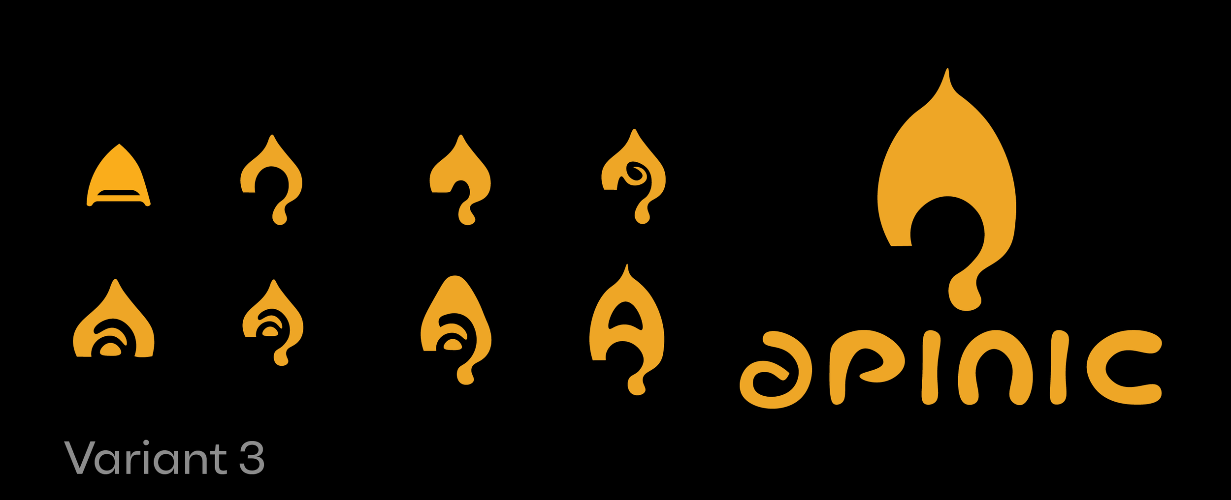
Hundreds of sketches explored different ways of connecting apiculture with Romanian heritage.

Three directions were selected and developed further, leading to the final ApiNic identity.
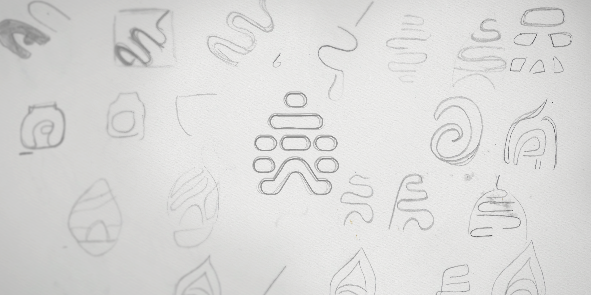
Multiple faint, abstract line drawings of various shapes and patterns on a white surface, resembling sketches or doodles. Some shapes appear to be stylized leaves or organic forms.

Hundreds of sketches explored different ways of connecting apiculture with Romanian heritage. Three directions were selected and developed further, leading to the final ApiNic identity.
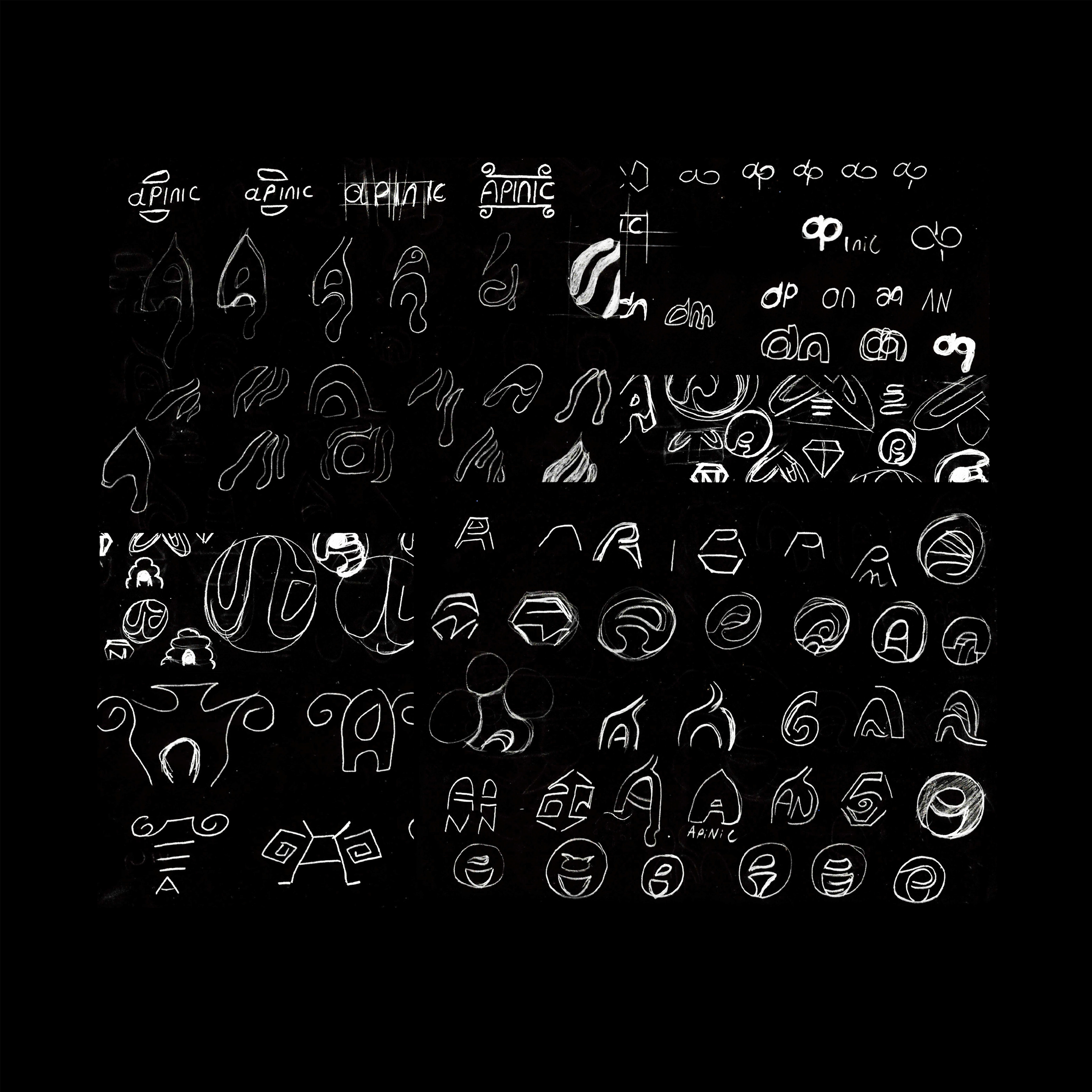
A chalkboard filled with sketches of various abstract symbols, shapes, and lettering designs in white chalk.
Comparison chart of different stylized words created from the bottom line of a DNA strand design with repeating shapes, organized in rows labeled from Variant 1 to Variant 9, with the largest variant spelling out 'apnic' in orange.
Image showing yellow and orange stylized text on a black background. The text appears to be a creative, abstract font design with a futuristic style. The words are not clearly readable.
Multiple images of a yellow torch with a black background, with text in a different language reading 'Varient 3'.

ApiNic - Pattern and Illustration

08

The Dacian Helmet, Illustrated

The illustrated pattern reinterprets the Helmet of Coțofenești through ApiNic’s visual language. Built from rounded, flowing lines that echo the forms of the logo, the illustration extends the identity’s connection to Romanian heritage into a flexible graphic element.


09

ApiNic - Motion Design and Vectors
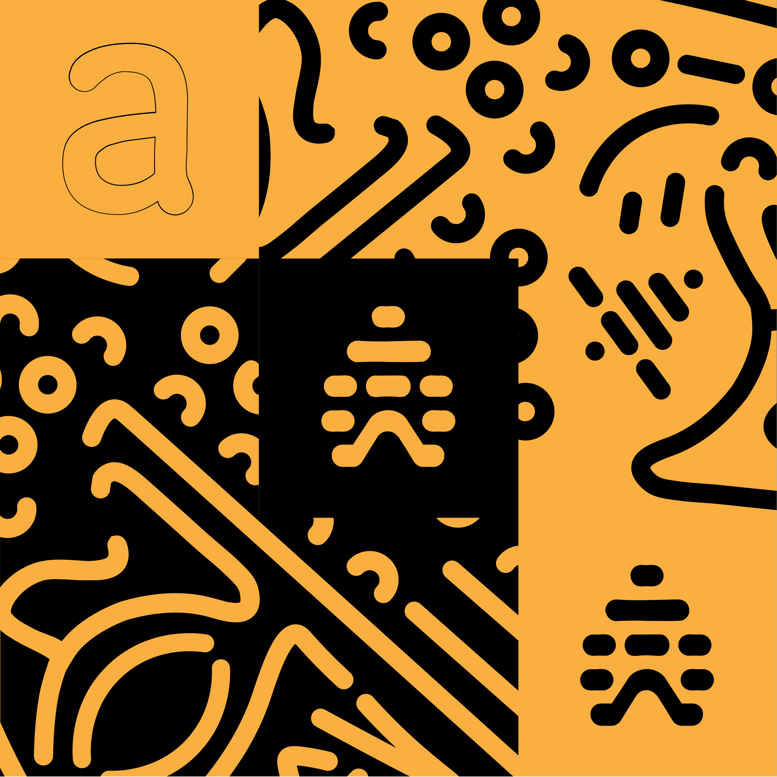
Abstract orange and black graphic with a large outlined letter 'a' on the left and various bold, black shapes and lines on an orange background.
Handwritten text in orange that says 'Laissez' on a black background.

III. Label Design


ApiNic - Honey Label Design

10

Not Just a Label,
But a Working Hive

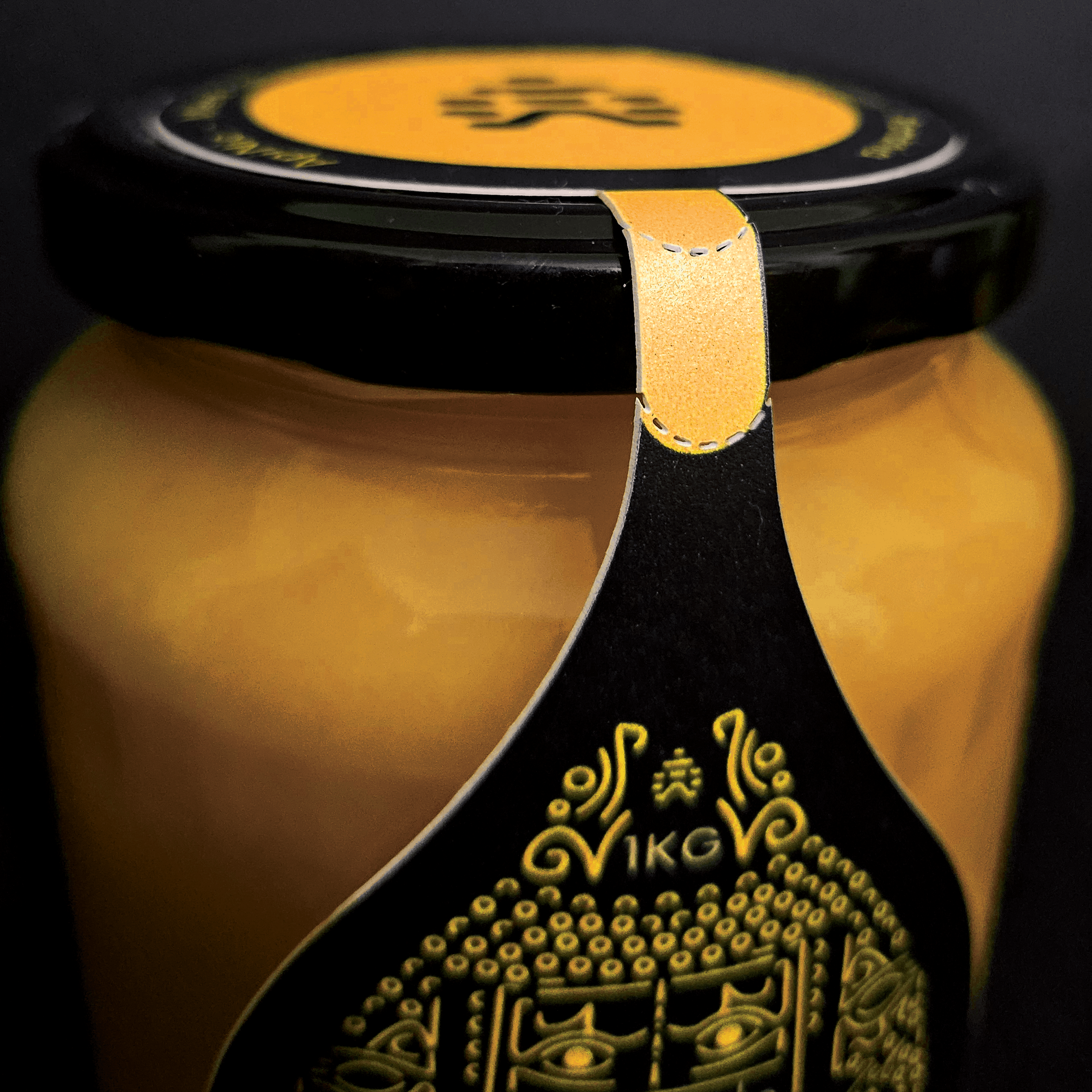
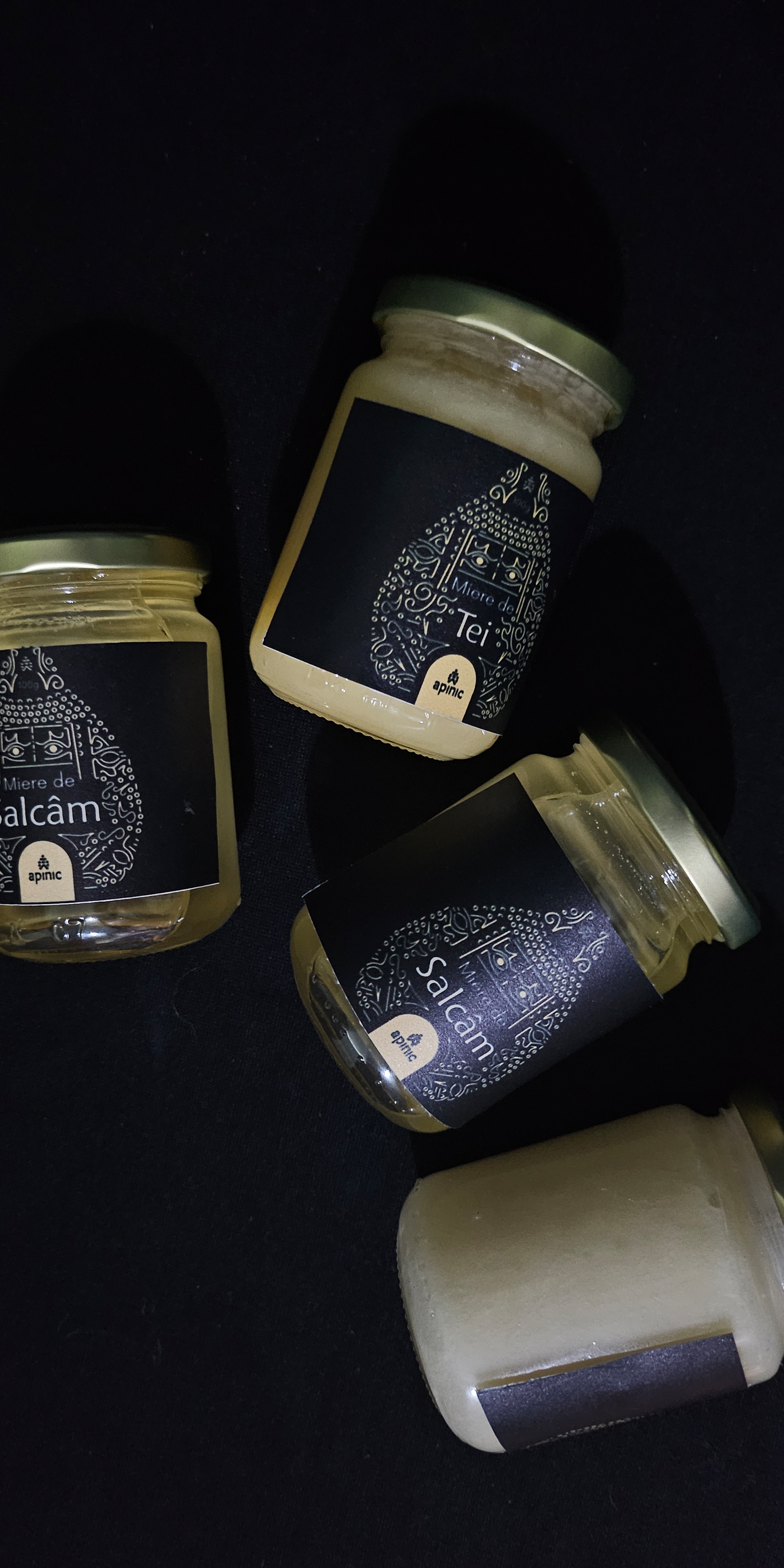
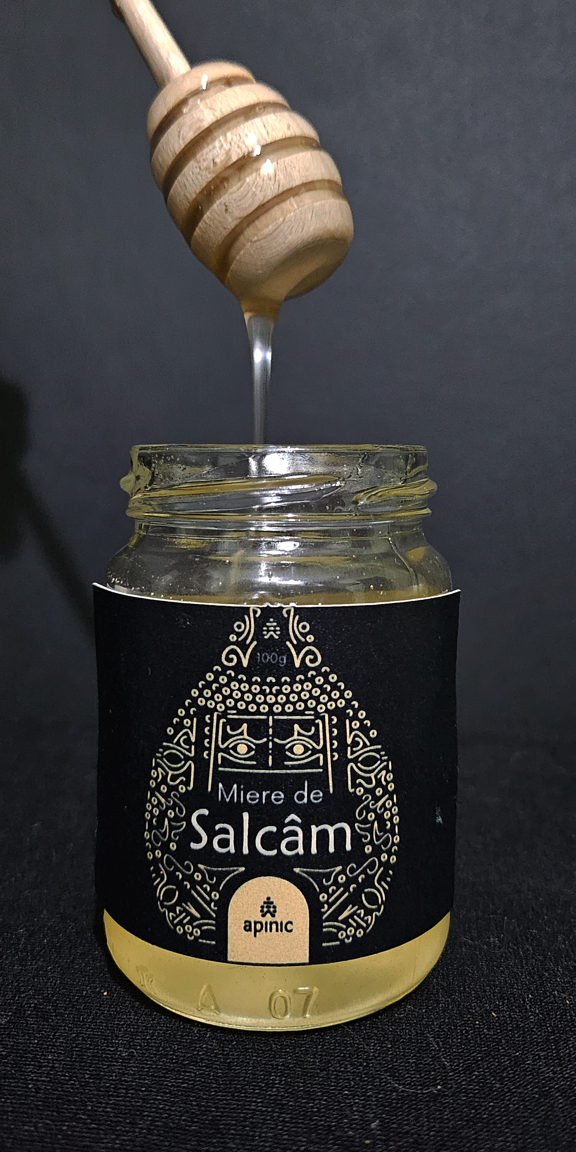
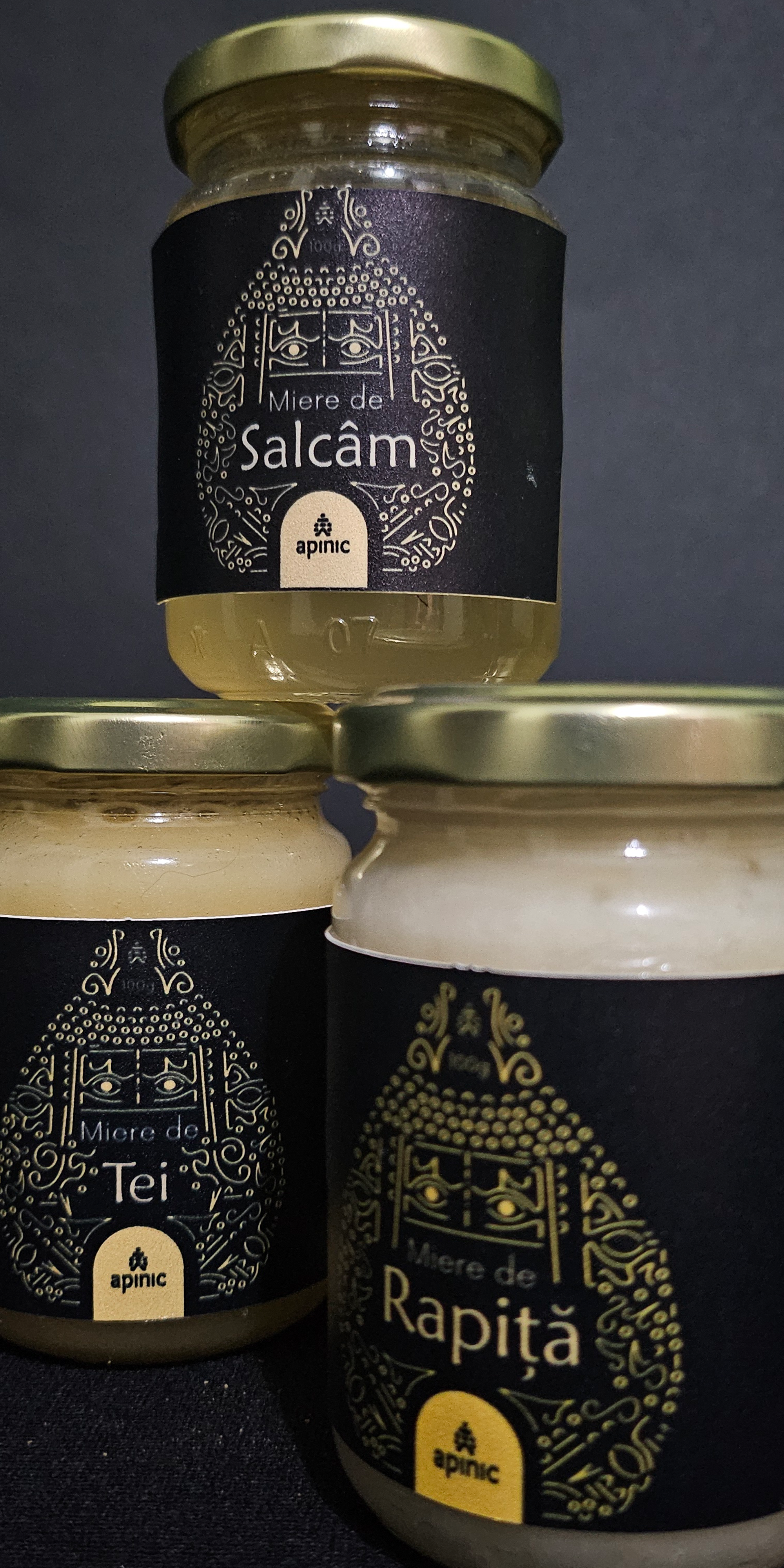
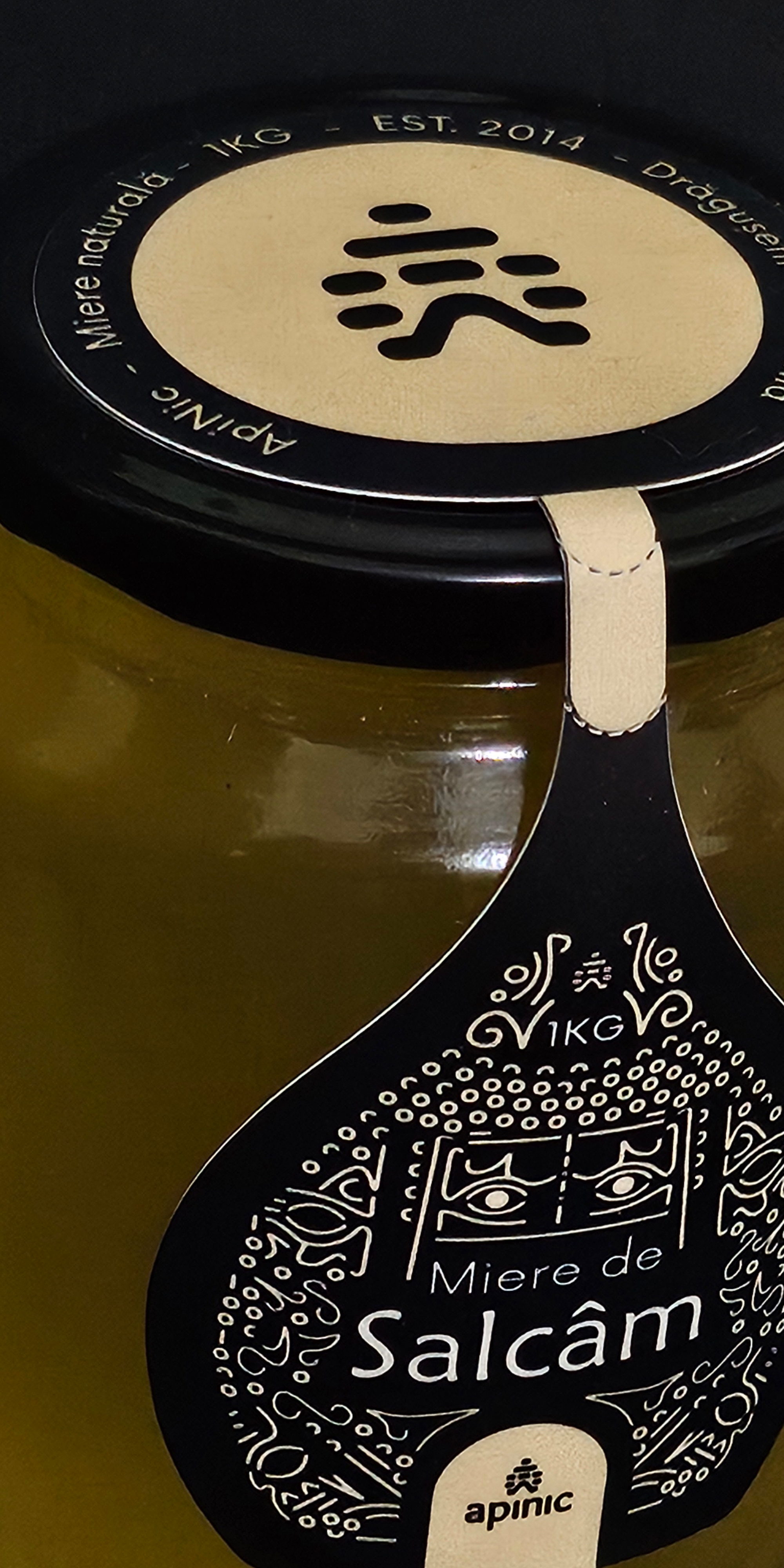
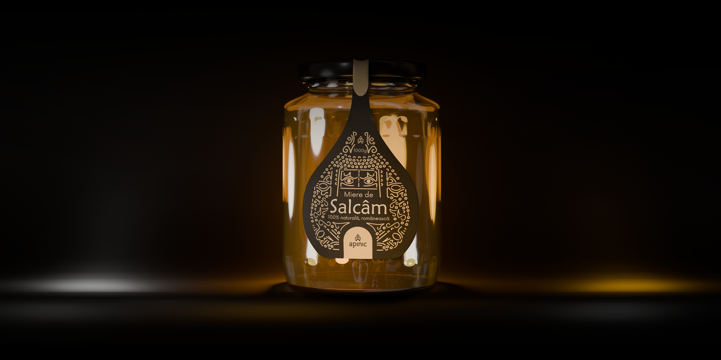
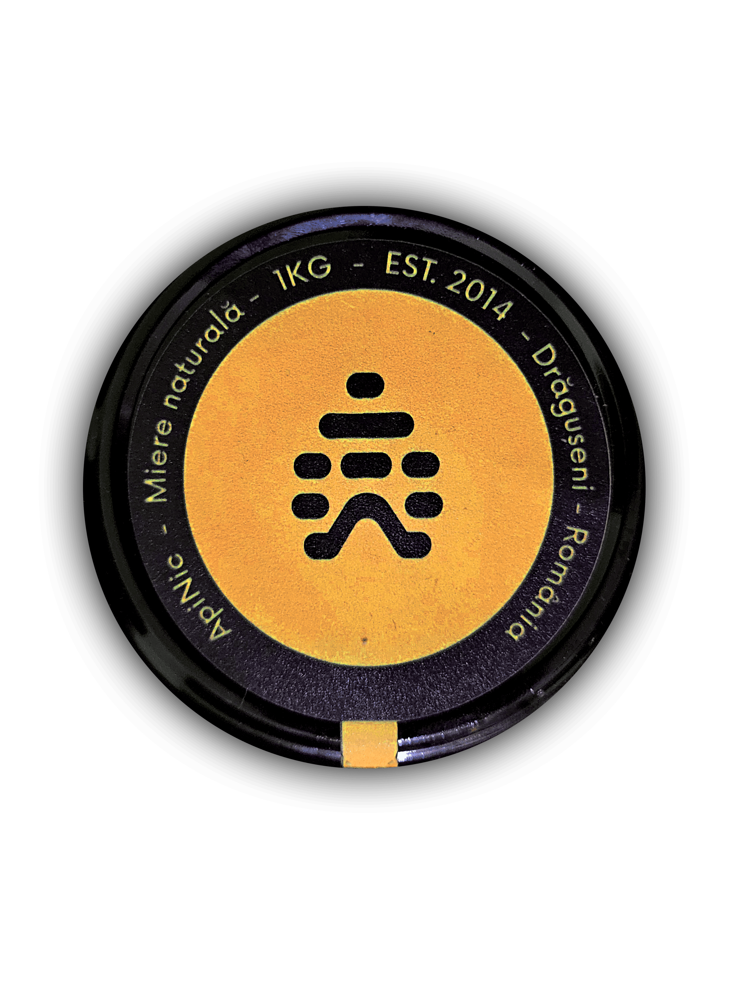
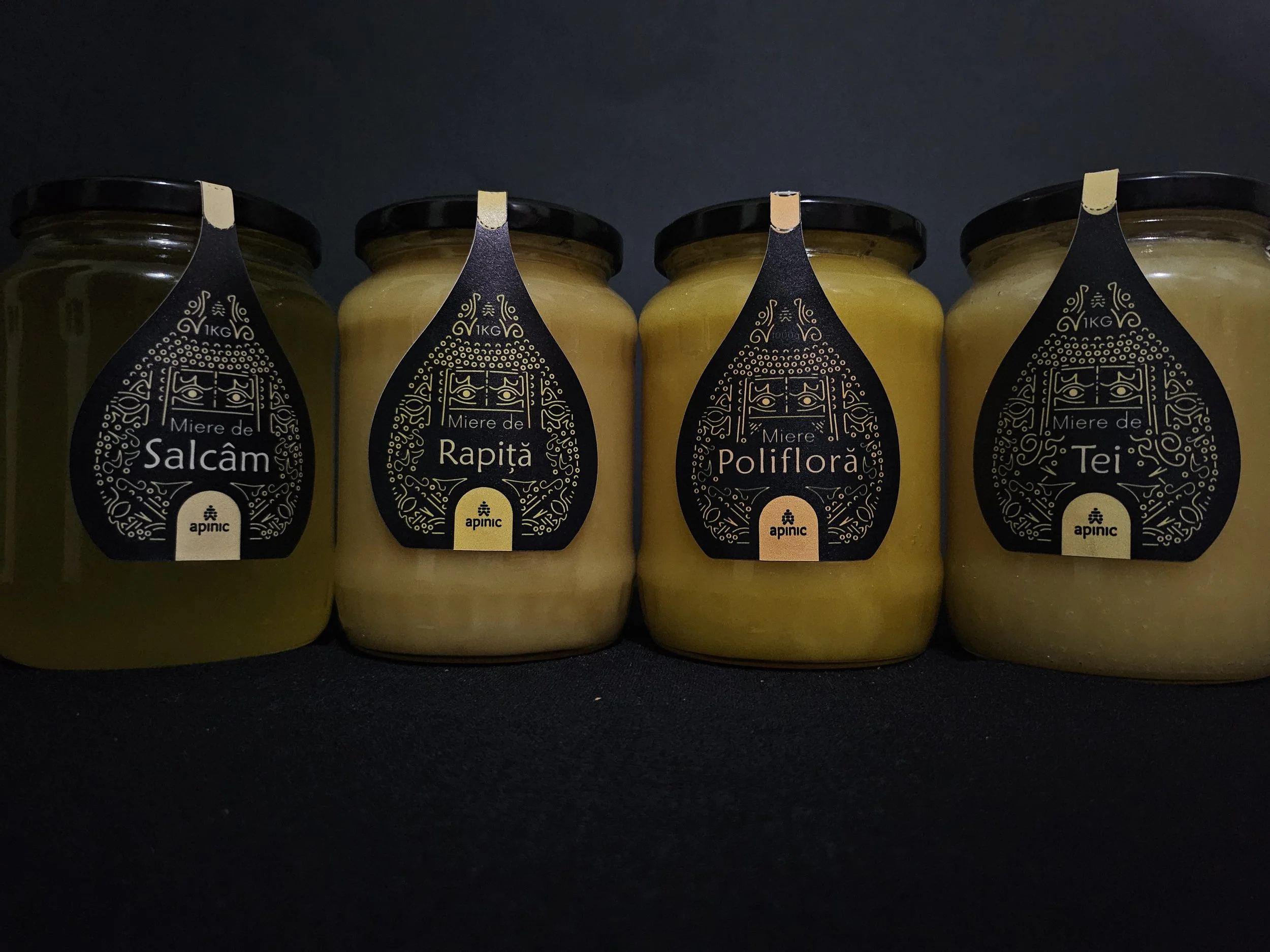
Inspired by the silhouette of a traditional beehive, the label combines a circular cap piece with a shaped body label.

A perforated paper seal connects the two, turning the label into both a visual element and a functional closure that breaks when the jar is opened.
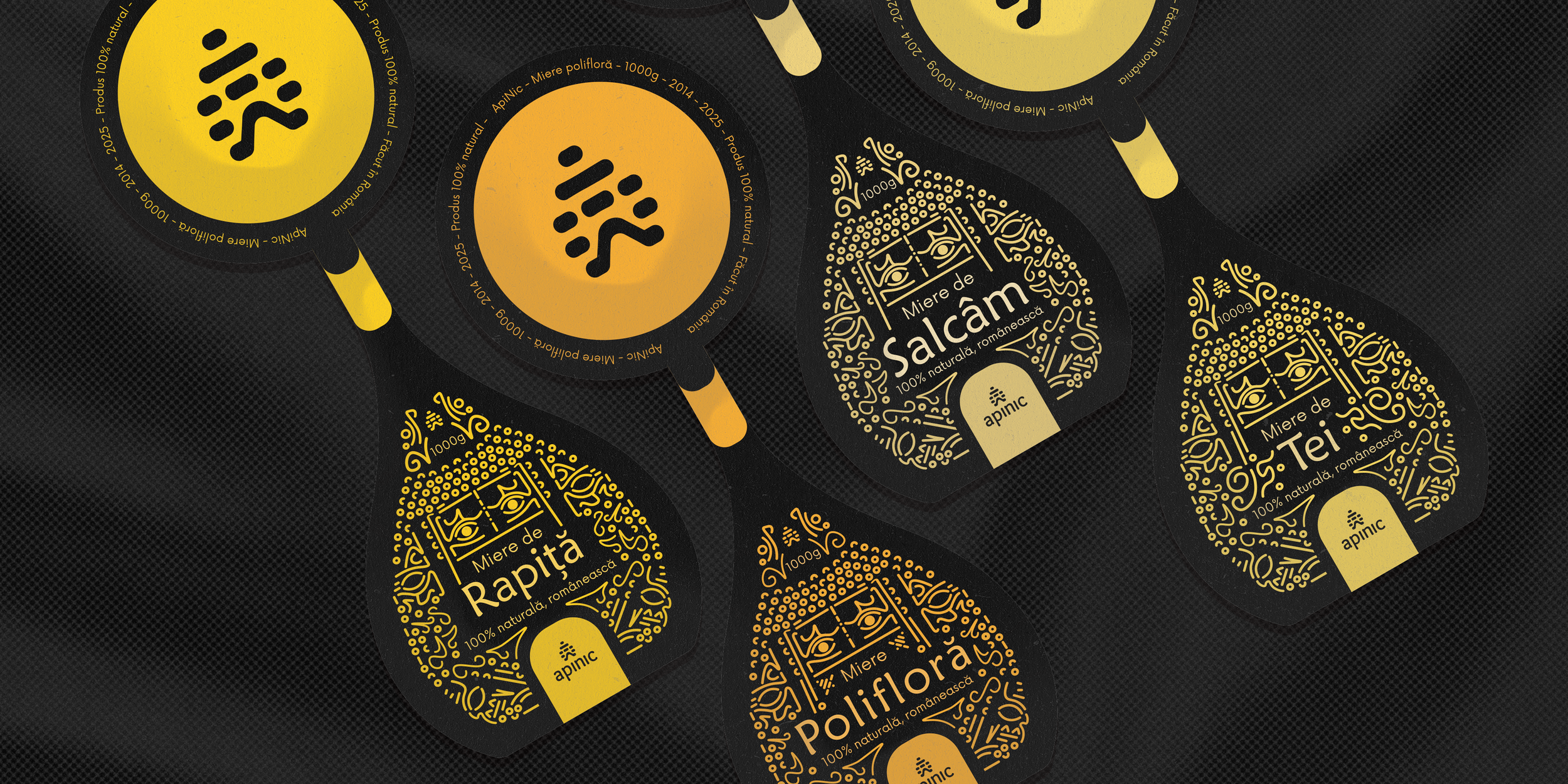
Close-up of honey labels featuring black backgrounds with yellow accents, displaying names like "Miere de Salcam," "Miere de Rapita," and "Miere de Tei," along with decorative designs and product details.
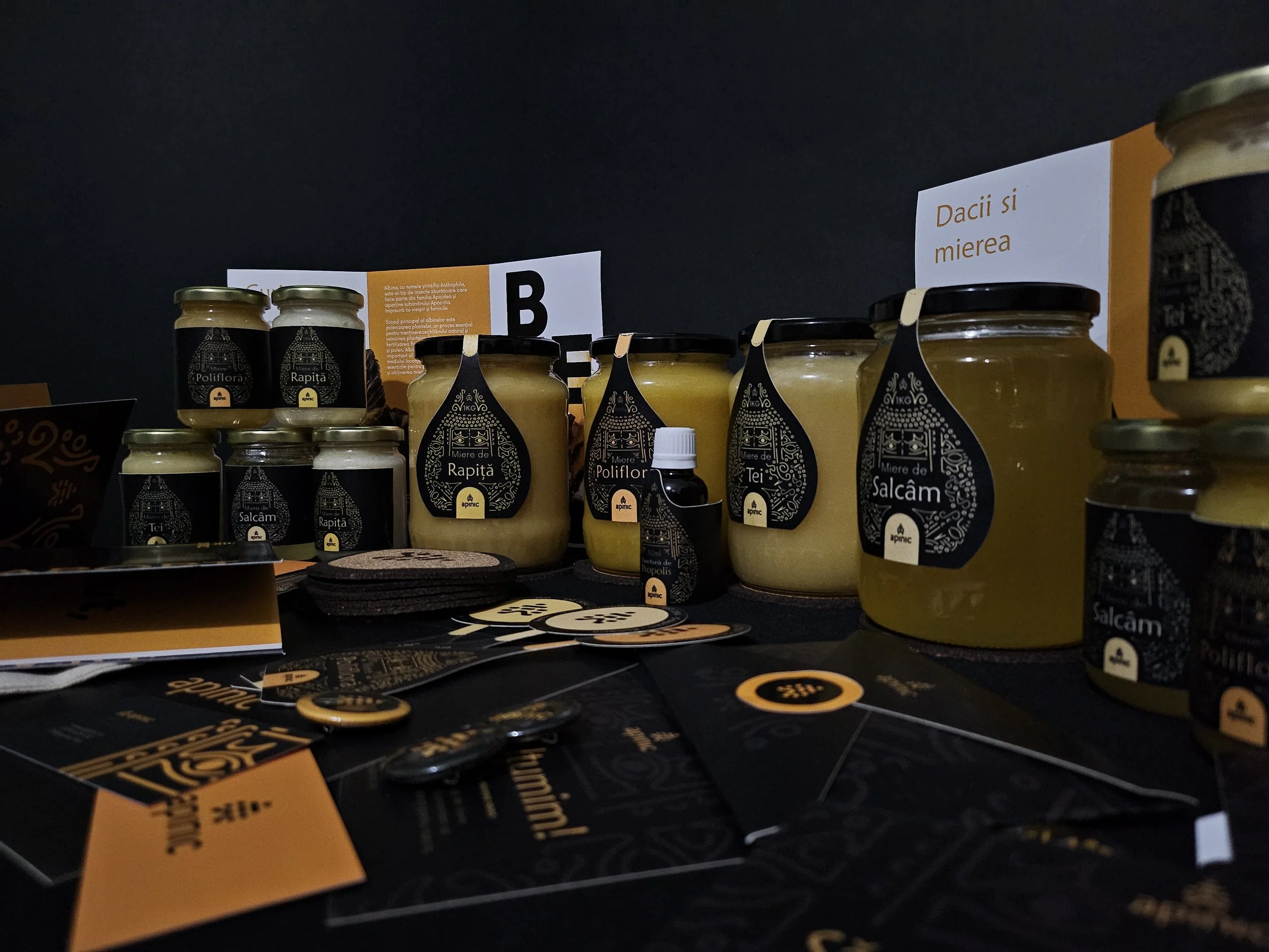
Four glass jars with black lids containing different types of honey, each with a black label featuring gold decorative design and text in Romanian.
Close-up of a black and yellow wristwatch with a round face, featuring a visible gear mechanism underneath the transparent cover, and yellow stitching on the black strap.

ApiNic - Old Vs New

11

IV. Editorial


ApiNic - Informational Trifolds

12

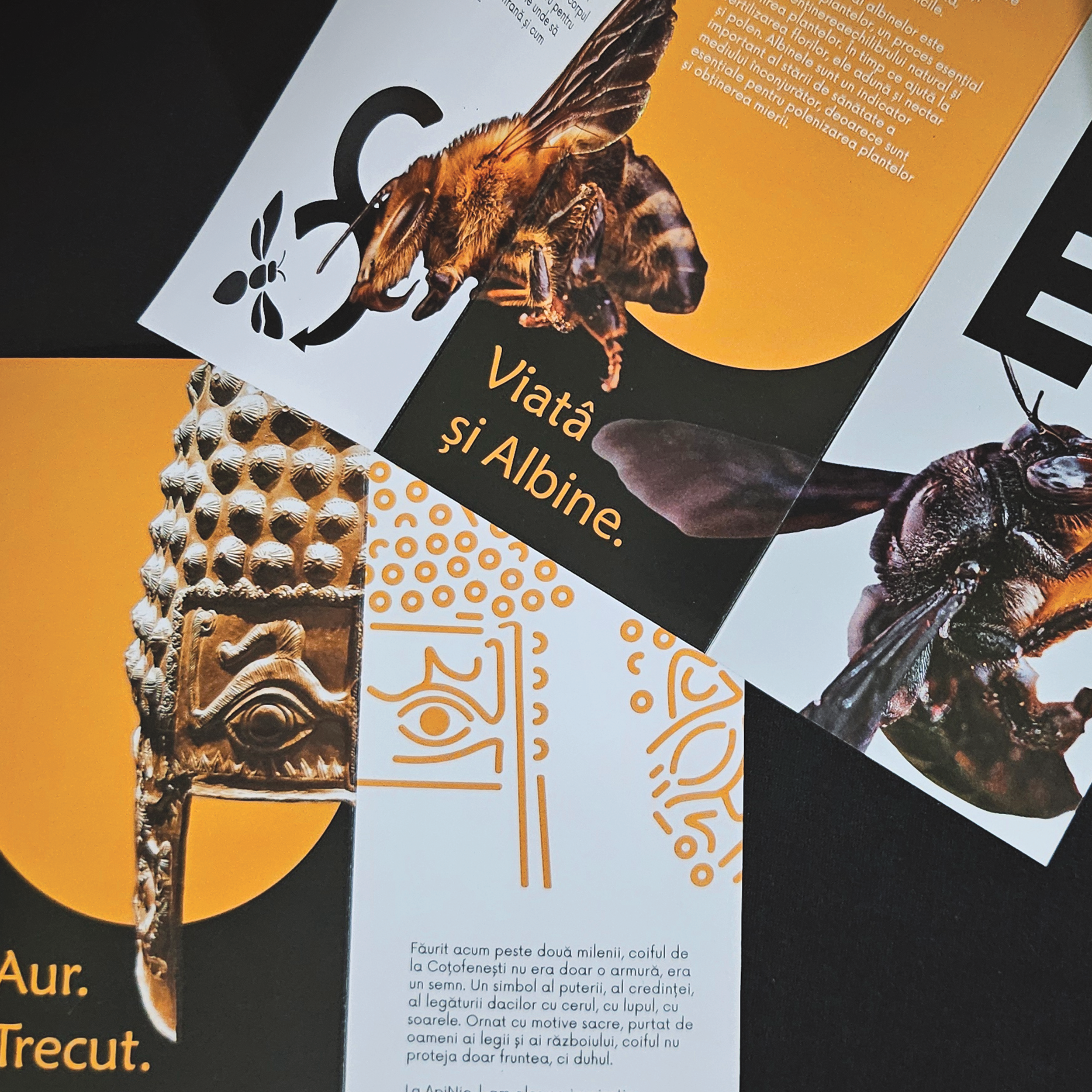
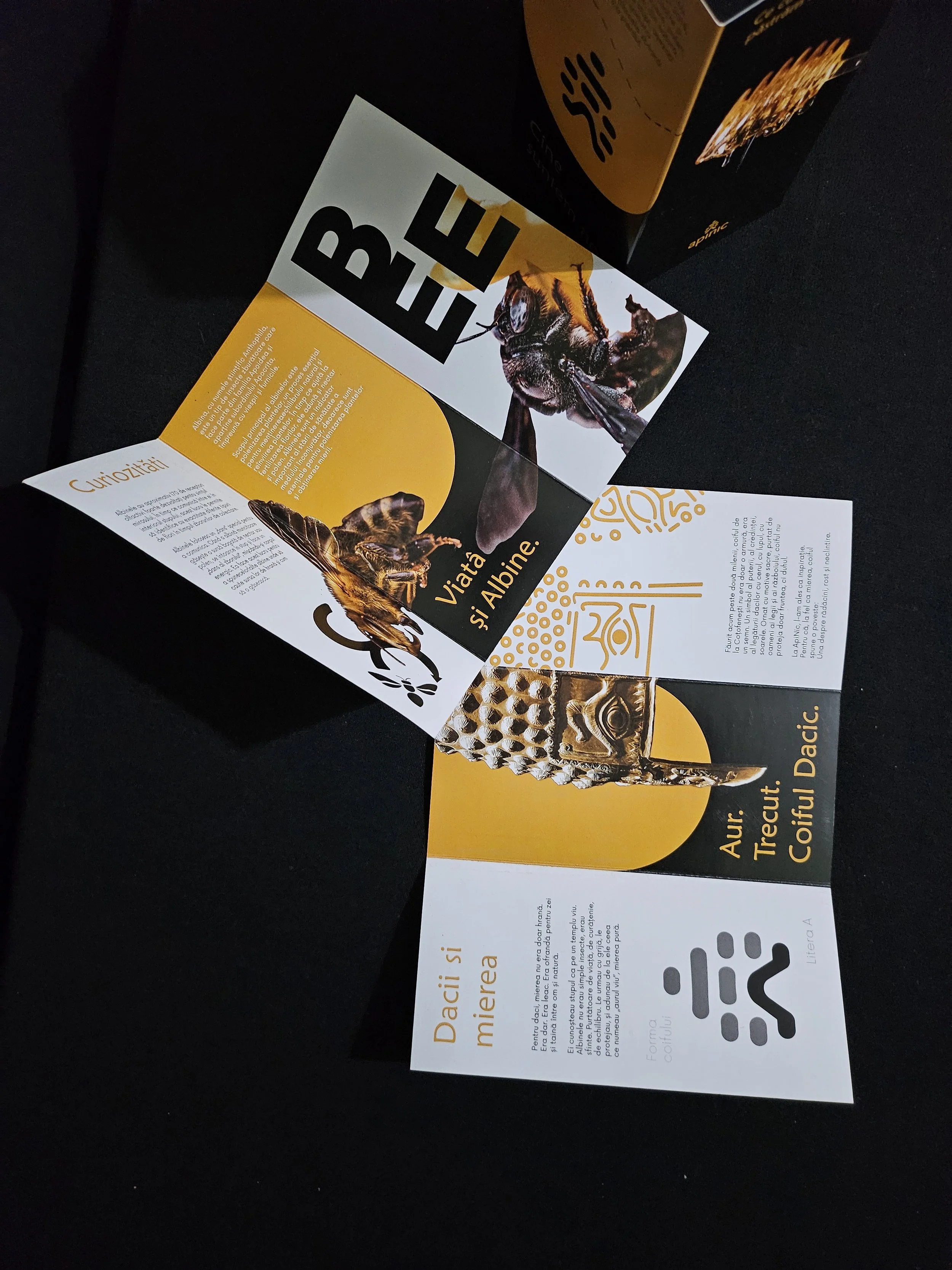
The Gate To The ApiNic’s Story

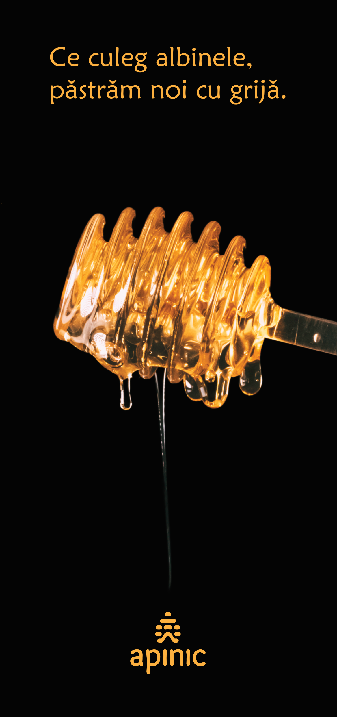
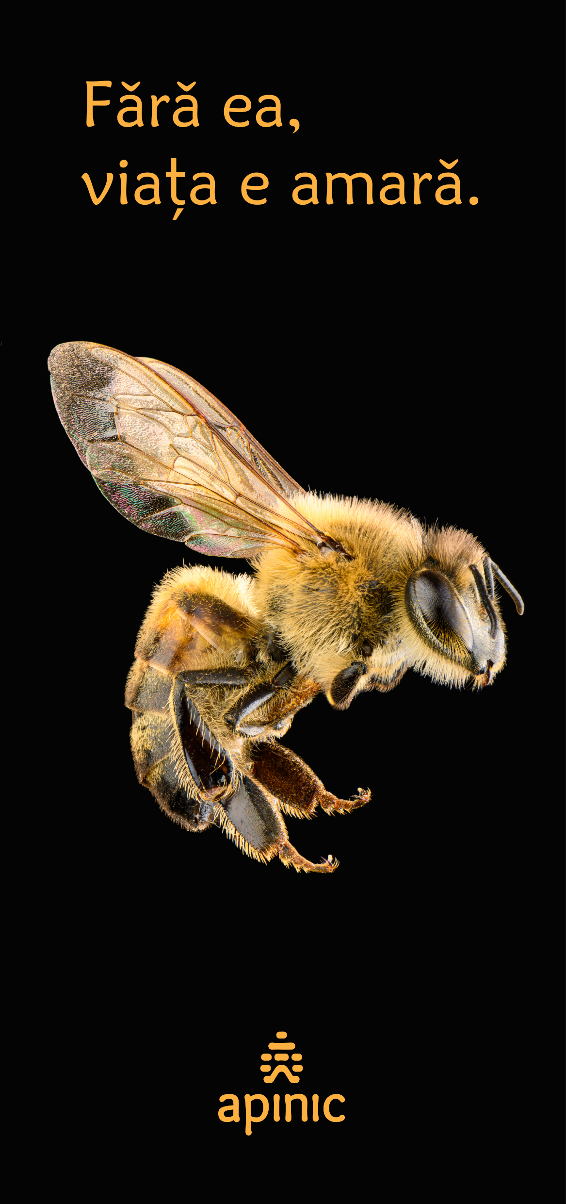
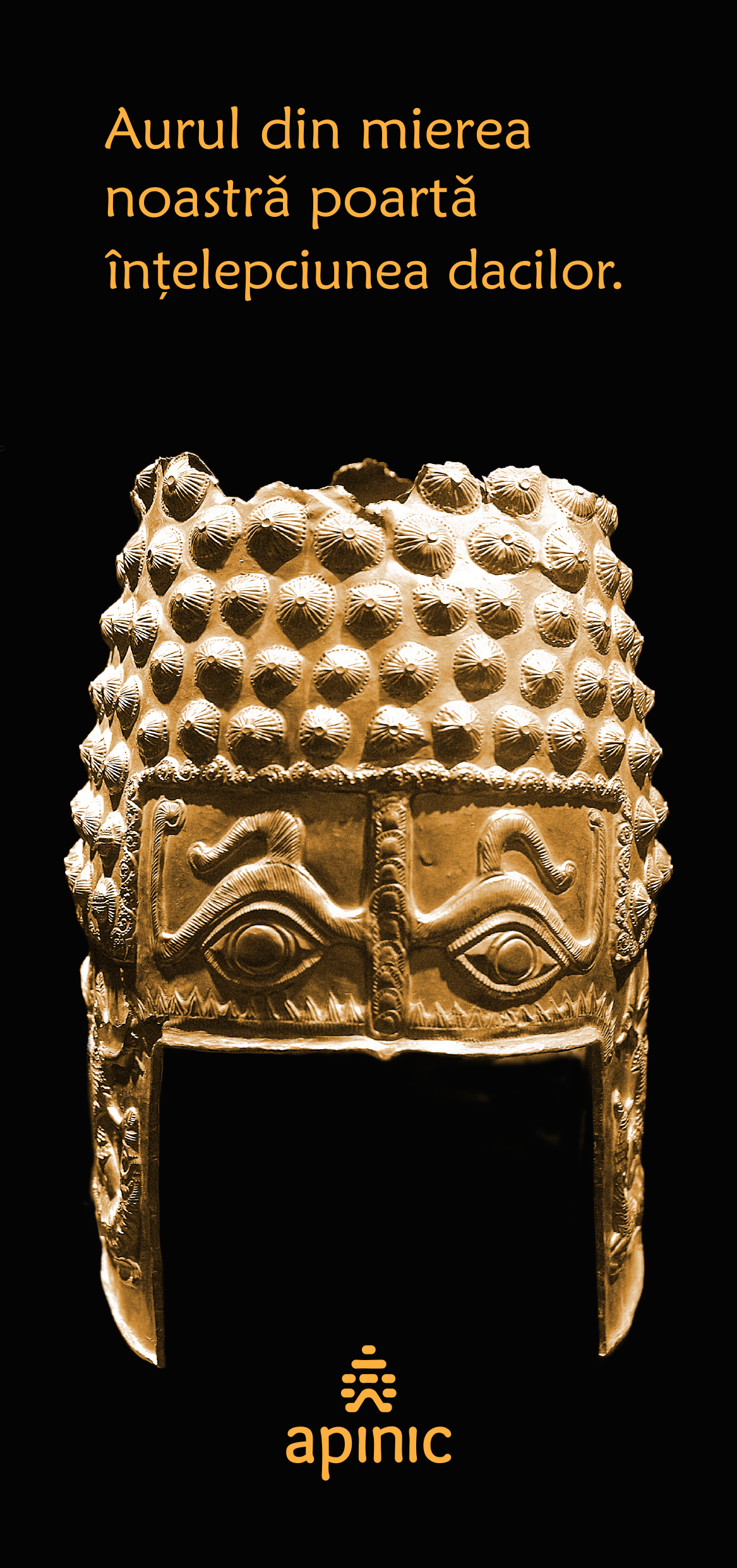
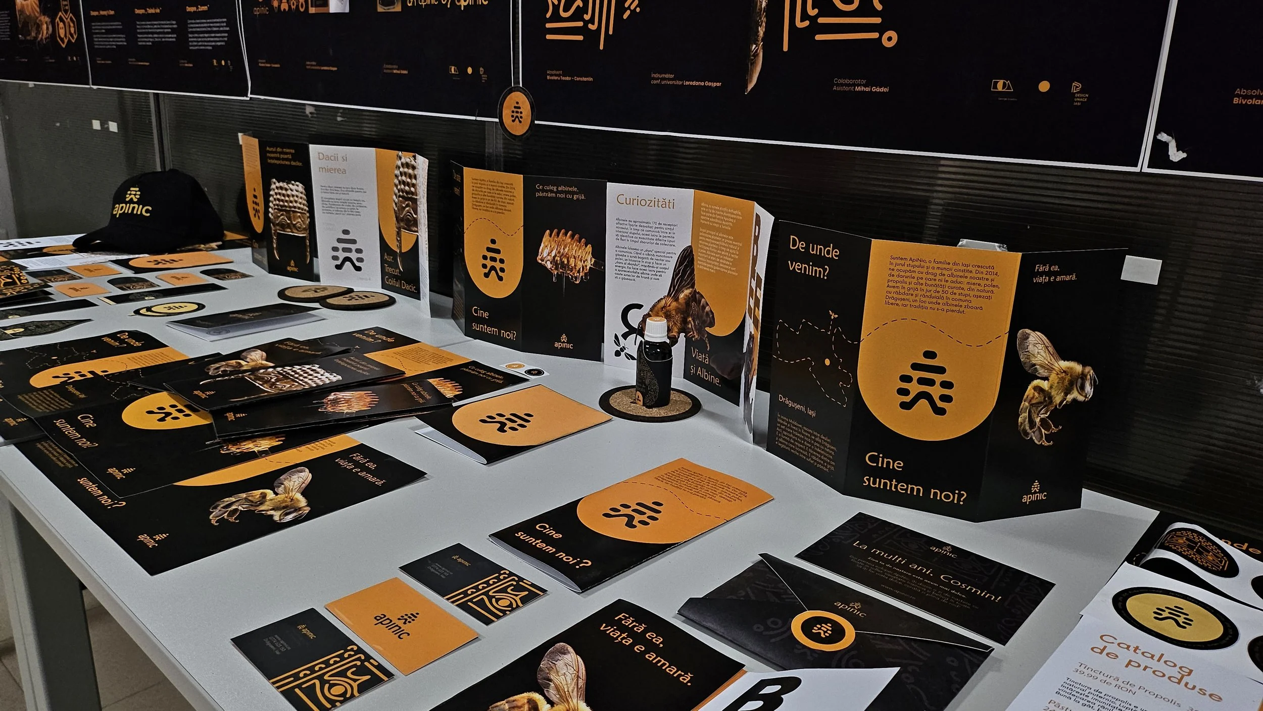
Designed as an introduction to the world of ApiNic, the trifolds combine storytelling and practical information. presenting the brand’s origins, beekeeping location, honey varieties and the process behind its products.
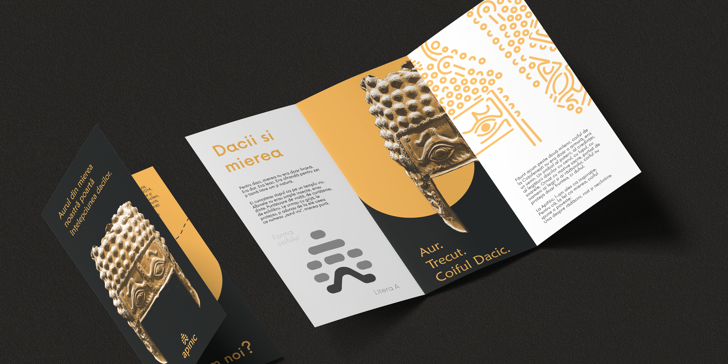
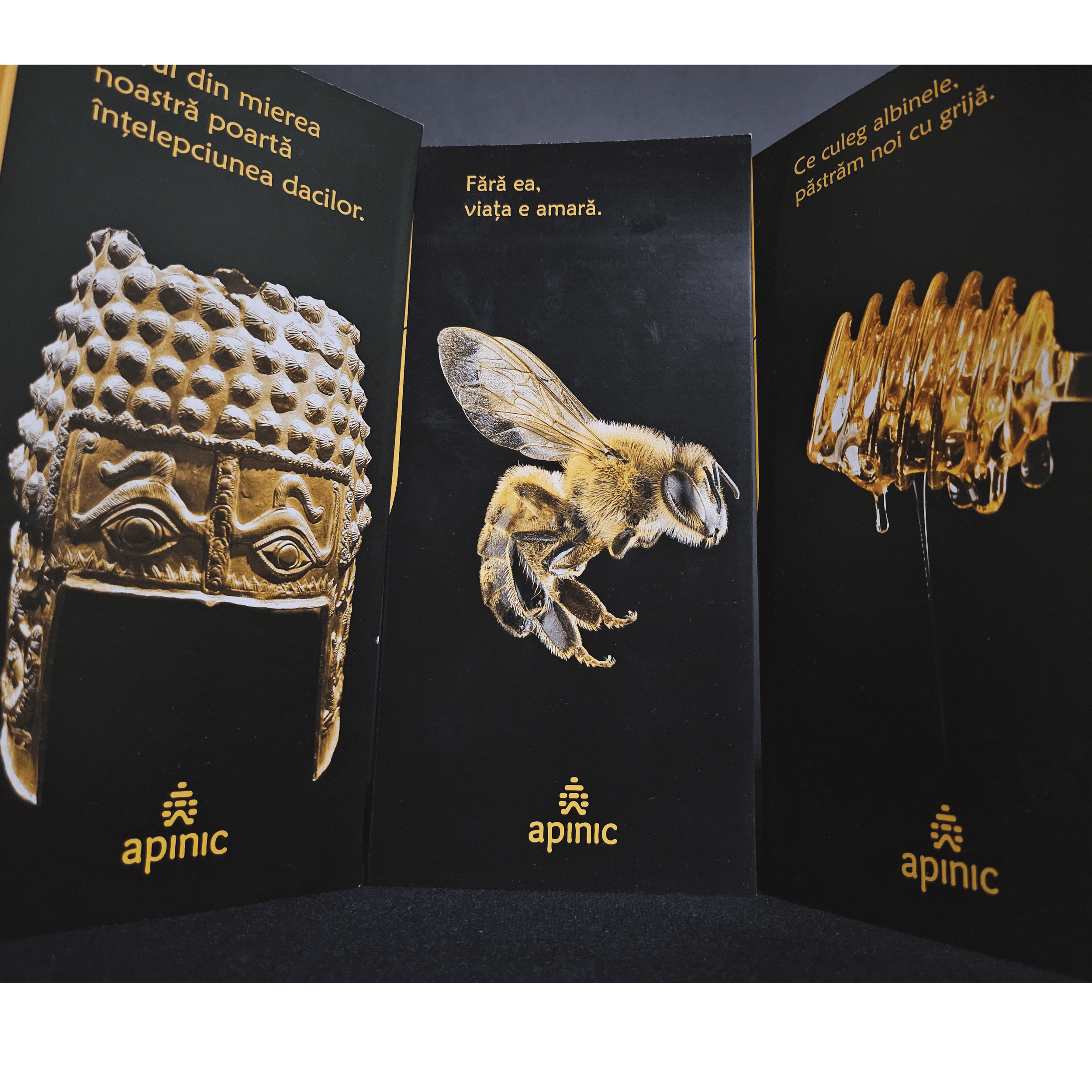
Brochure featuring an ancient gold artifact with detailed carvings, accompanied by text in Romanian and design elements in black, white, and gold.
Close-up of a black display panel with gold text and images of honey bees, honeycomb, and honey jars, with the word 'apnic' repeated at the bottom.
Glow-in-the-dark honey dipper with honey dripping, black background, orange text in Romanian, and APINIC logo at the bottom.
Close-up of a honeybee on a black background with the text 'Fără ea, viața e amară' and the Apinic logo.
Close-up of an ornate, gold-colored ceremonial mask or headdress with intricate patterns, surrounded by black background, with an orange text in Romanian and a logo at the bottom.

ApiNic - Customized Letters

13

The Golden Voice Representing The Honey

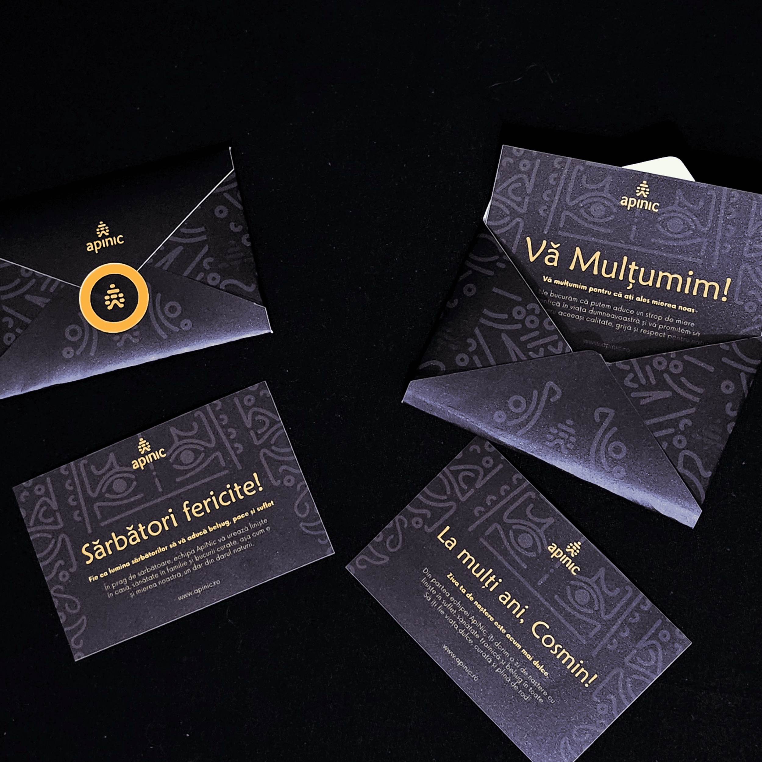
ApiNic’s brand voice comes to life through personalized cards accompanying its products, from thank-you notes to birthday and congratulatory messages. Warm, familiar and slightly playful, they give the brand a more personal character while turning each jar of honey into a small gesture between people.
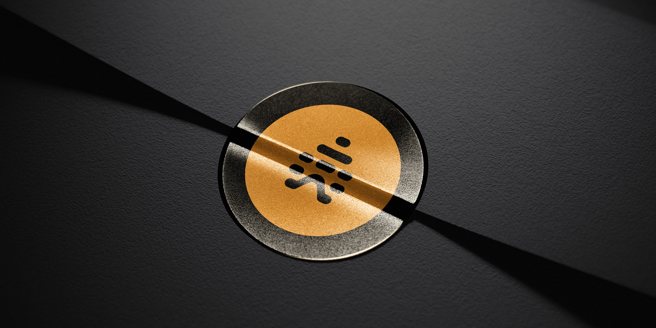
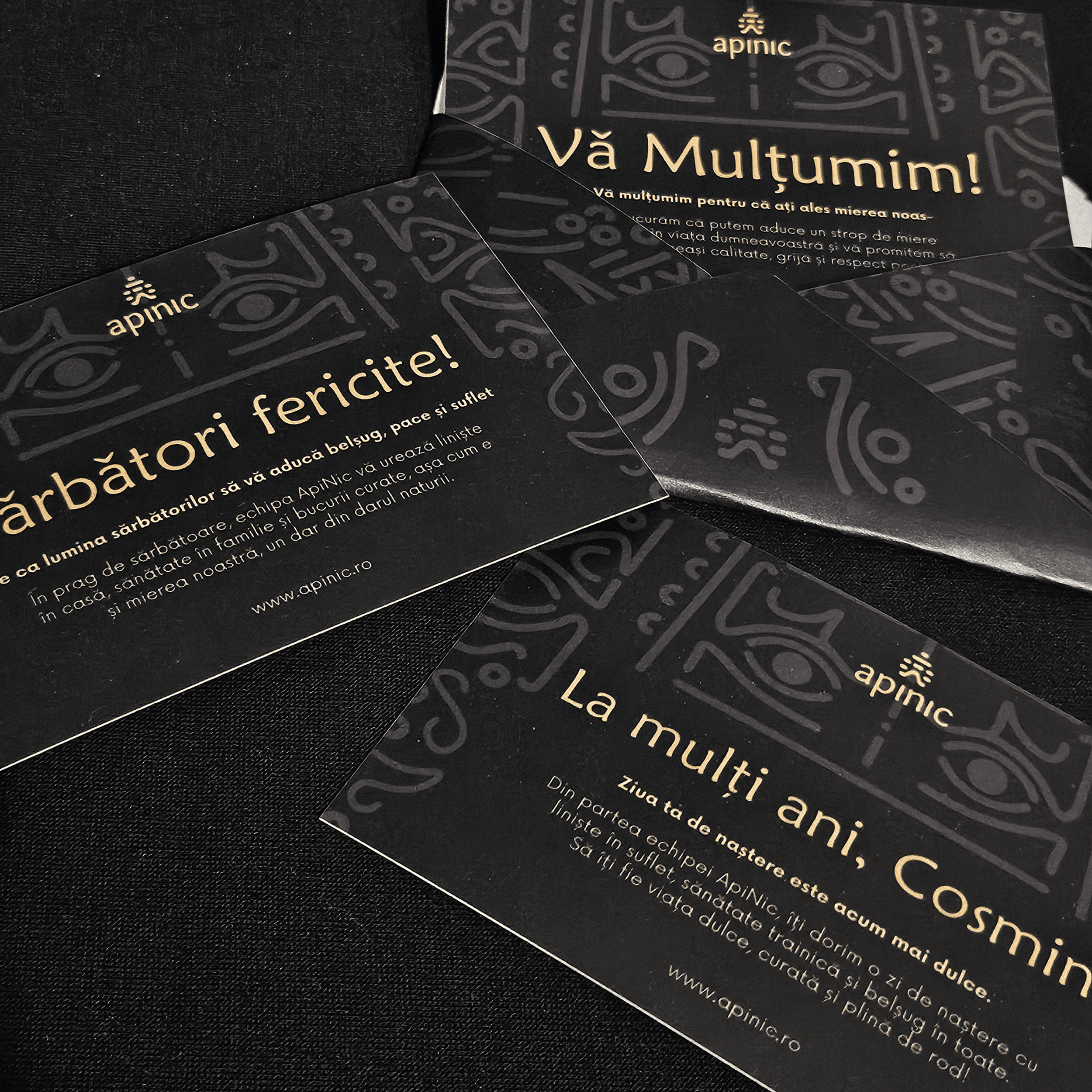
Close-up of a gold-colored circular button with a Wi-Fi signal icon, partially covered by a diagonal black stripe, on a dark textured surface.

ApiNic - Client Discount Passport

14

An Immersive Experience

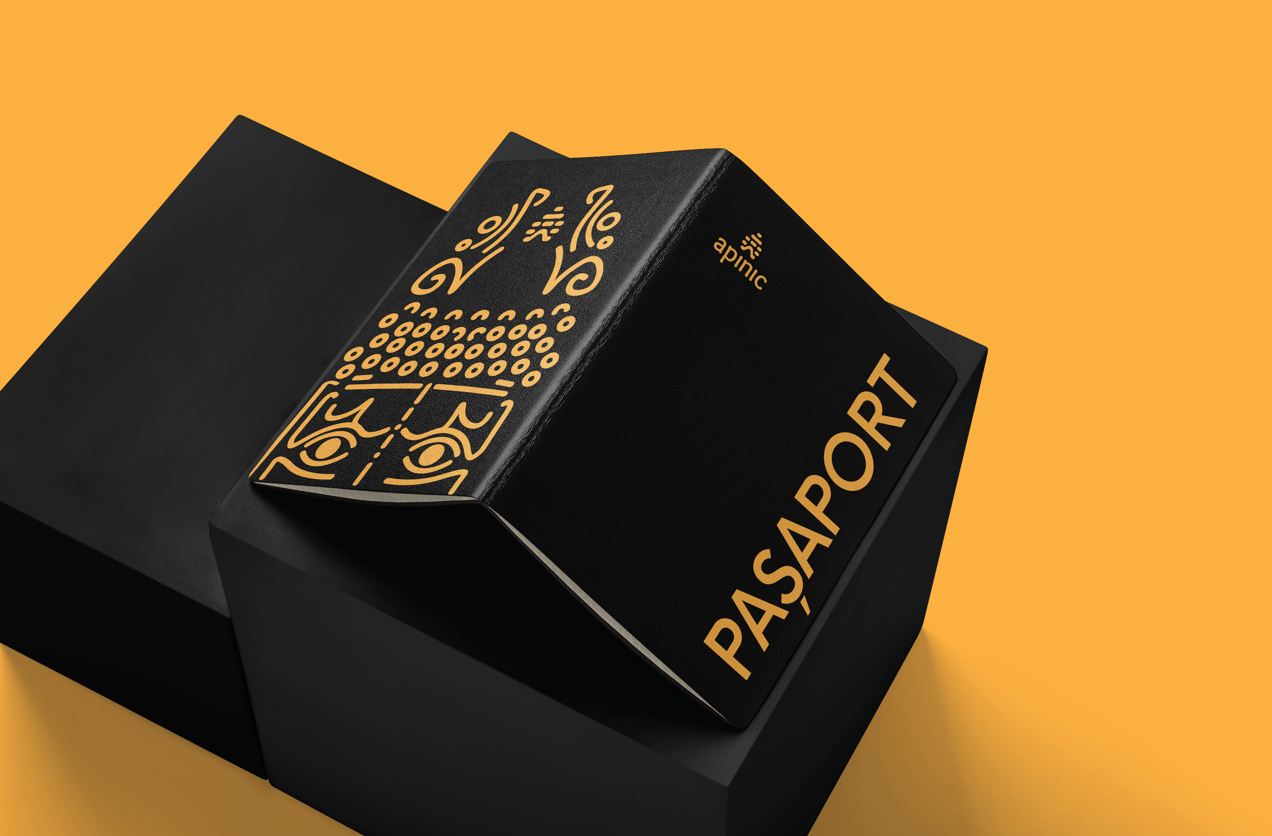
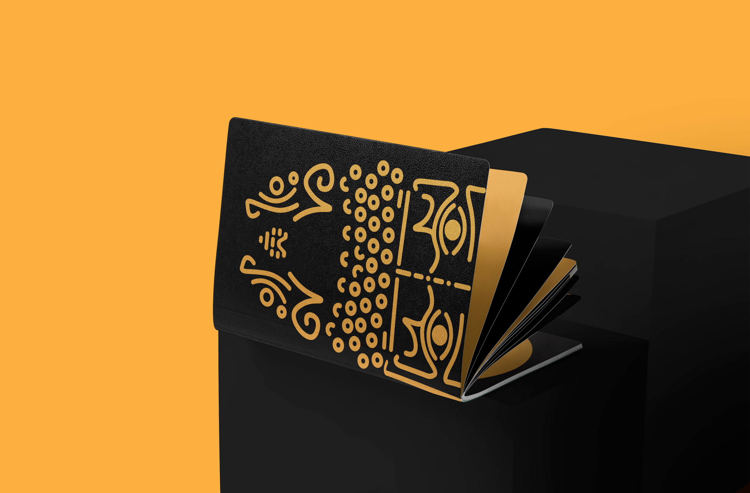
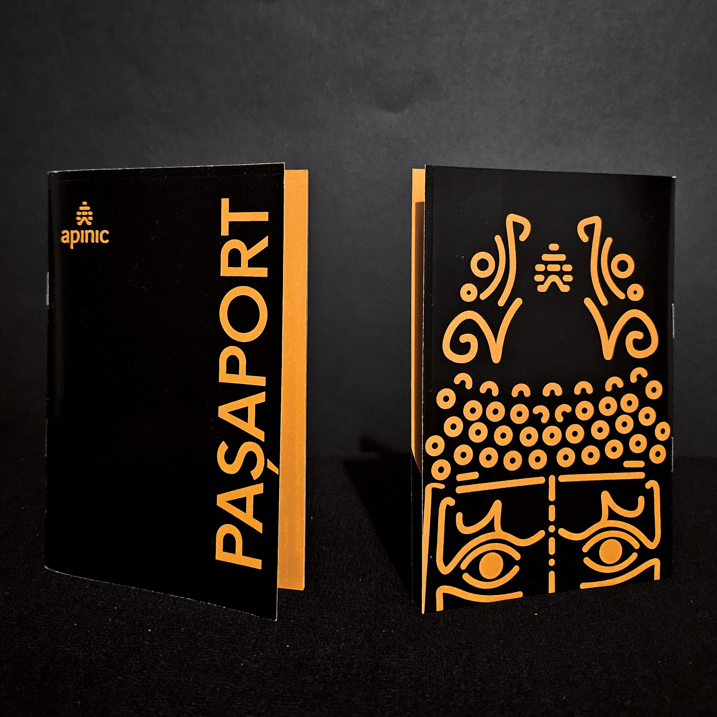
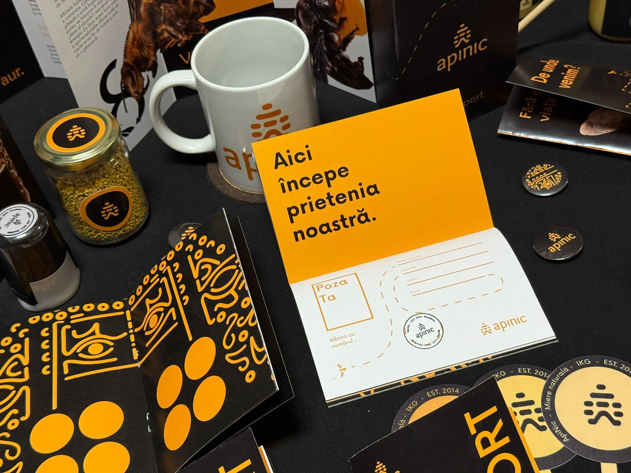
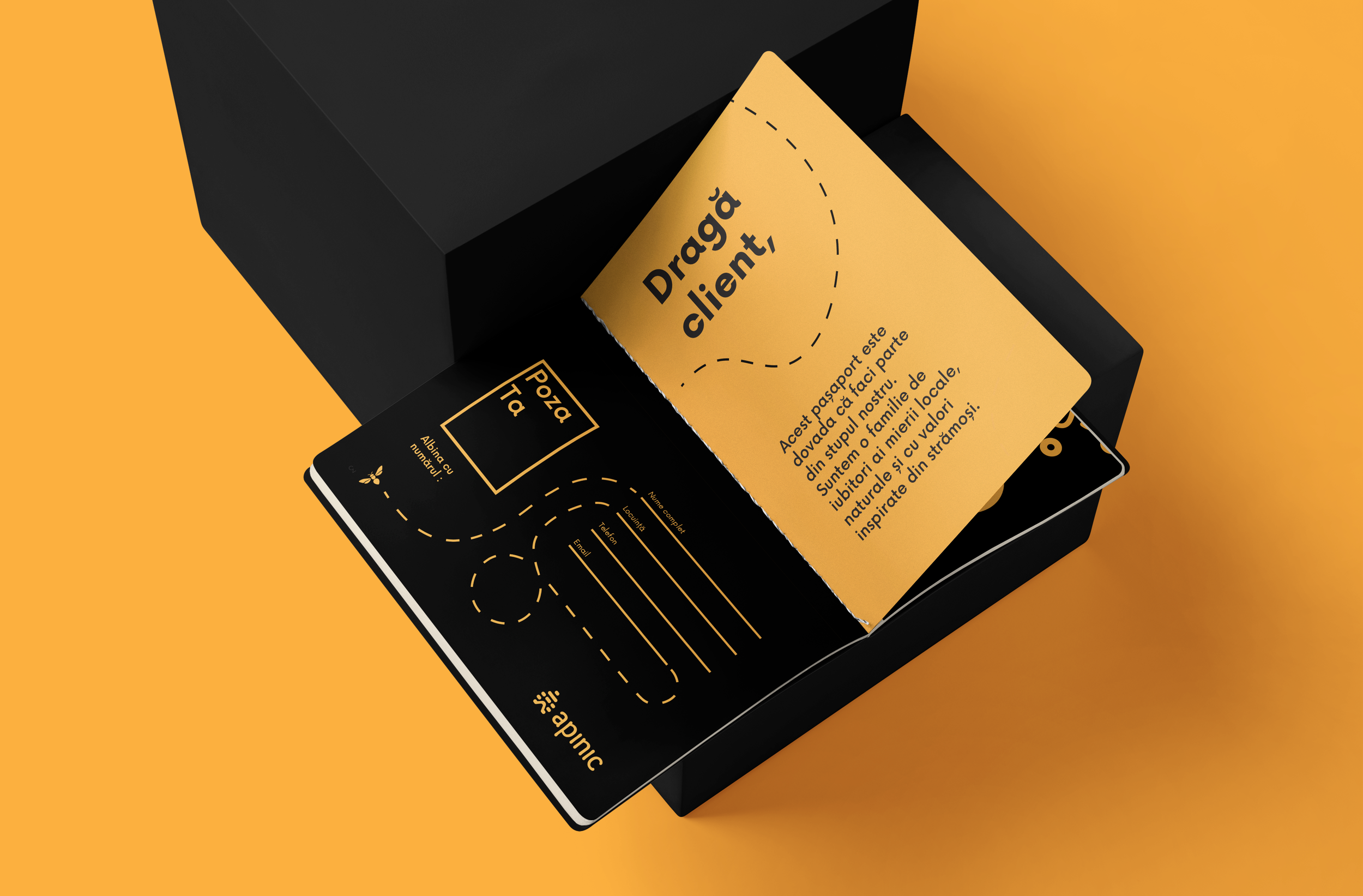
Created as a personal piece for each customer, the ApiNic Passport transforms repeat purchases into a collectible experience. Each product pack earns a new stamp, gradually unlocking benefits while creating a more playful and immersive relationship with the brand.
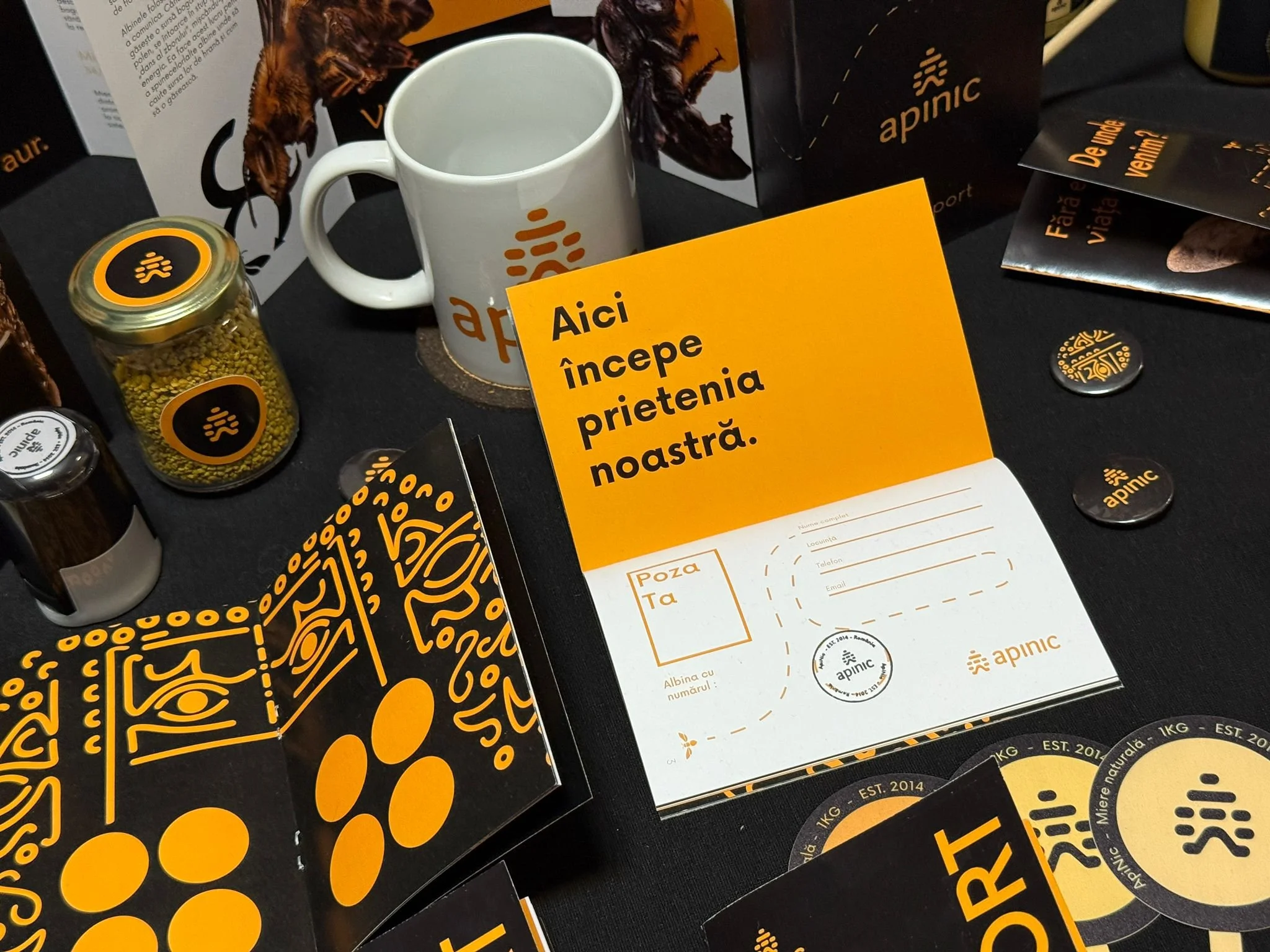
A display table with promotional items for Apinic, an herbal product brand. Items include a white mug with the Apinic logo, a jar of pellets, brochures, and informational cards with orange and black branding. There is a yellow sign with black text in Romanian that says 'Aici începe prietenia noastră'.
A black and orange card with a dotted path guiding to 'Drag here' and a form to fill out contact information. The card is partially inside a black box on an orange background.
Close-up of a black box with gold design and text on a yellow background.
Black spa card with a gold line drawing of a face, set against a yellow background with a black stand.

ApiNic - Research & Documentation

15

An Intensive “Beesearch “

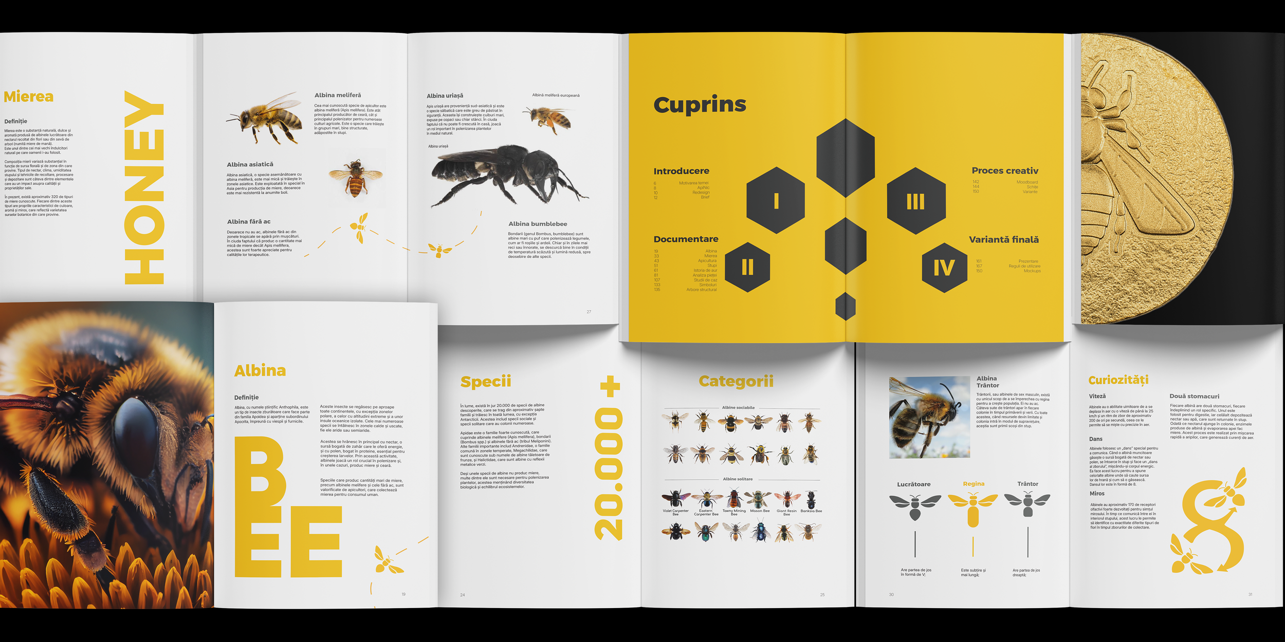
The ApiNic identity was supported by research into honey, bees and apiculture, documented through a dedicated editorial system.

Complex information was translated into clear visual compositions, combining typography, imagery, illustration and infographics.
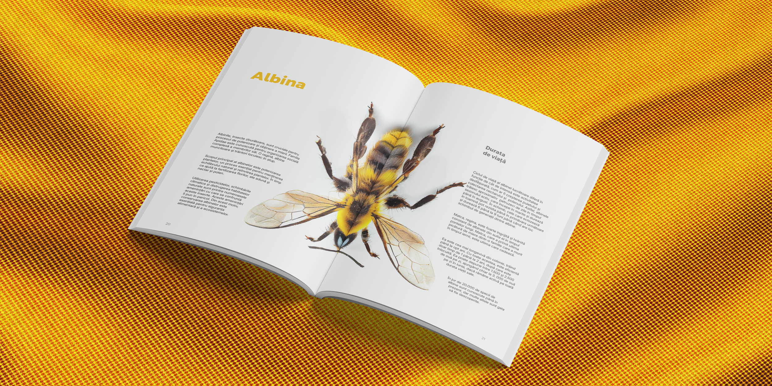
Open book with a large, detailed illustration of a bee and text about it, on a yellow and red patterned table.
An open book or magazine spread about bees, honey, and insect species, with images of bees, honeycombs, and pages with text and diagrams, featuring a yellow and black color scheme.

V. ApiNic Materials


ApiNic - Pictures of Physical Applications

16
Orange COVID-19 safety warning card with a black icon of a person wearing a mask and text in Romanian that instructs checking the ID and vaccination status for entry.
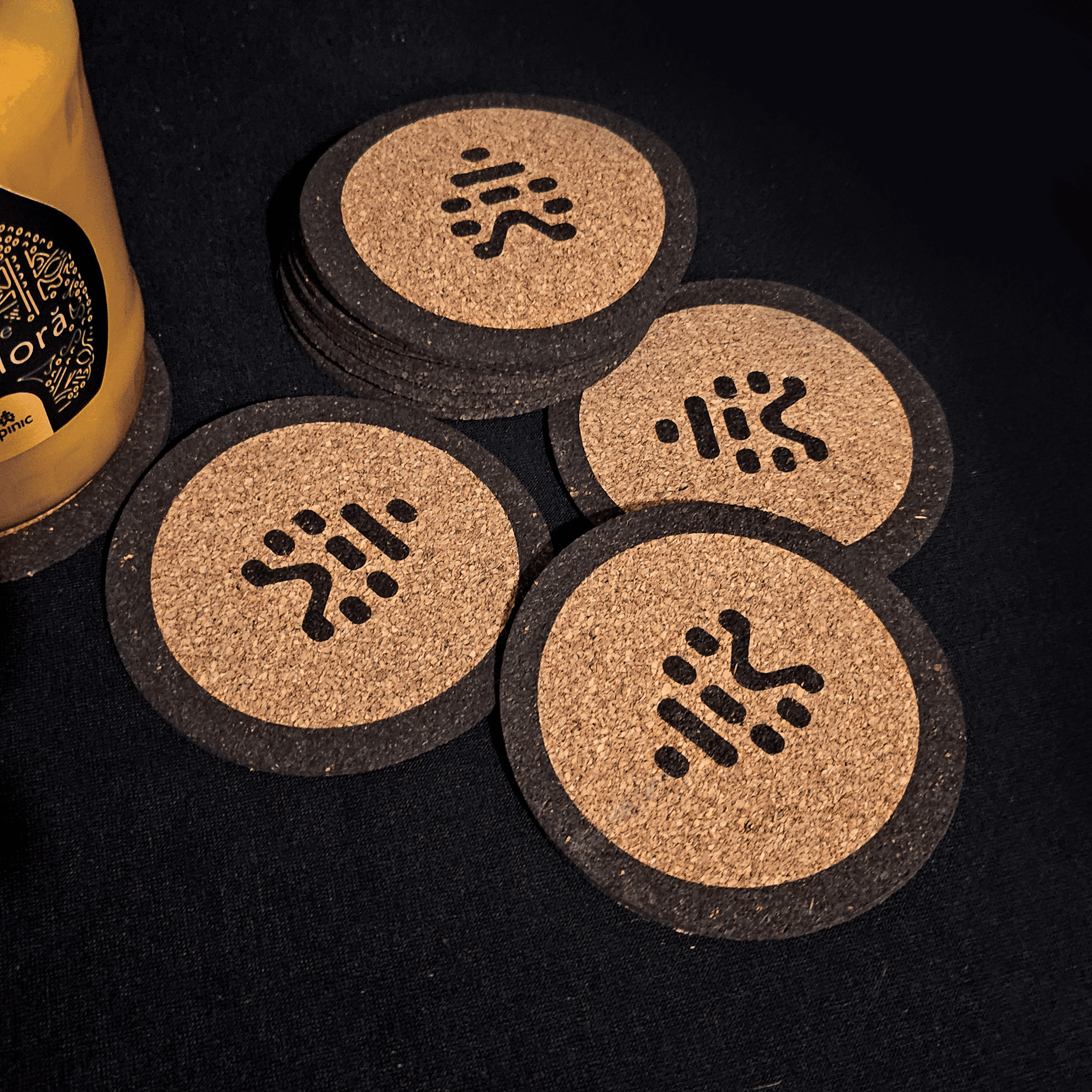
Close-up image showing a collection of round coasters with a black and beige design on a dark surface, alongside a yellow object partially visible on the left side.
Close-up of a black electronic device with a coiled metal element, gold-colored text, and symbols on the surface.
Close-up image of a black and yellow canned beverage label with decorative yellow patterns and partially visible text.
Close-up of a black container lid with a beige label printed with a black stylized fish icon and the text "Mięso de Salcâm". The lid is on a metallic surface, with a pull tab visible.

Let’s get in touch and expand your brand’s visual system together.

Check out the other selected projects:

View ApiNic project
View ApiNic project
View ApiNic project

Email