

NSEW - Project Brief
00
NSEW
NSEW was developed during my participation in READSEARCH, a research internship at PXL-MAD School of Arts.
The brief was to develop a new visual identity for the Reading Type & Typography Master Course at PXL-MAD, communicating its experimental approach to typography and its international character.
The identity needed to speak to students from around the world, reflecting the international character of the Master’s programme. Typography became a bridge between cultures through a shared visual language capable of connecting different backgrounds, perspectives and ways of reading.
The brief was to redesign ApiNic’s existing identity, creating a more contemporary and cohesive brand system while preserving its connection to traditional Romanian apiculture.
The new identity needed to improve consistency across packaging and communication, support a growing range of products, and establish a stronger foundation for the brand’s future development.
Type
Brand identity
Rebranding
Year
2026
Context
Internship Project
Commisioned
Location
Belgium
Role
Independent
Designer
Industry
Education
Typography
Entire project independently conceived, designed and producted.
Brand Strategy - Visual Identity - Packaging -Editorial Design - Motion Design - 3D Visualisation
Brand Strategy - Visual Identity - Typograpy - Motion Design - Campaign Design - Reading Research
I. Introduction
NSEW - About The Project
01
Reading Type,
Finding Direction
Reading Type & Typography is an international Master’s programme at PXL-MAD School of Arts in Hasselt, Belgium, centred around typography as a field of research, experimentation and communication.
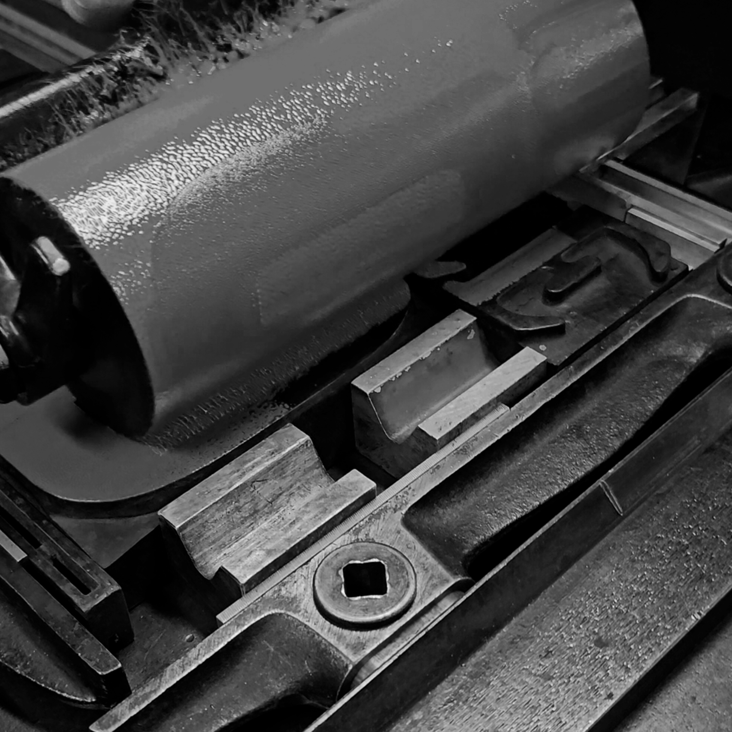
Rather than approaching its identity through a conventional logo, NSEW explores how reading, movement and orientation can become the foundations of a typographic system.
NSEW - Project Approach
02
From Reading
to Identity
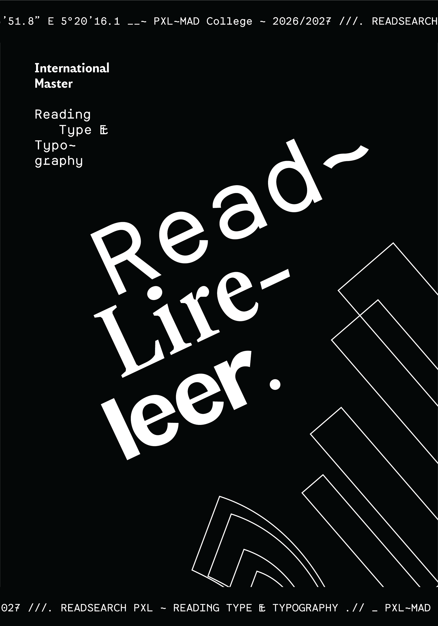
Research into reading behaviour revealed that reading is shaped by rhythm, hierarchy, movement, culture and interaction. This became the starting point for an identity in which typography functions not only as information, but as the visual system itself.
NSEW - Reading Behaviour Research
03
READSEARCH
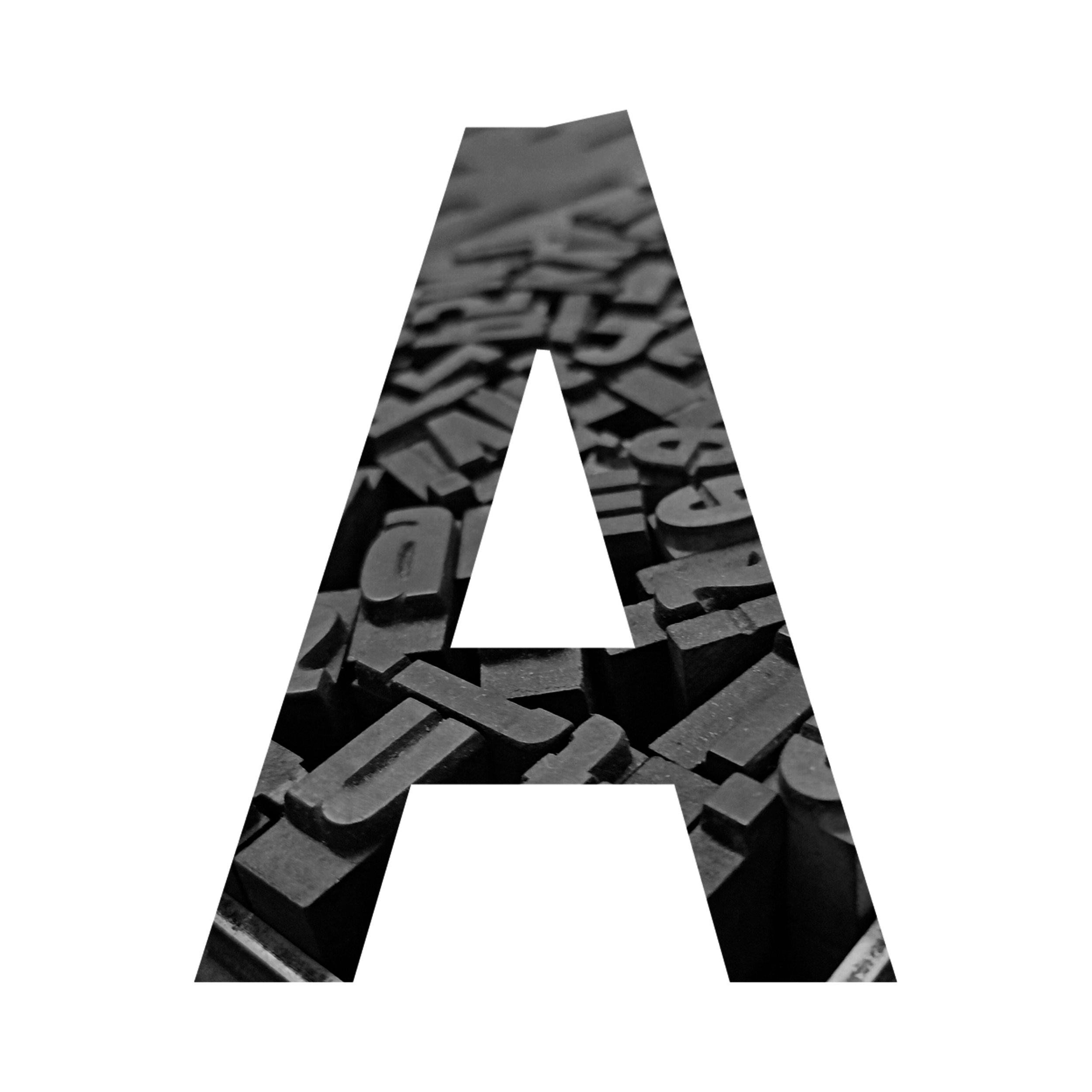
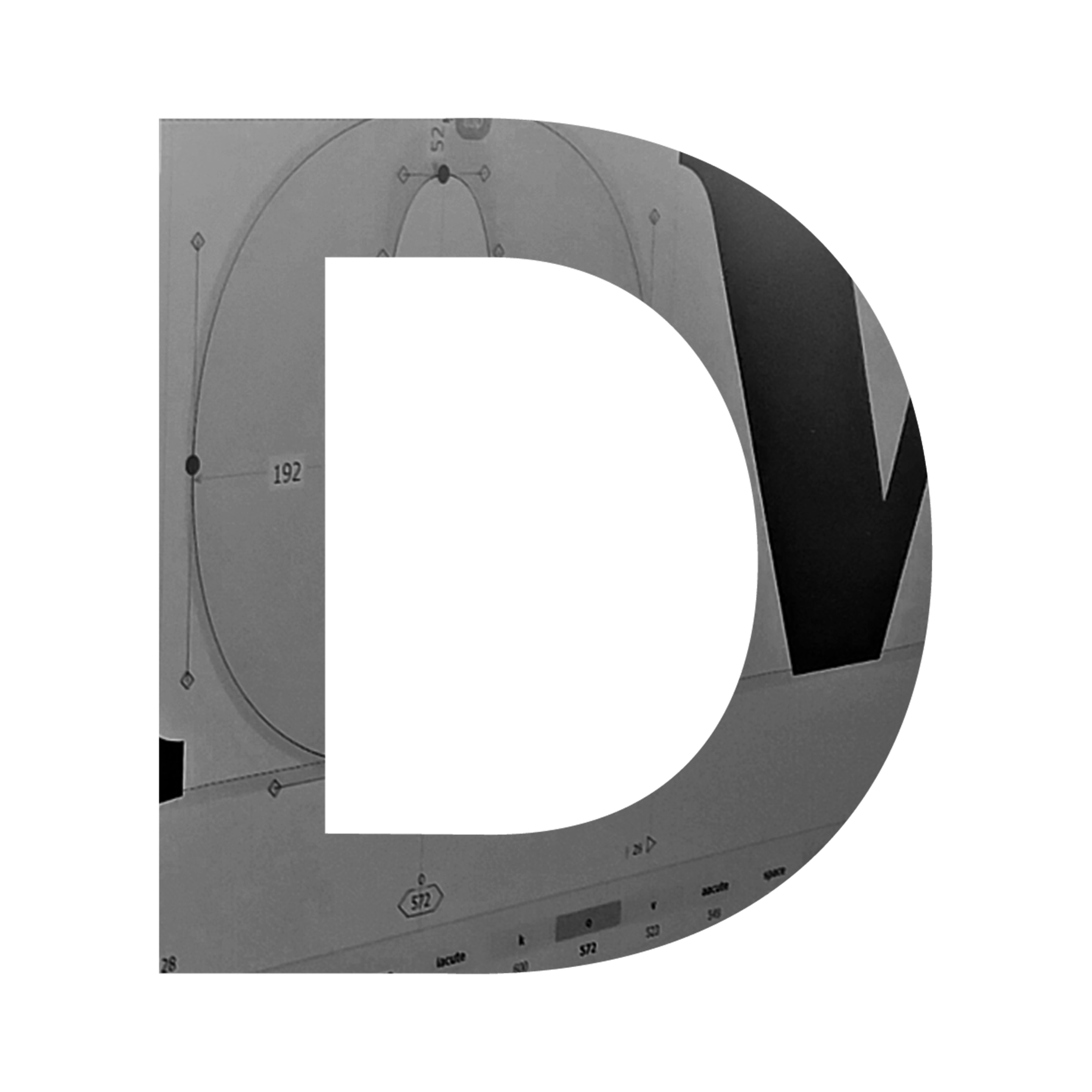
During the READSEARCH internship, I investigated reading behaviour, different modes of reading and the fundamental elements that shape typography — from spacing and kerning to letterforms and glyphs.
II.The Visual System
NSEW - Visual System : Explained
04
A Brand With No
Fixed Logo
NSEW does not rely on a traditional fixed logo as its primary identifier.
Instead, recognition is established through the wider visual system: recurring layouts, typographic hierarchy, positioning, photography, coordinates, spatial relationships and motion.

100% Glyphs
The identity introduces no separate geometric graphic language.
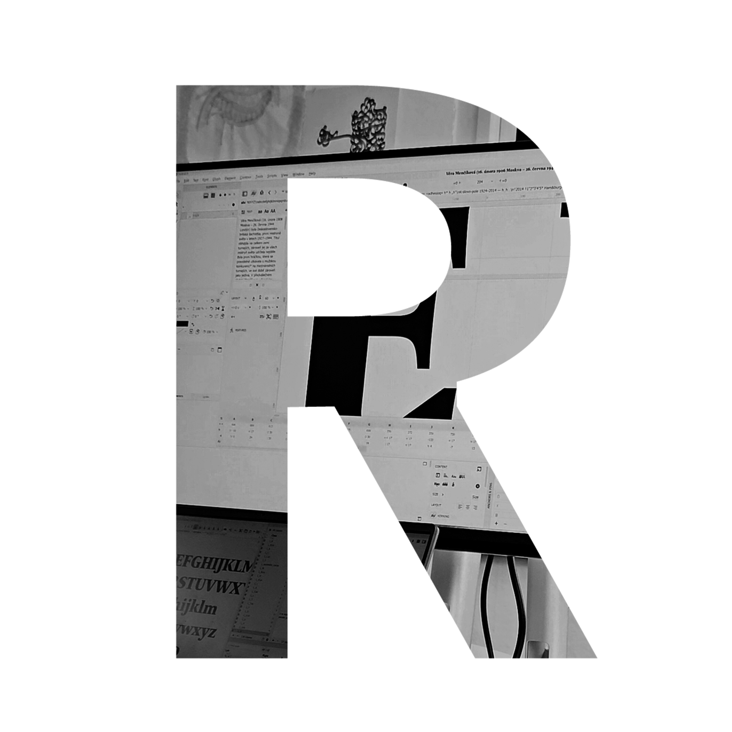
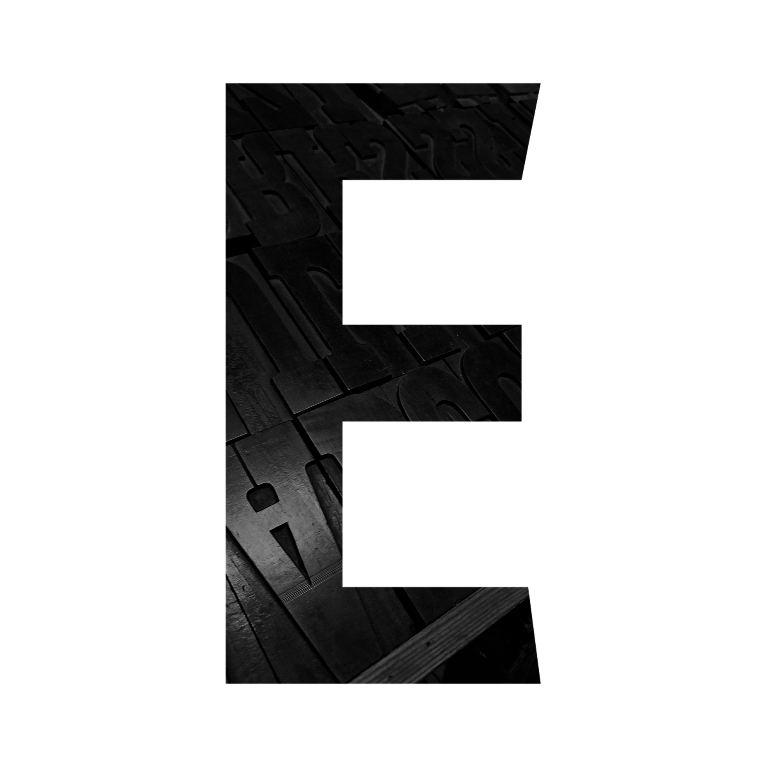
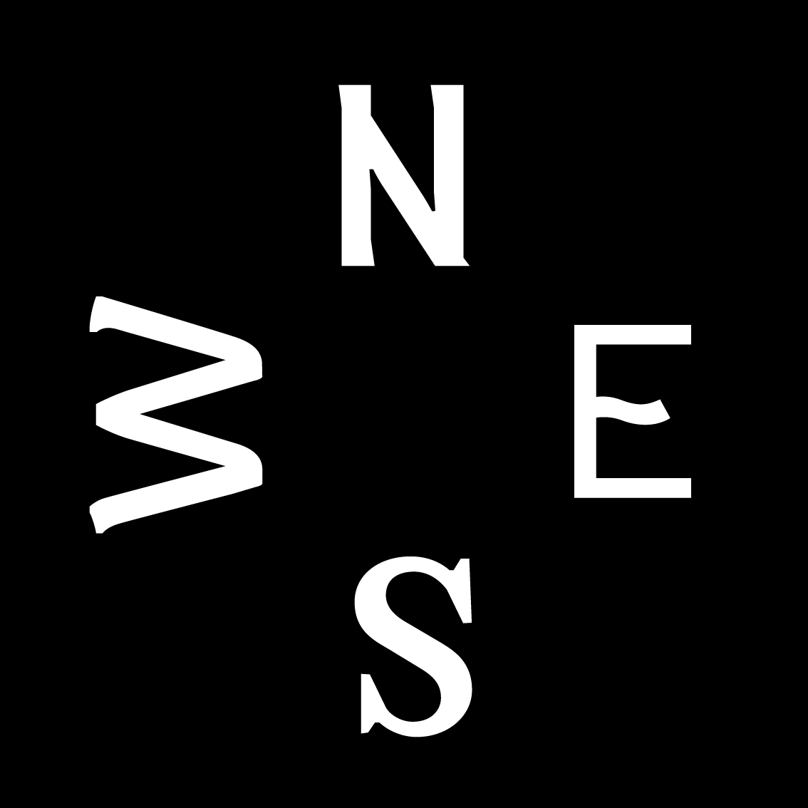
Its visual elements are constructed through typography, allowing letters and glyphs to operate simultaneously as text, symbols and graphic forms. Typography therefore becomes both the content and the visual material used to communicate it.
NSEW - Student’s Typography
05
Students As Part
Of The Identity
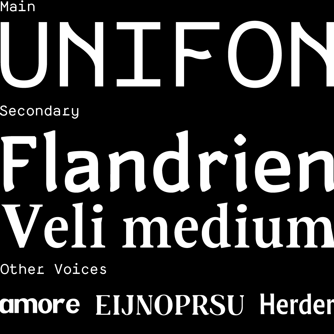
The typefaces used throughout NSEW were designed by former students of the Reading Type & Typography Master’s programme.
By using work created within the programme itself, its students’ typography becomes part of the programme’s own visual identity.
NSEW - Coordinates System
06
Location
Through Coordinates
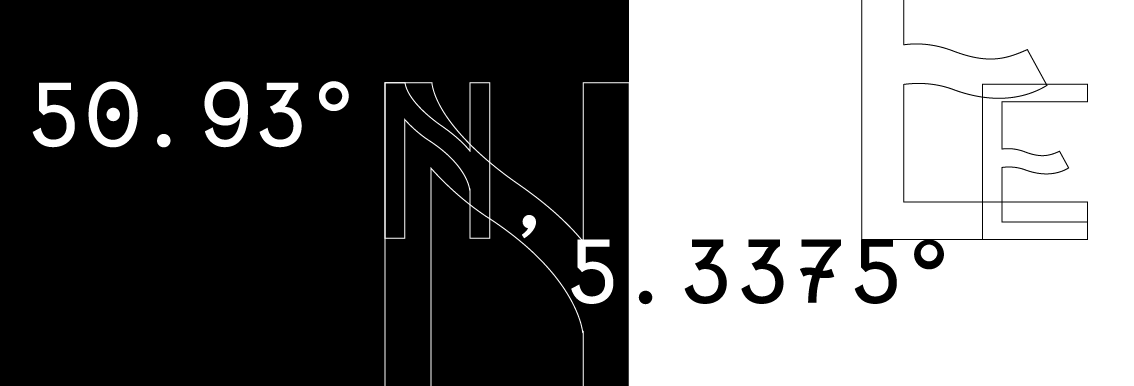
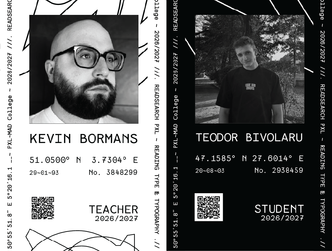
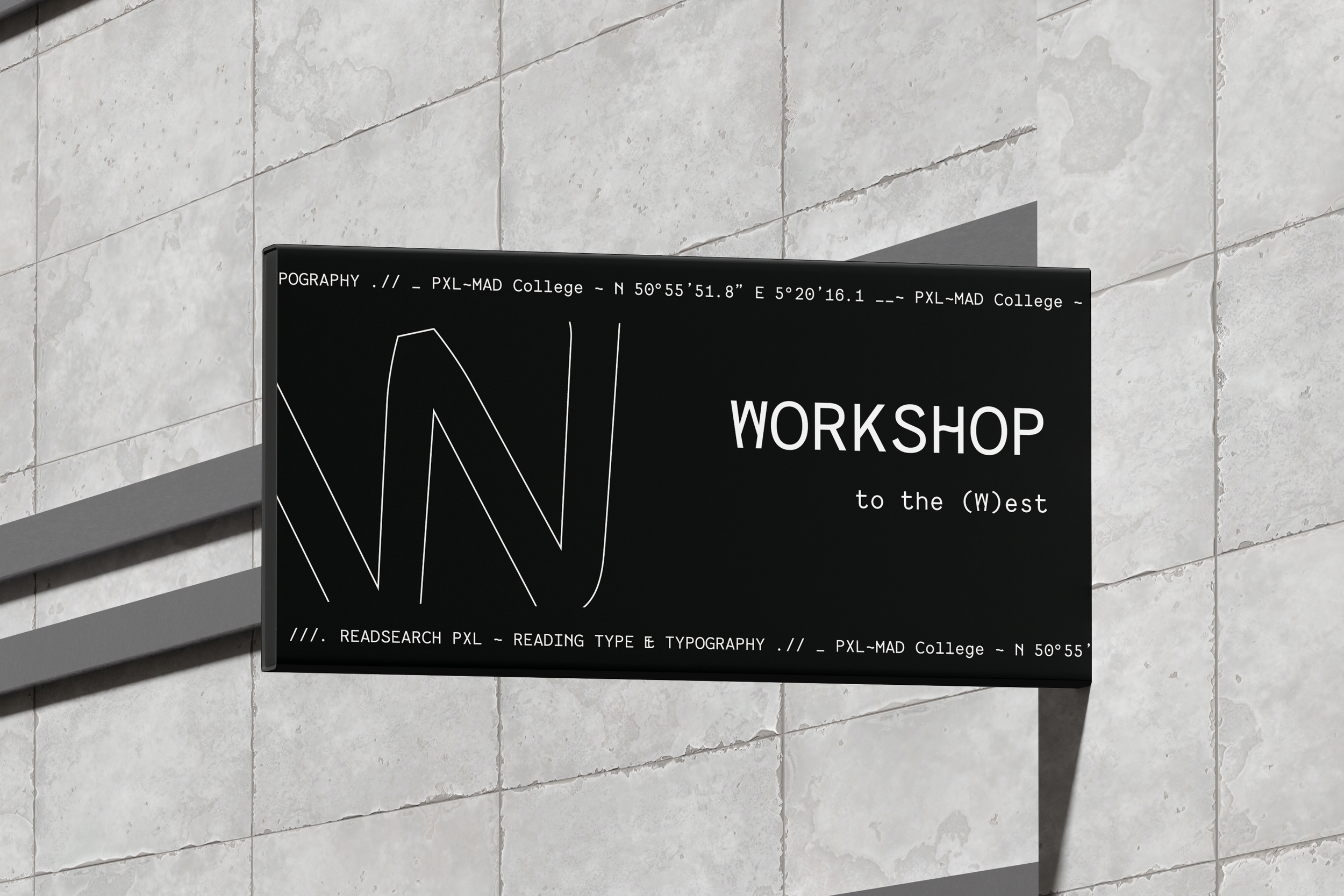
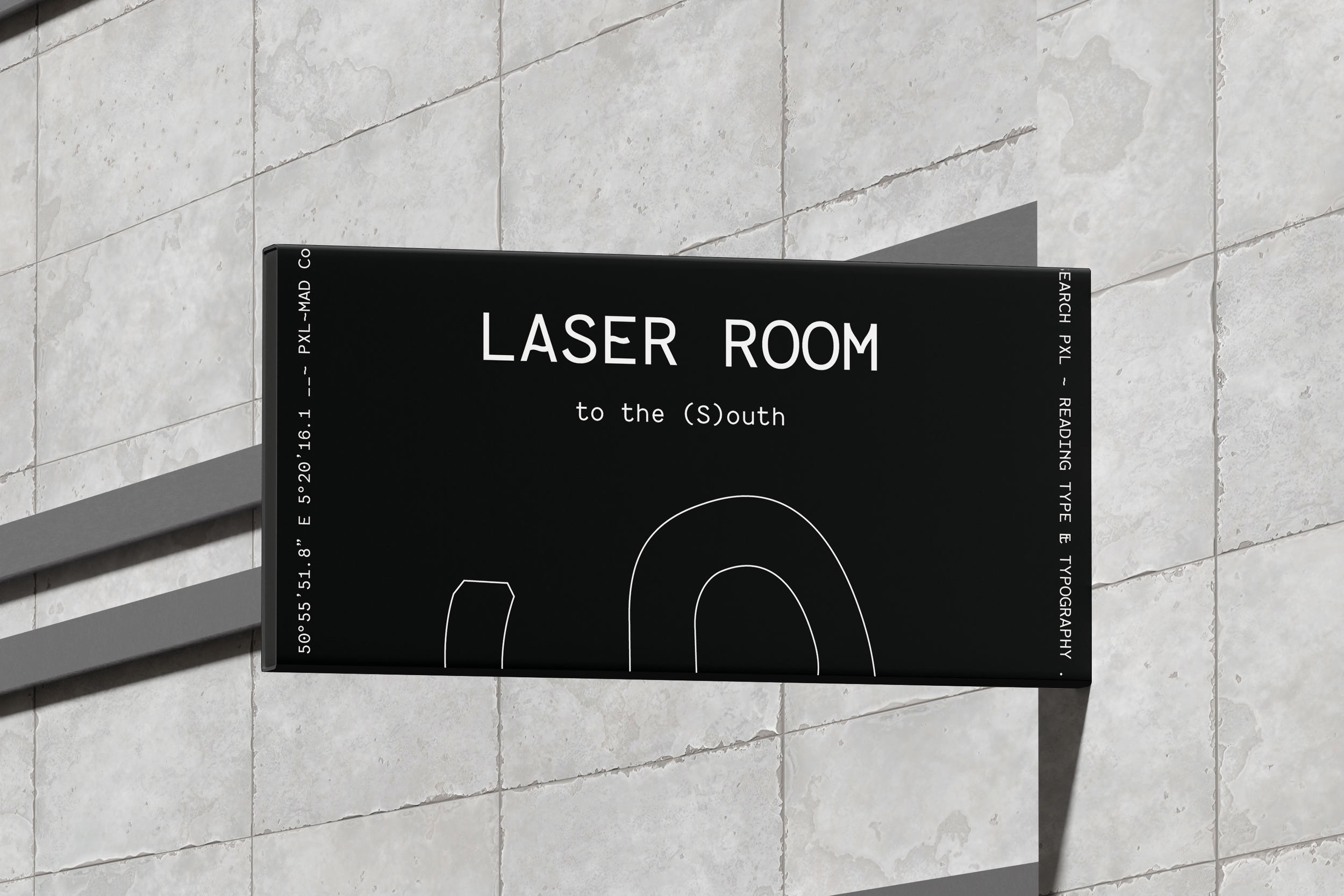
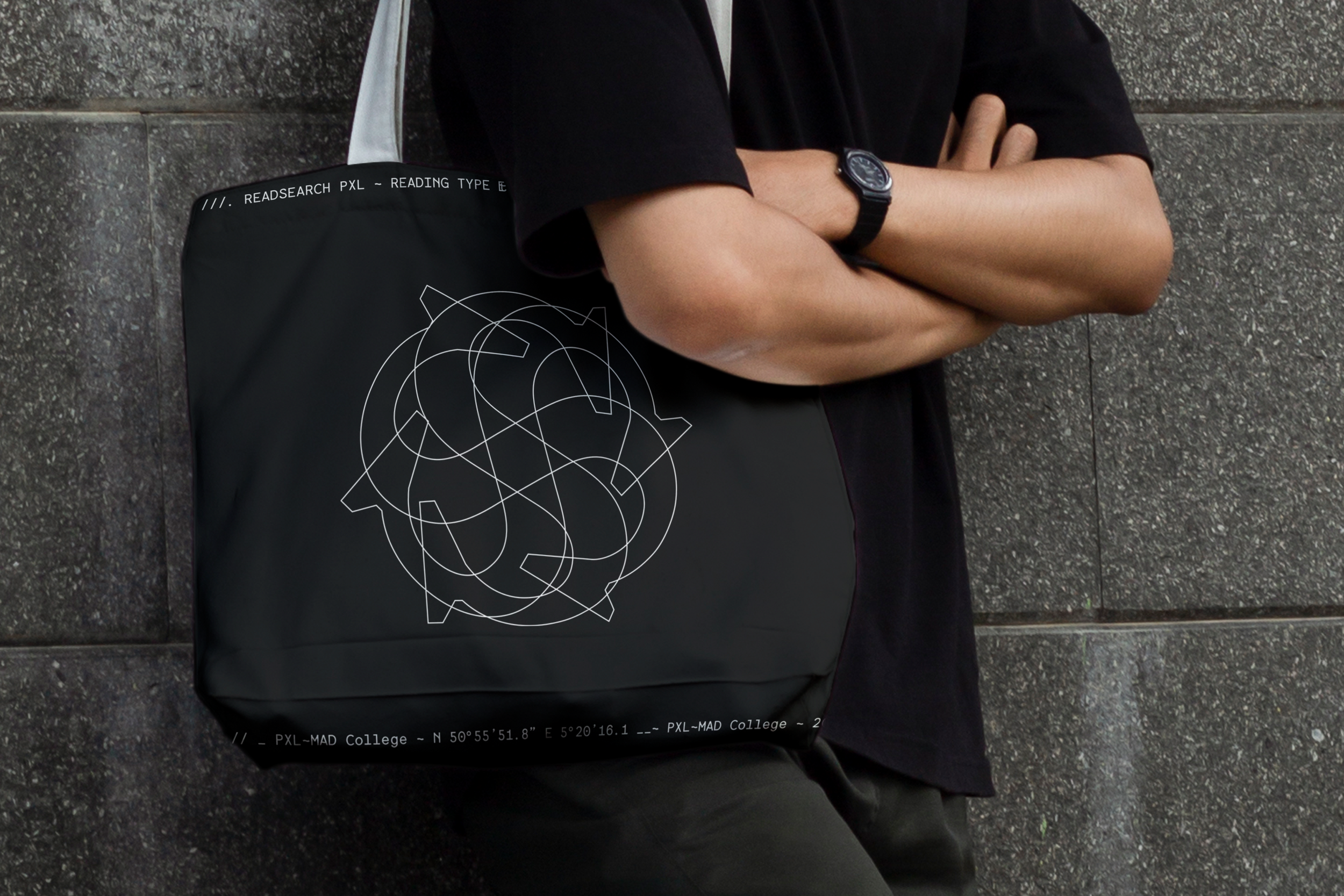
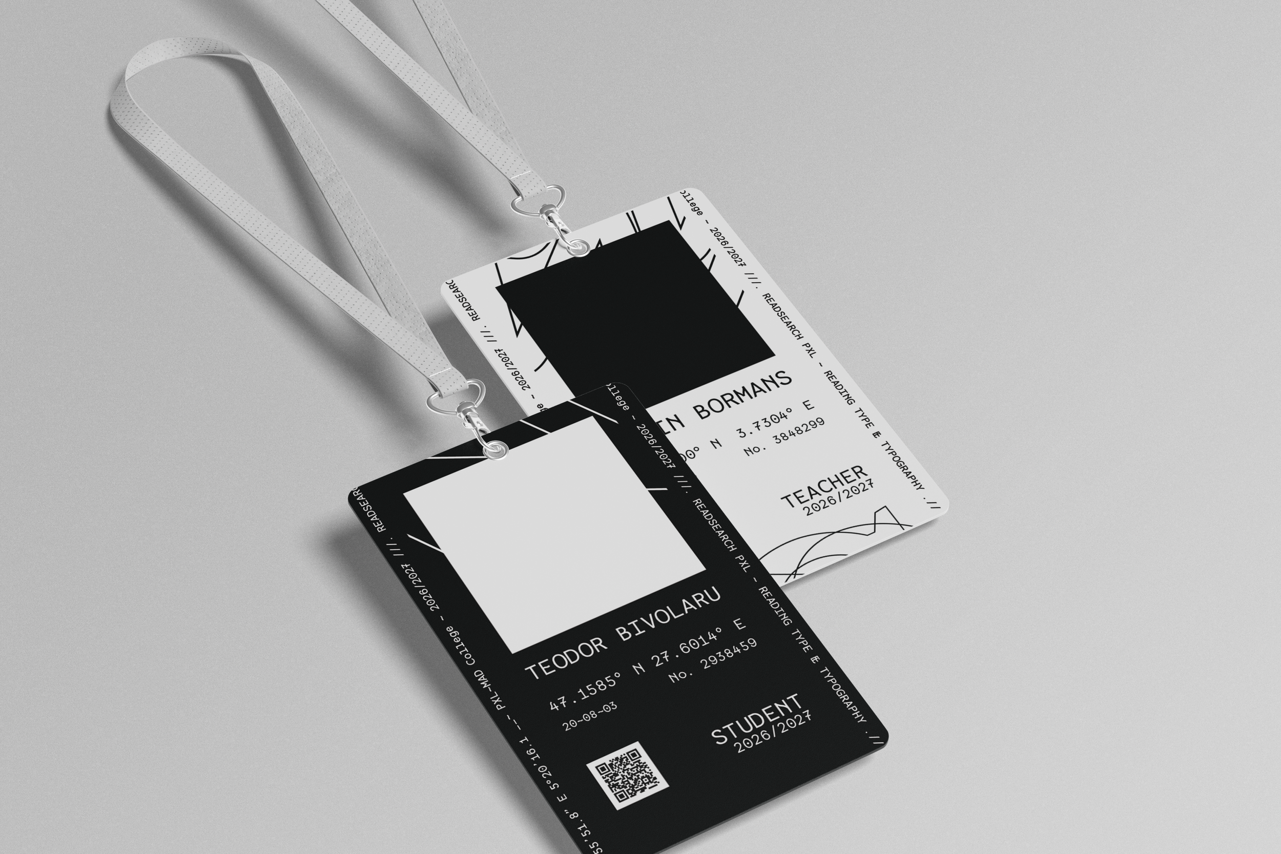
Geographic coordinates replace conventional place names, extending NSEW’s language of orientation into the information system.
NSEW - Wayfinding System
07
Wayfinding
Unites
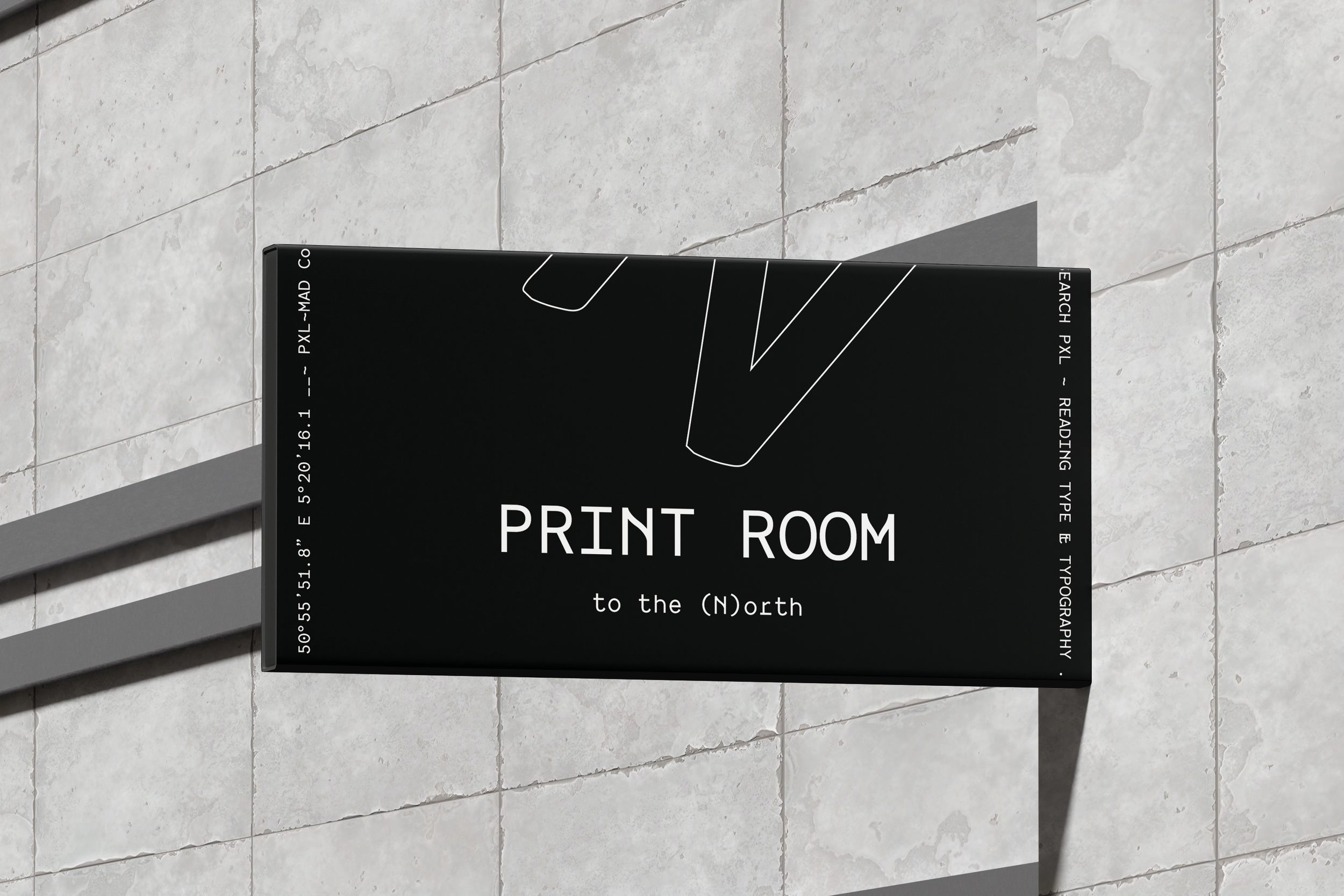
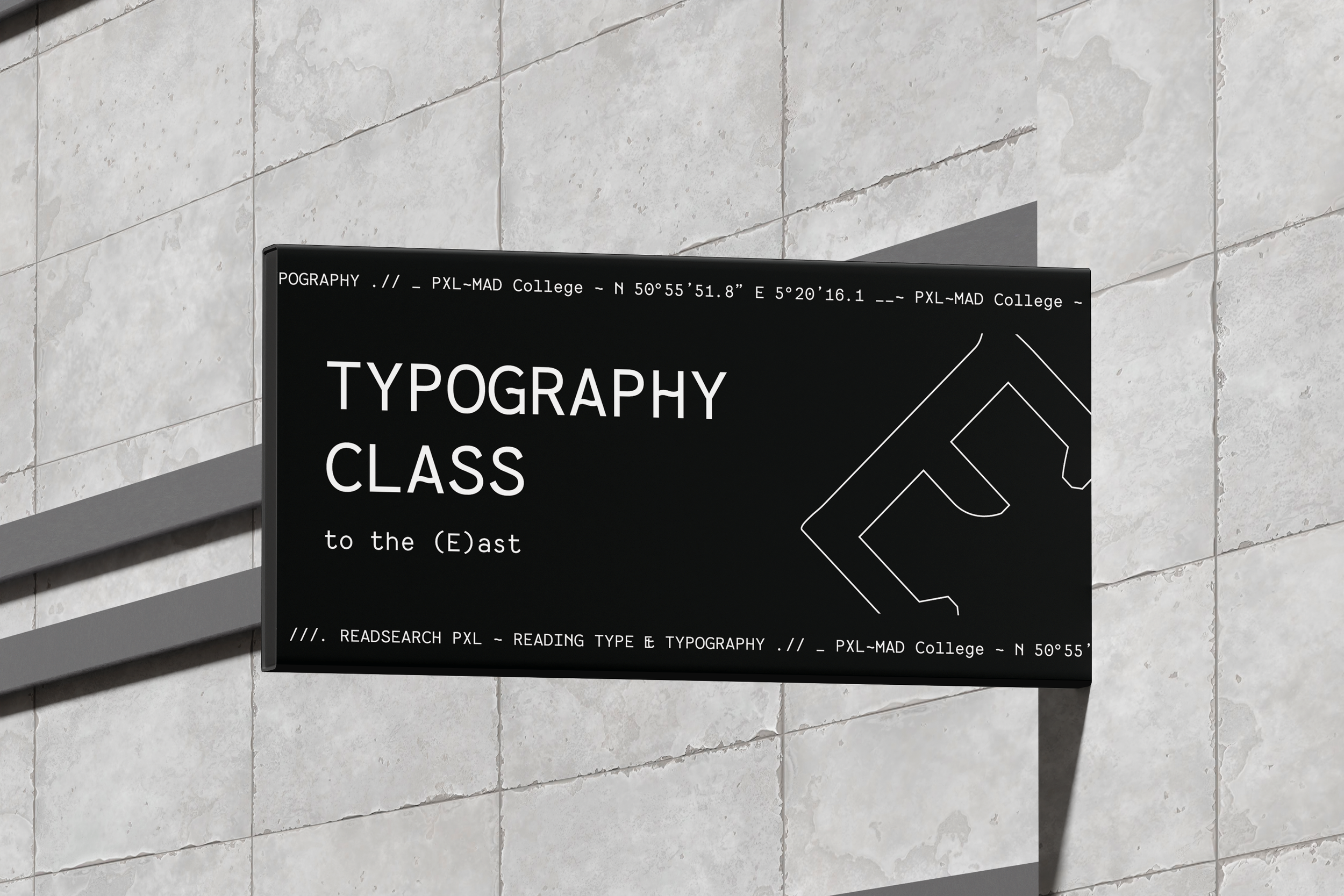
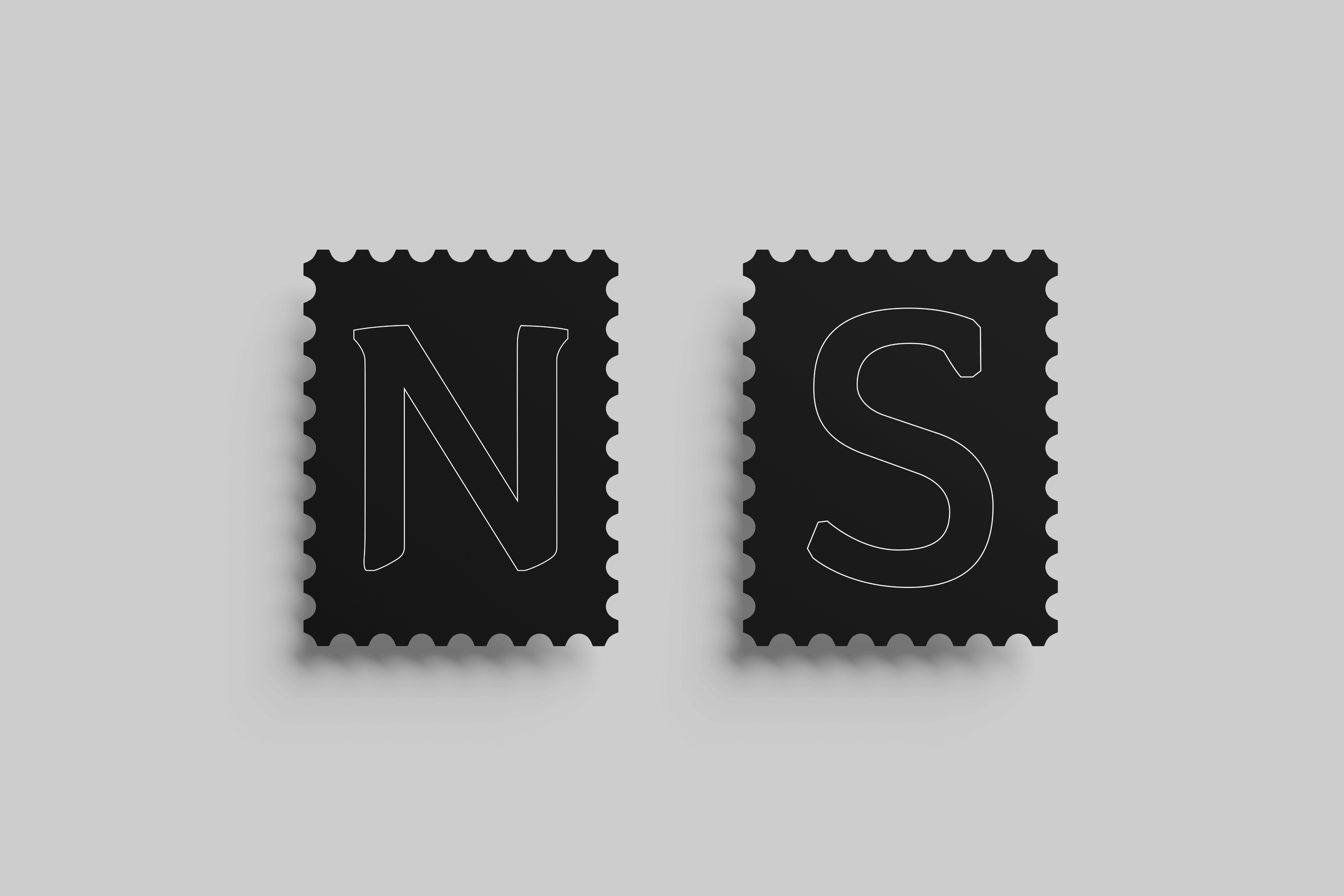
The NSEW letters can indicate direction, guiding visitors towards specific rooms and facilities through North, South, East and West.


III.NSEW
NSEW - The Cardinal Points
08
Four Letters.
Four Actions.
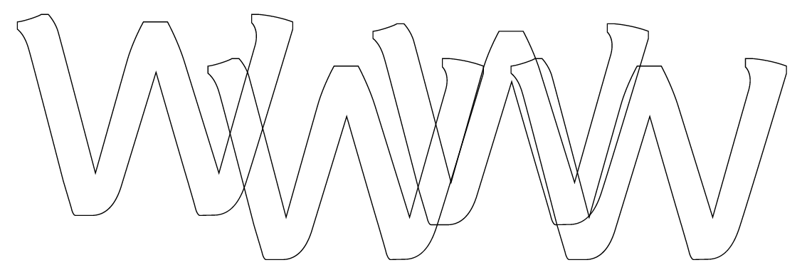
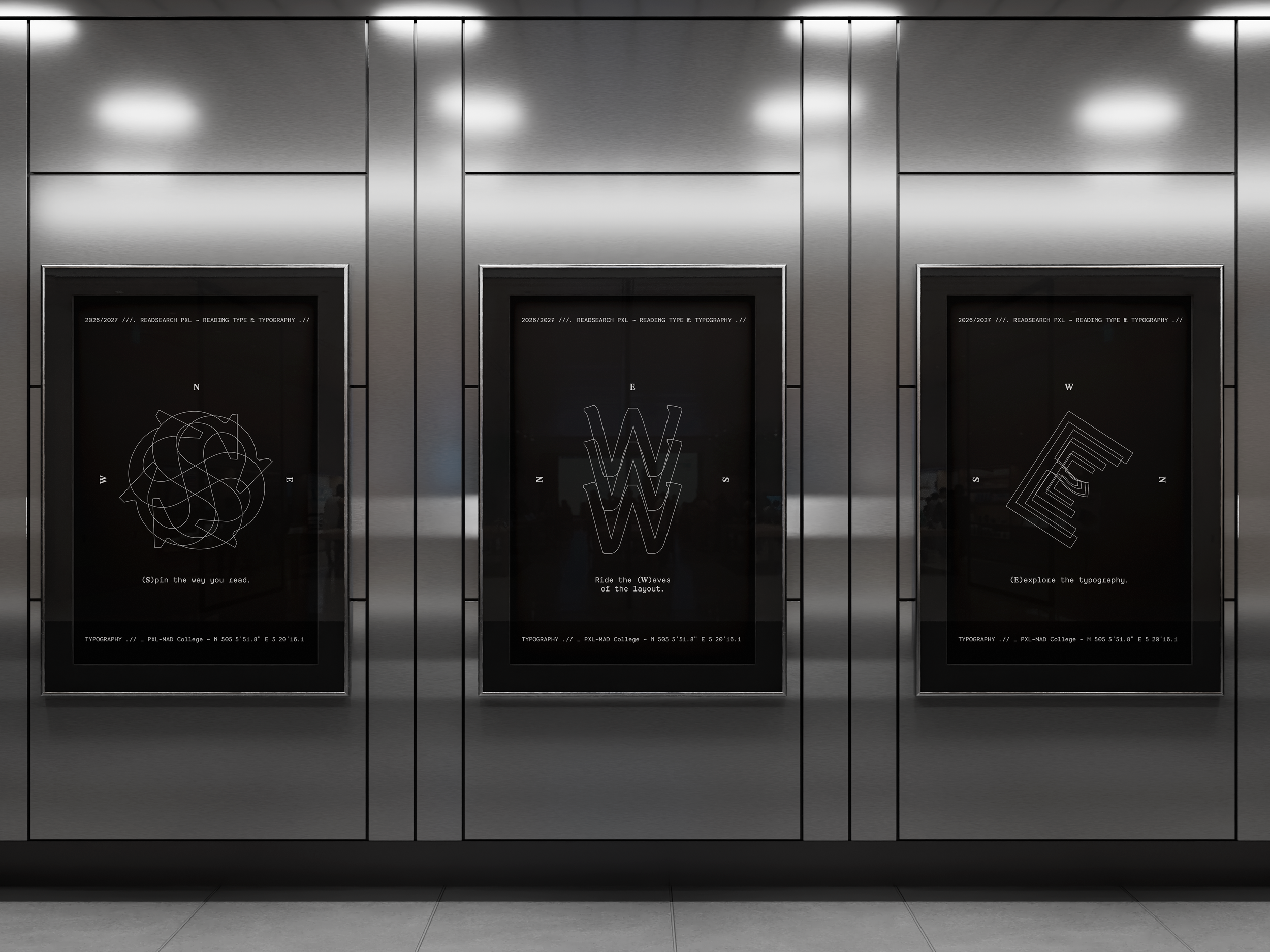
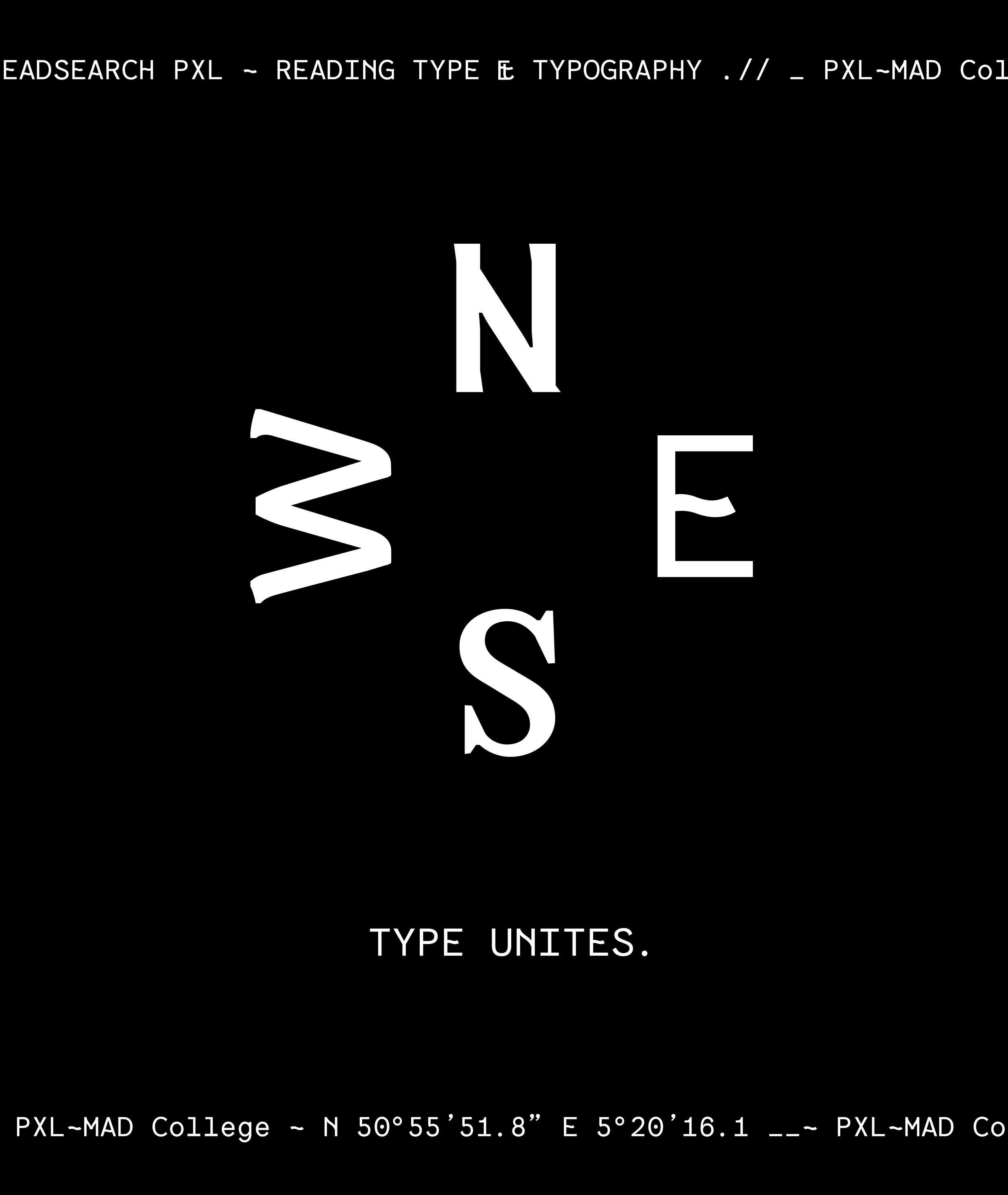
The four cardinal directions form the conceptual framework behind NSEW, connecting the international character of the programme with ideas of movement, orientation and exploration.
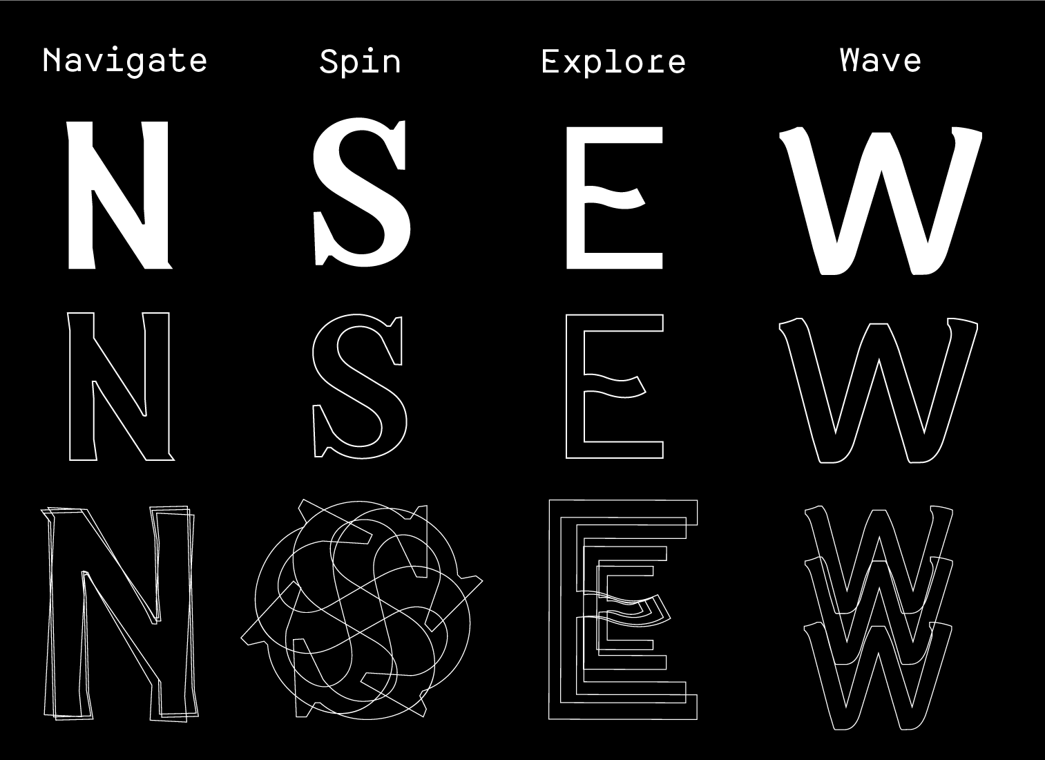
Each direction is associated with an action that informs its visual and motion-based expression:
Together, NSEW connects the physical idea of travelling from different directions with the exploratory nature of studying typography.
NSEW - Motion System
09
Typography In
Motion
Motion extends the meaning assigned to each of the four directions.
Rather than functioning as an additional decorative layer, each animation translates its corresponding action into movement.
Recurring moving text within the system reinforces this sense of direction and movement while remaining part of the identity’s established layouts.
N — Navigate
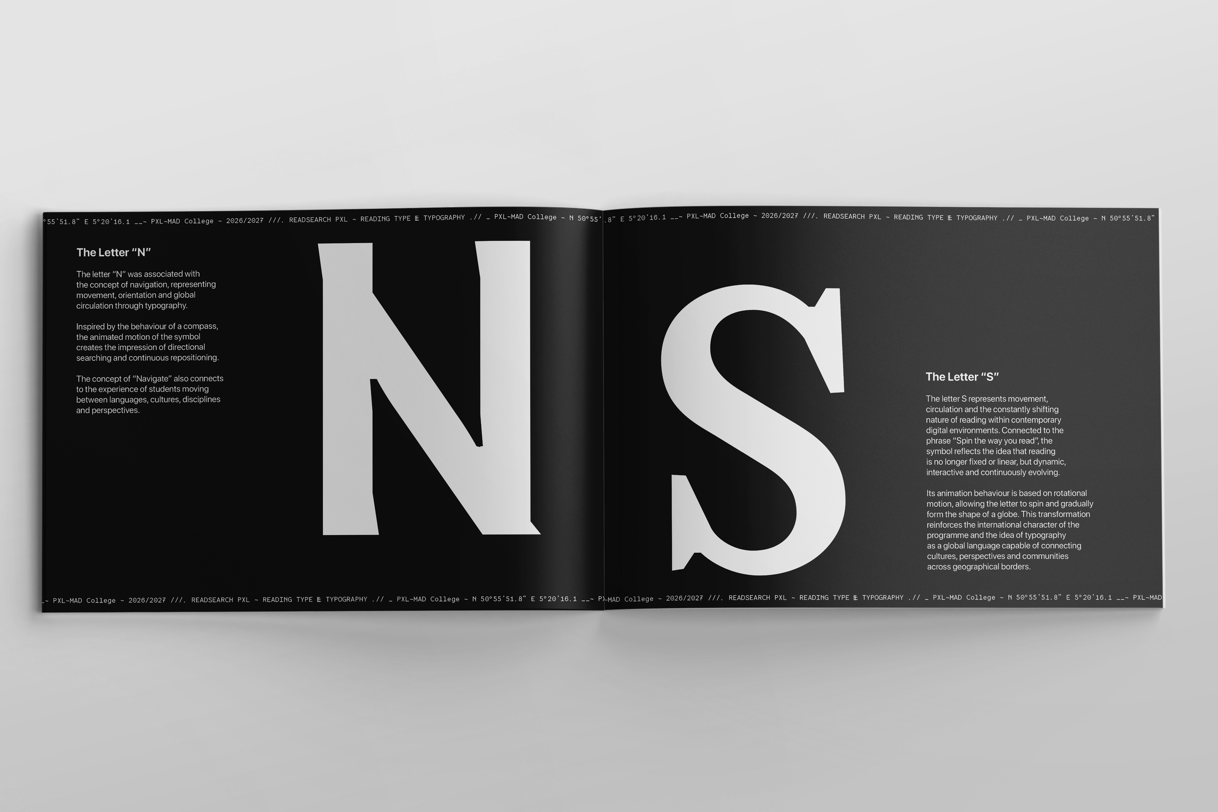
The letter behaves like a compass, using rotation to communicate orientation and direction.
S — Spin
Circular movement transforms the letter into a globe-like expression of the programme’s international character.
E — Explore
Repeated forms create a route through space, expressing exploration and movement towards new directions.
W — Waves
The letter moves through flowing rhythms inspired by waves and the journeys connecting different places.
IV.Type Unites.
NSEW - The Programme’s Motto
10
Different Directions.
One Meeting Point.
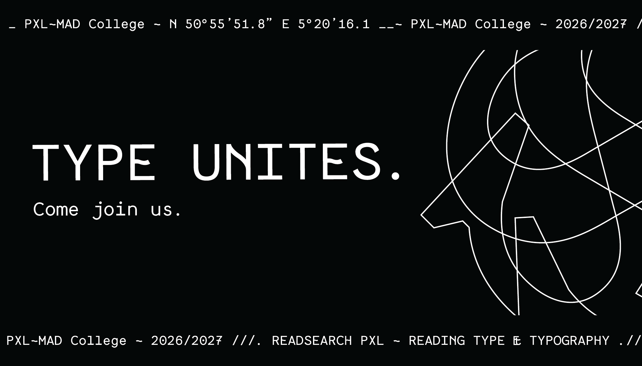
Students arrive at the programme from different countries, cultures and creative backgrounds. Typography becomes the common space through which these different perspectives meet.
Type Unites expresses this central idea: people may arrive from different directions, but their individual typographic voices become connected through the programme.
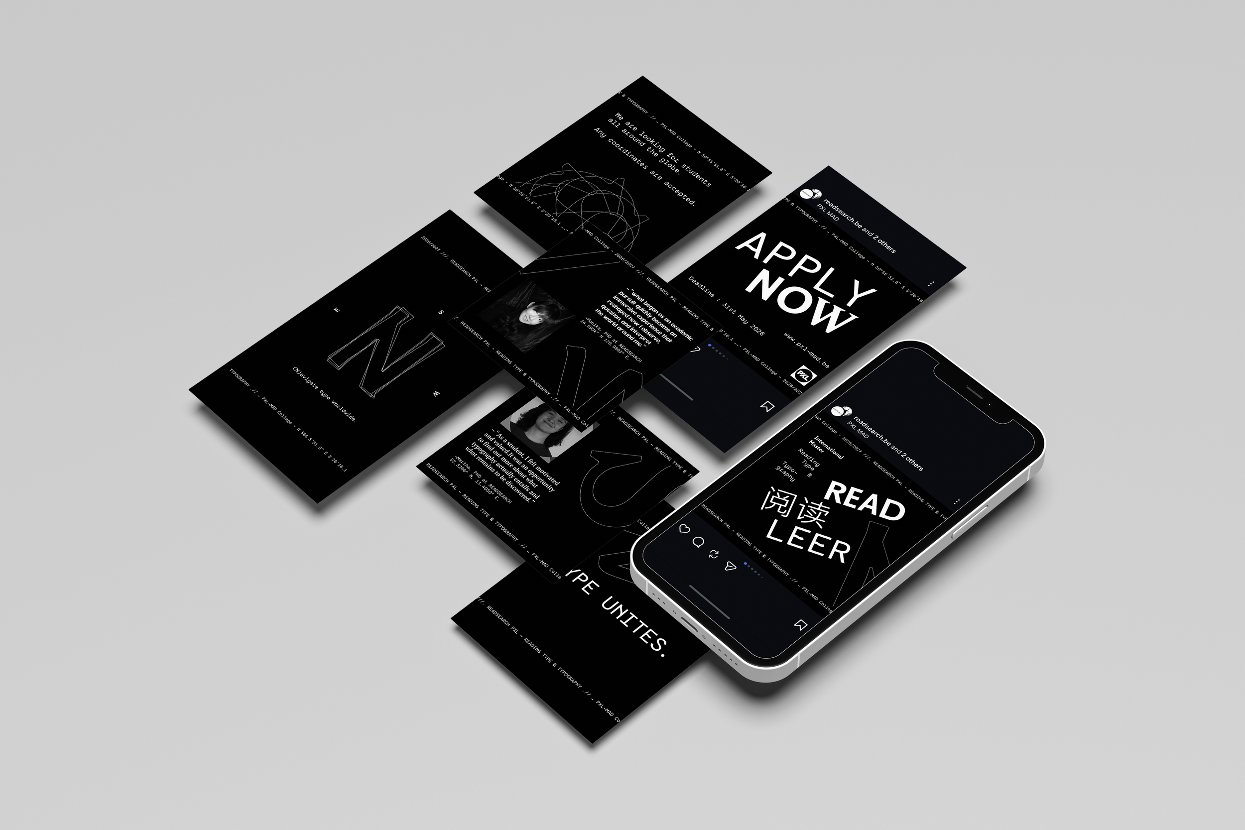
NSEW - Social Media Design
11
Social Campaign
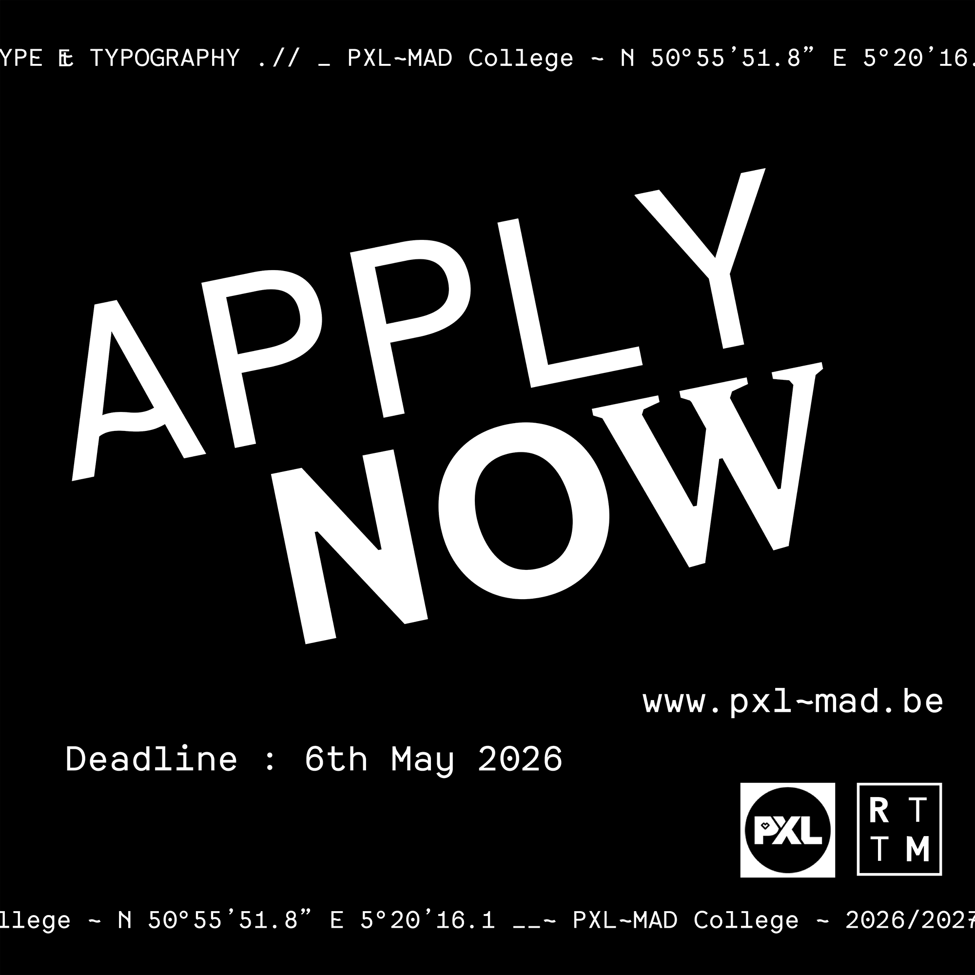
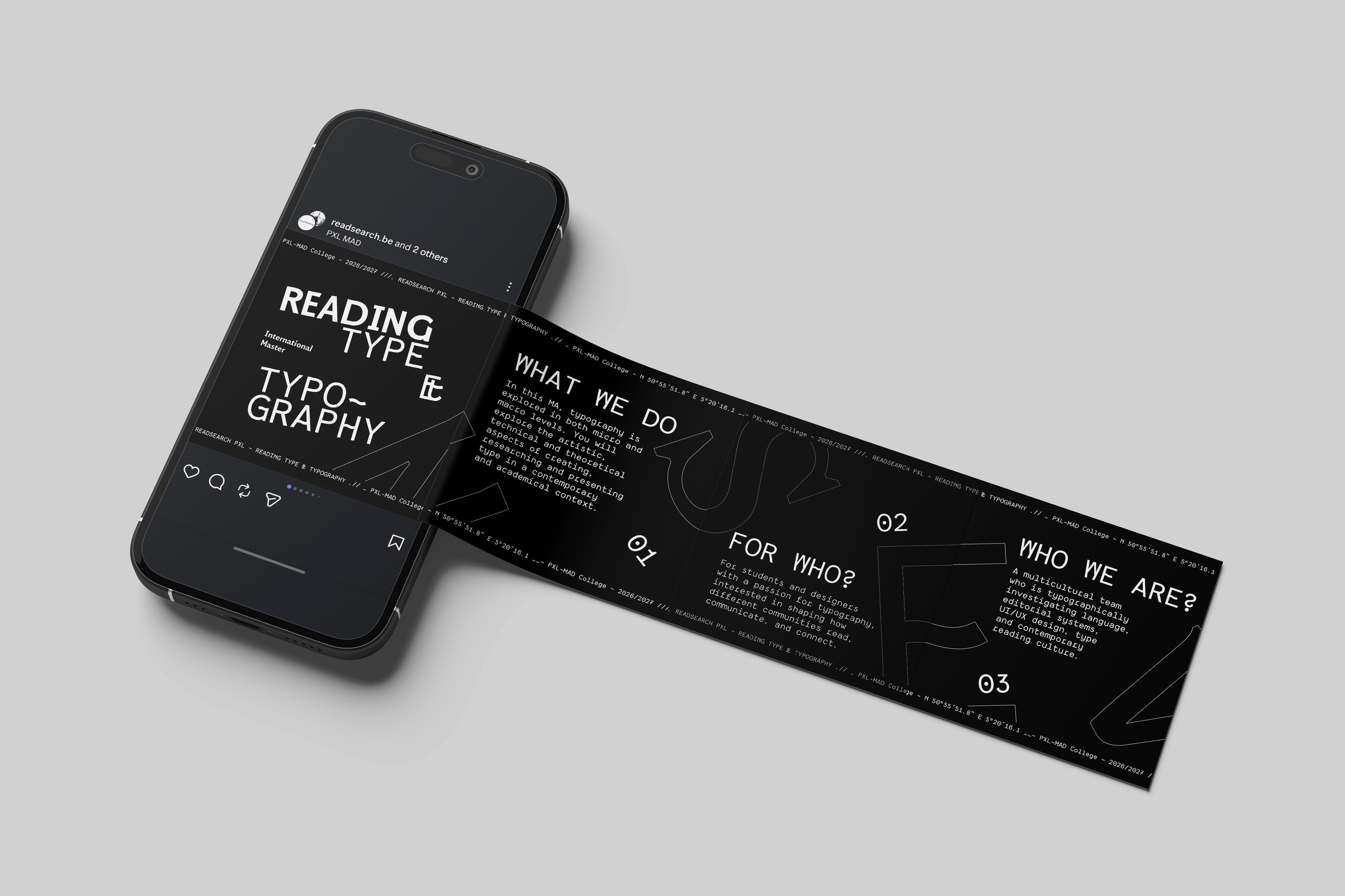
Social media acts as a primary promotional space for NSEW, combining typography, photography, information and motion to introduce the programme to prospective students.
Carousels and animated content communicate the programme, its approach and the experiences of its international community while following the same visual system established throughout the identity.
NSEW - Testimonials
12
The Voices Of
The Students
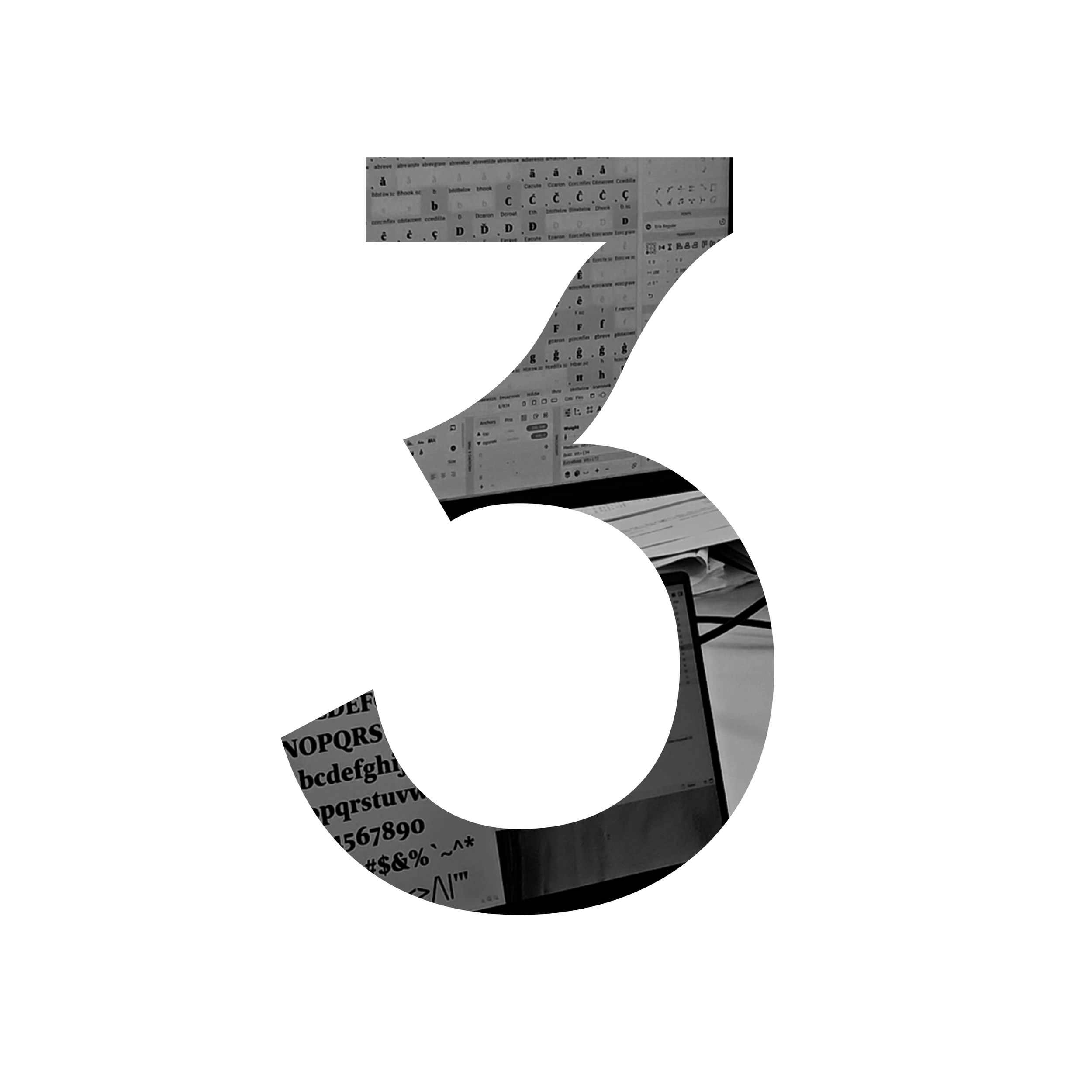
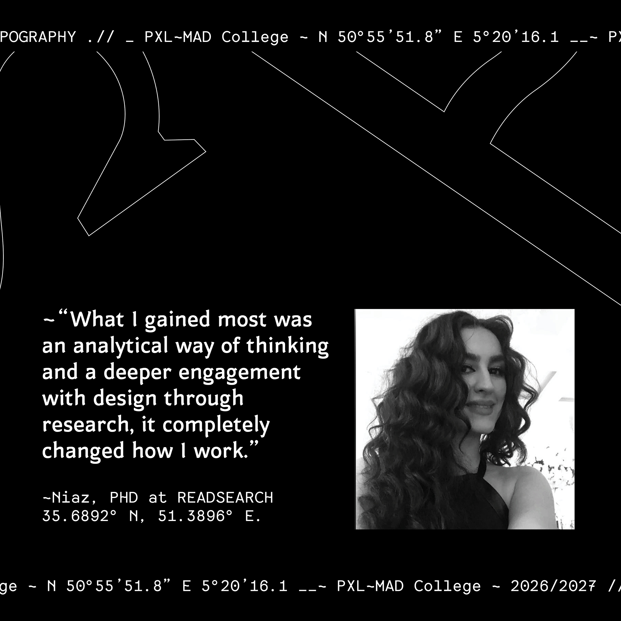
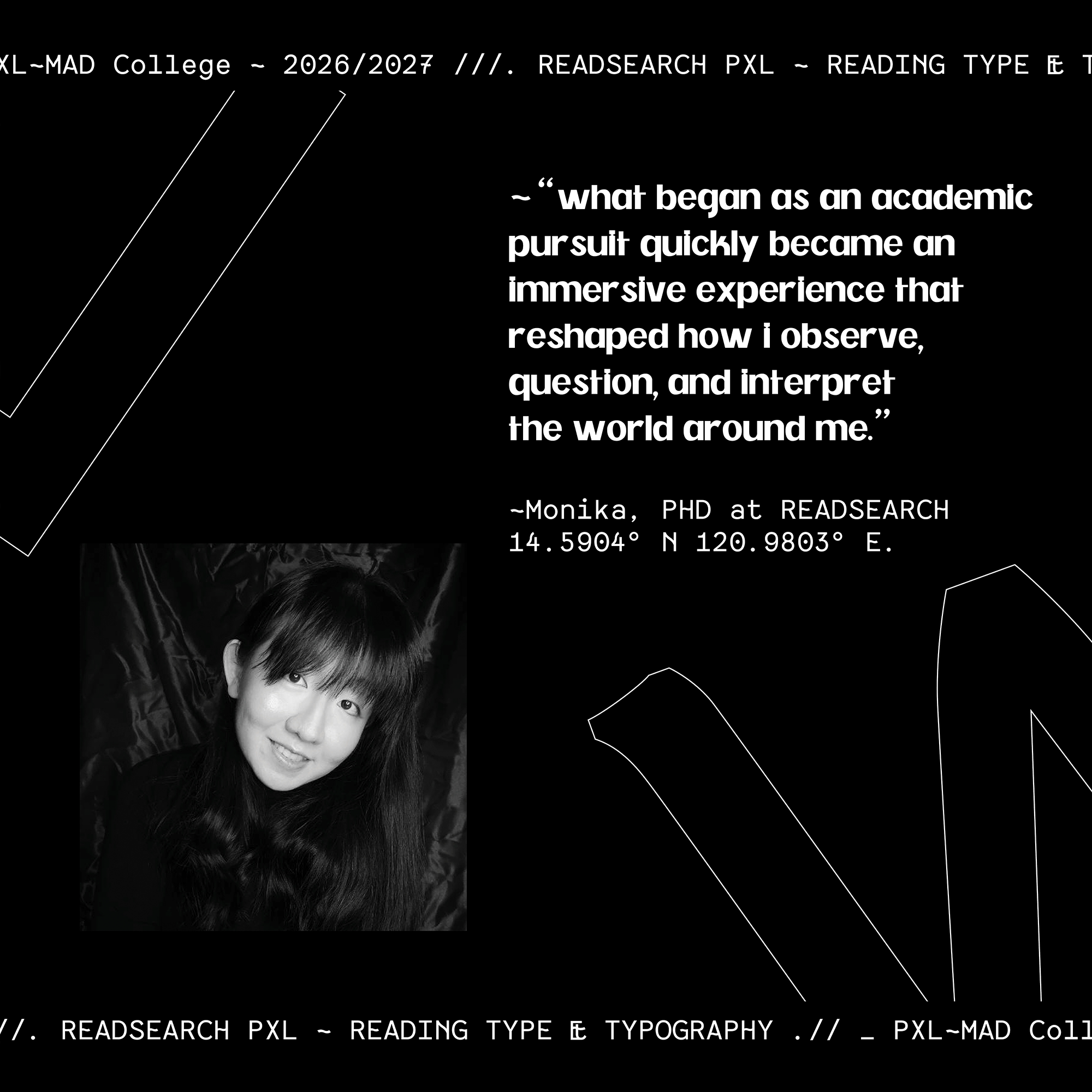
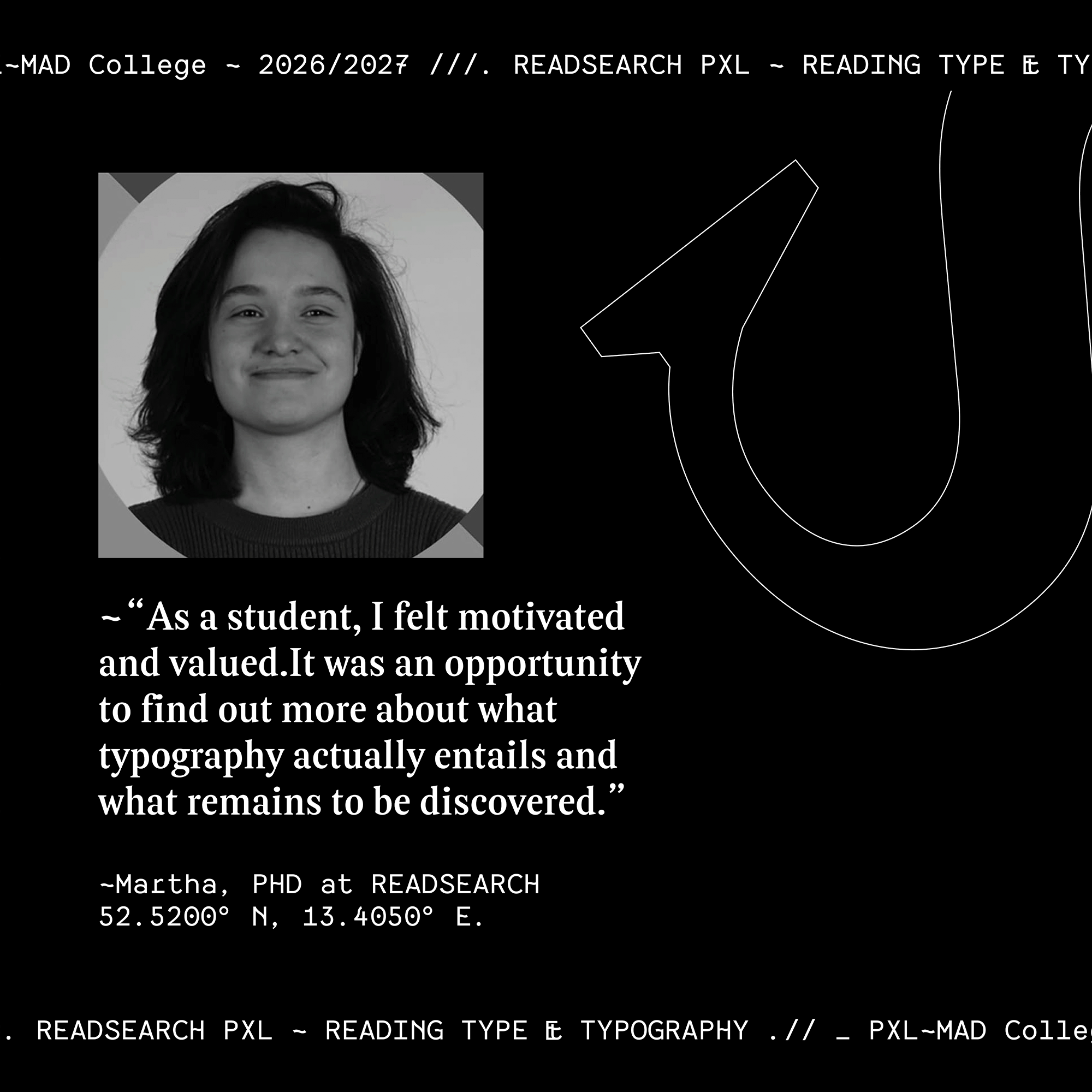
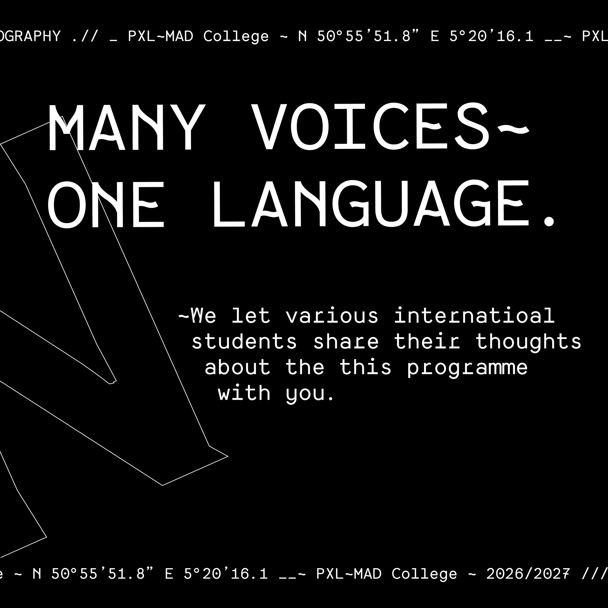
Former students are represented through both their experiences and the typefaces they created during the Master’s programme.
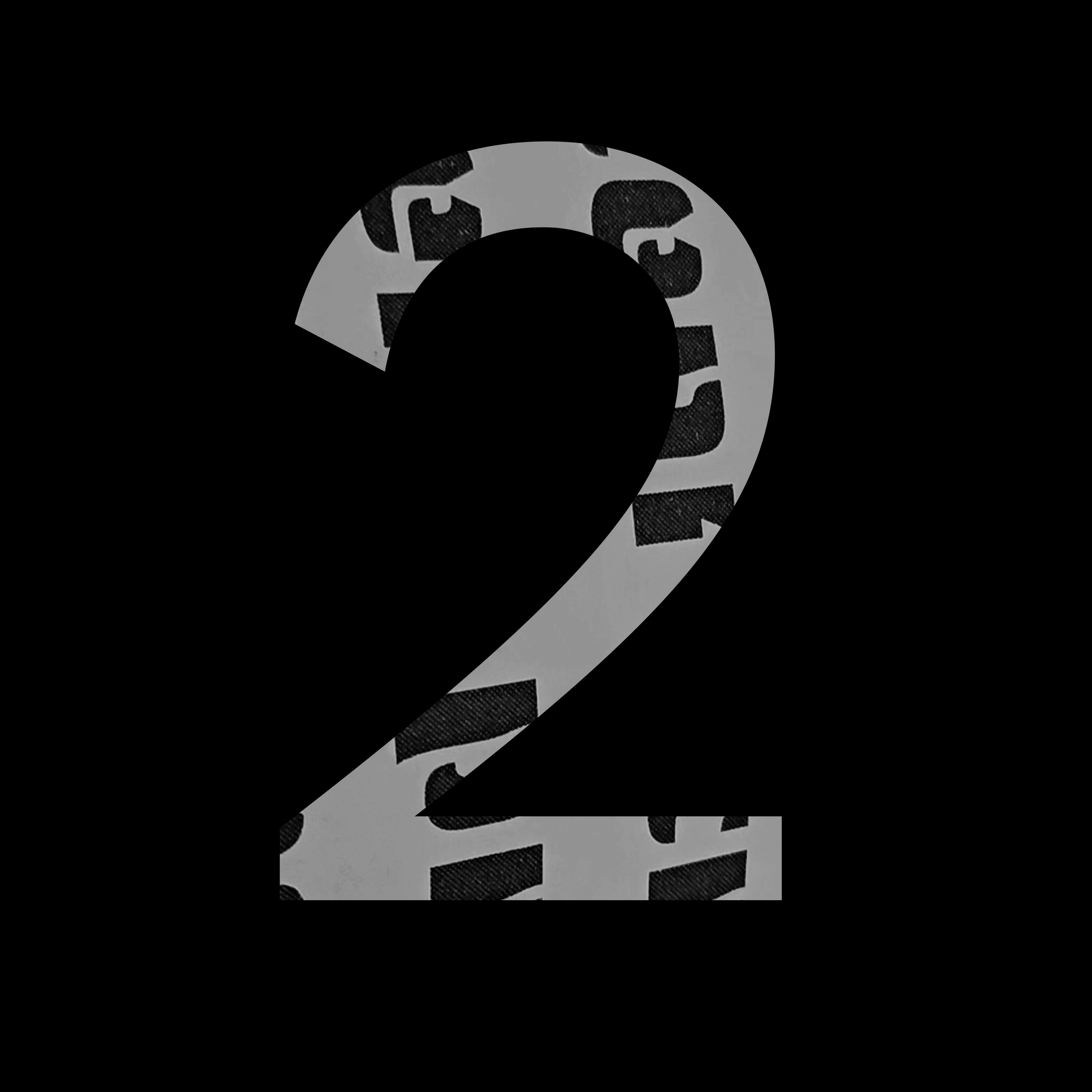
Testimonials are paired with their respective typographic work, allowing the people behind the programme and the typography produced within it to communicate together.

V. Applications
NSEW - Student’s Starter Kit
13
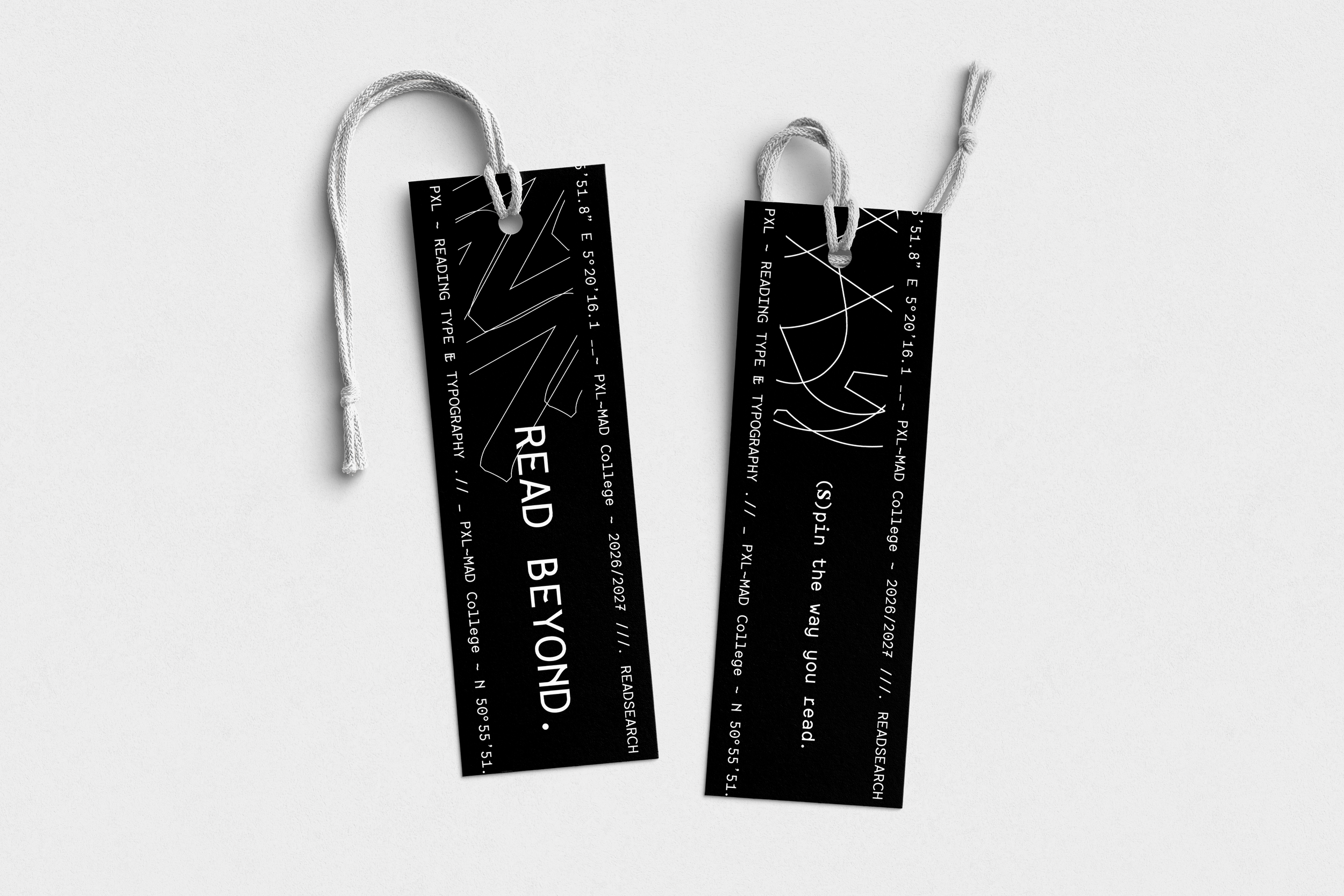
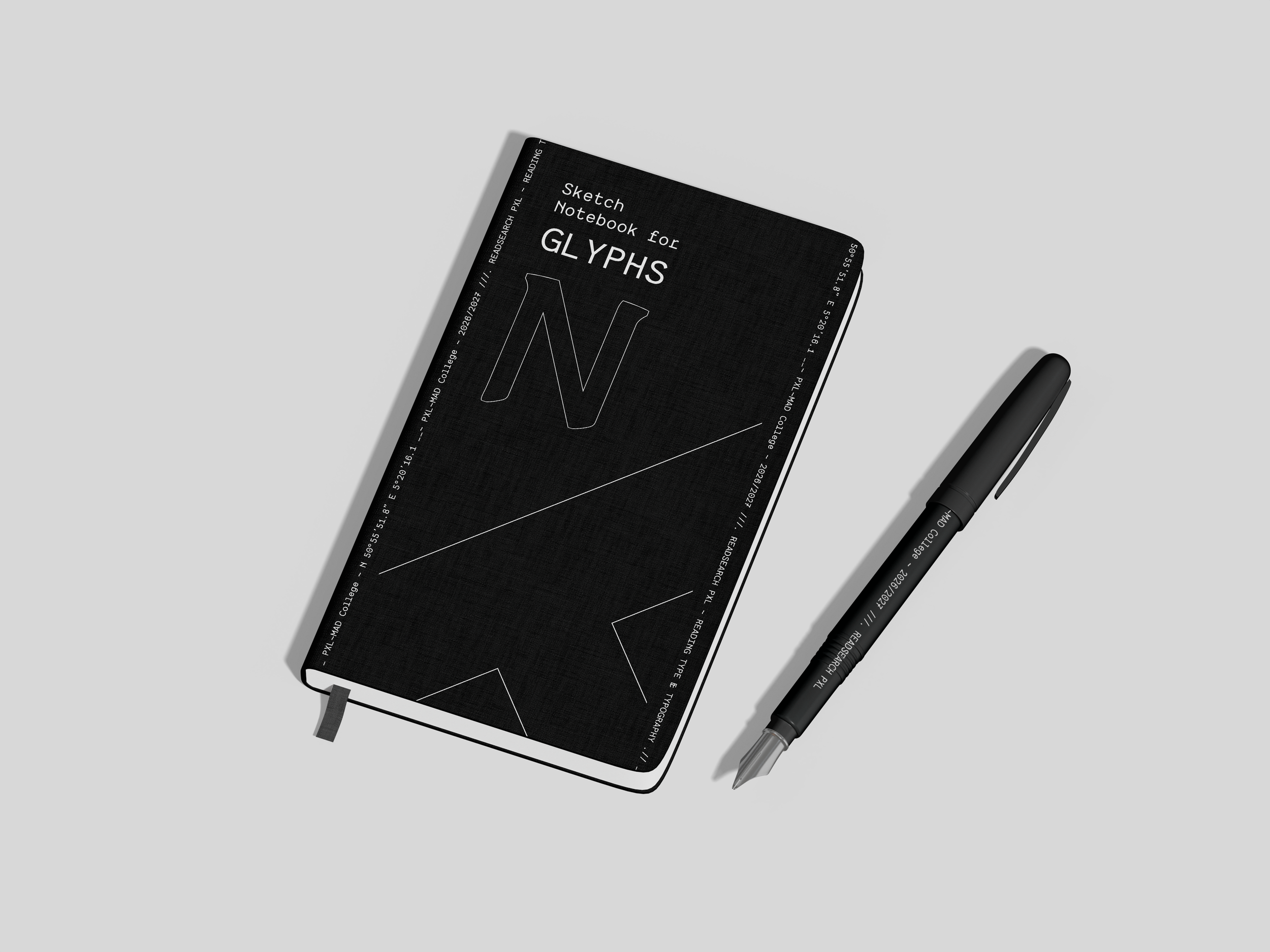
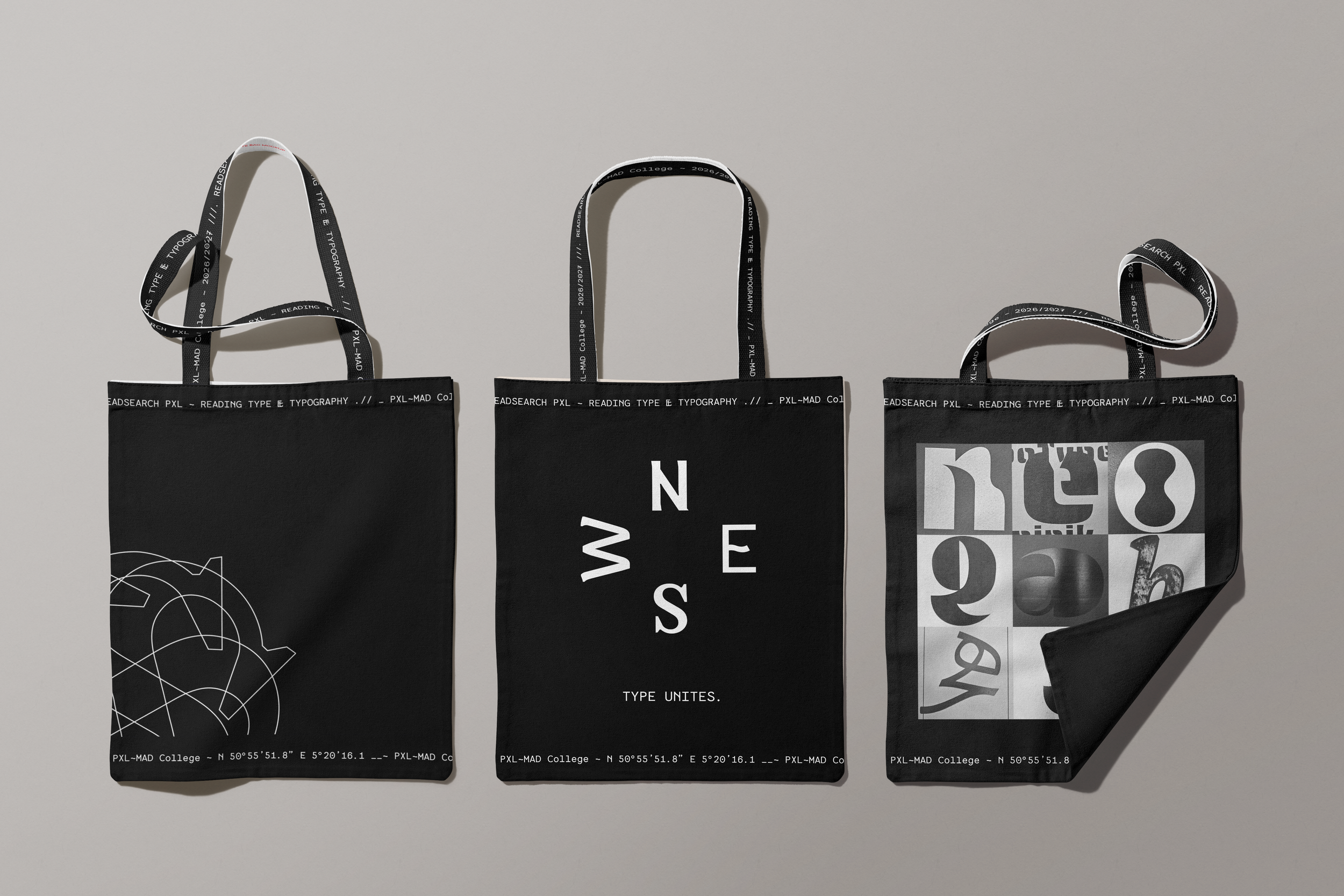
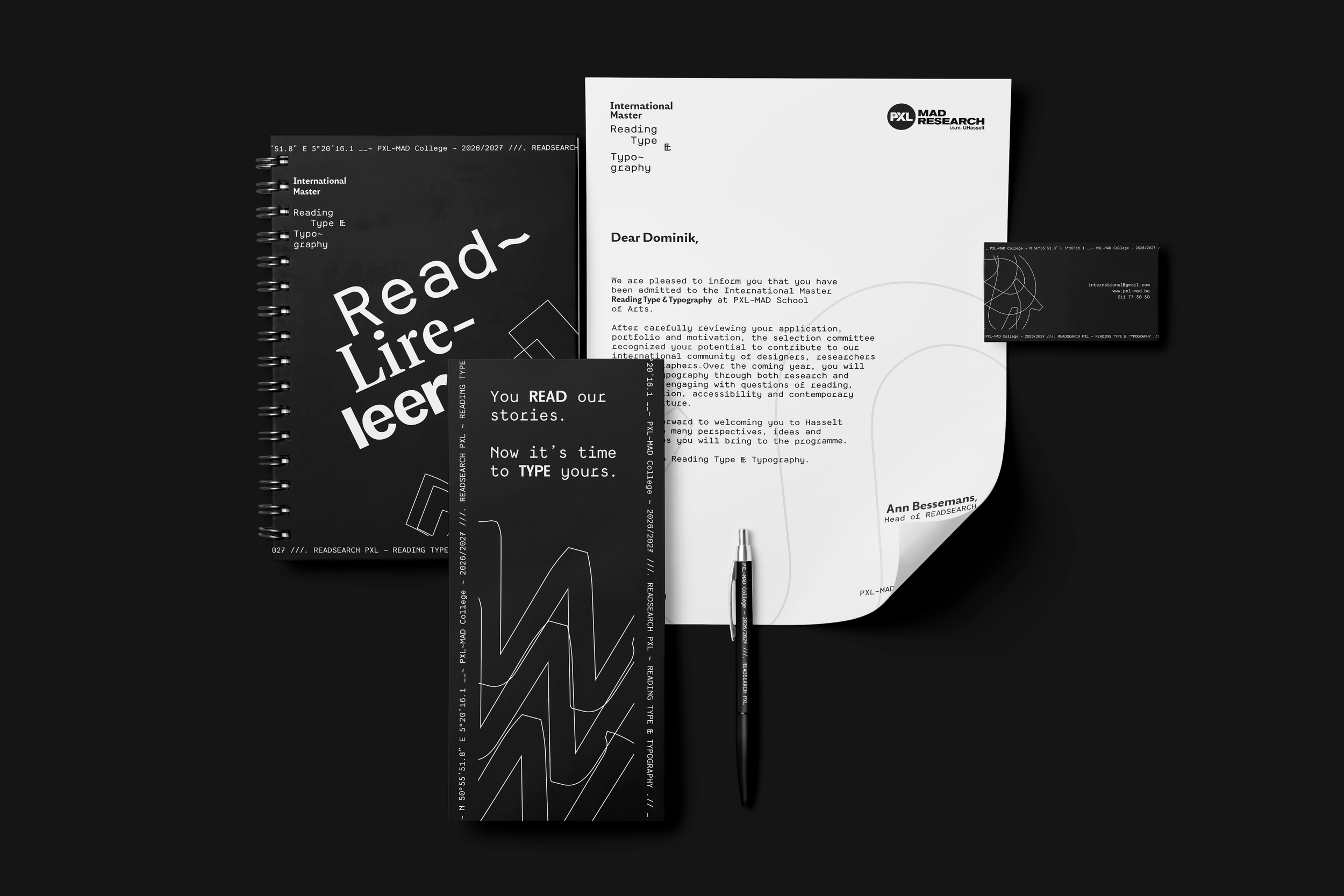
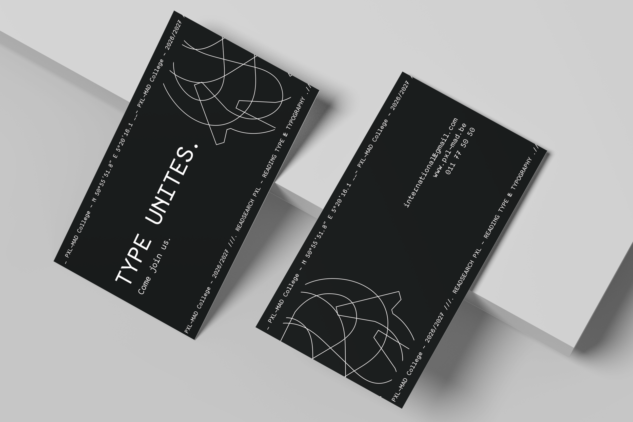
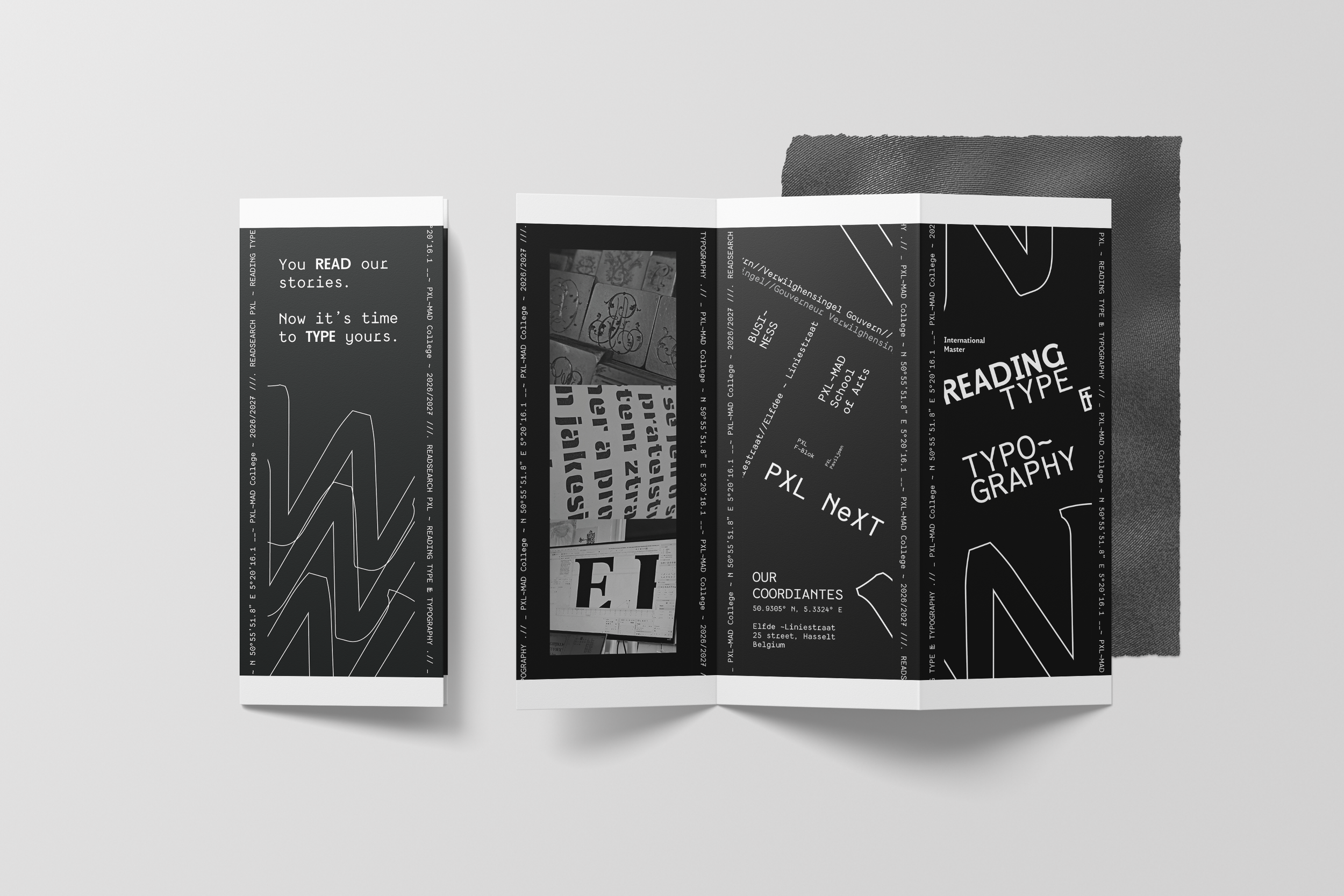
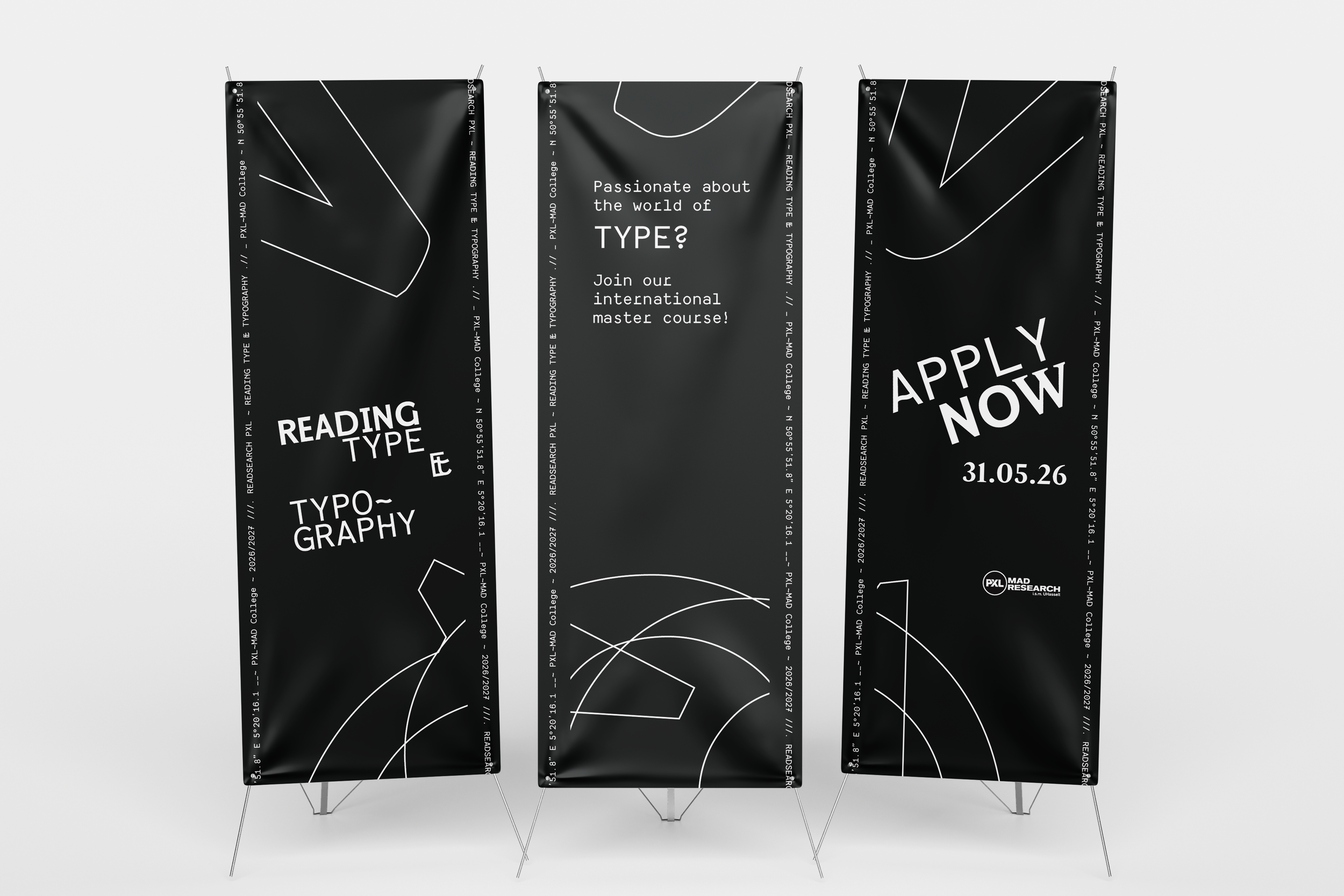
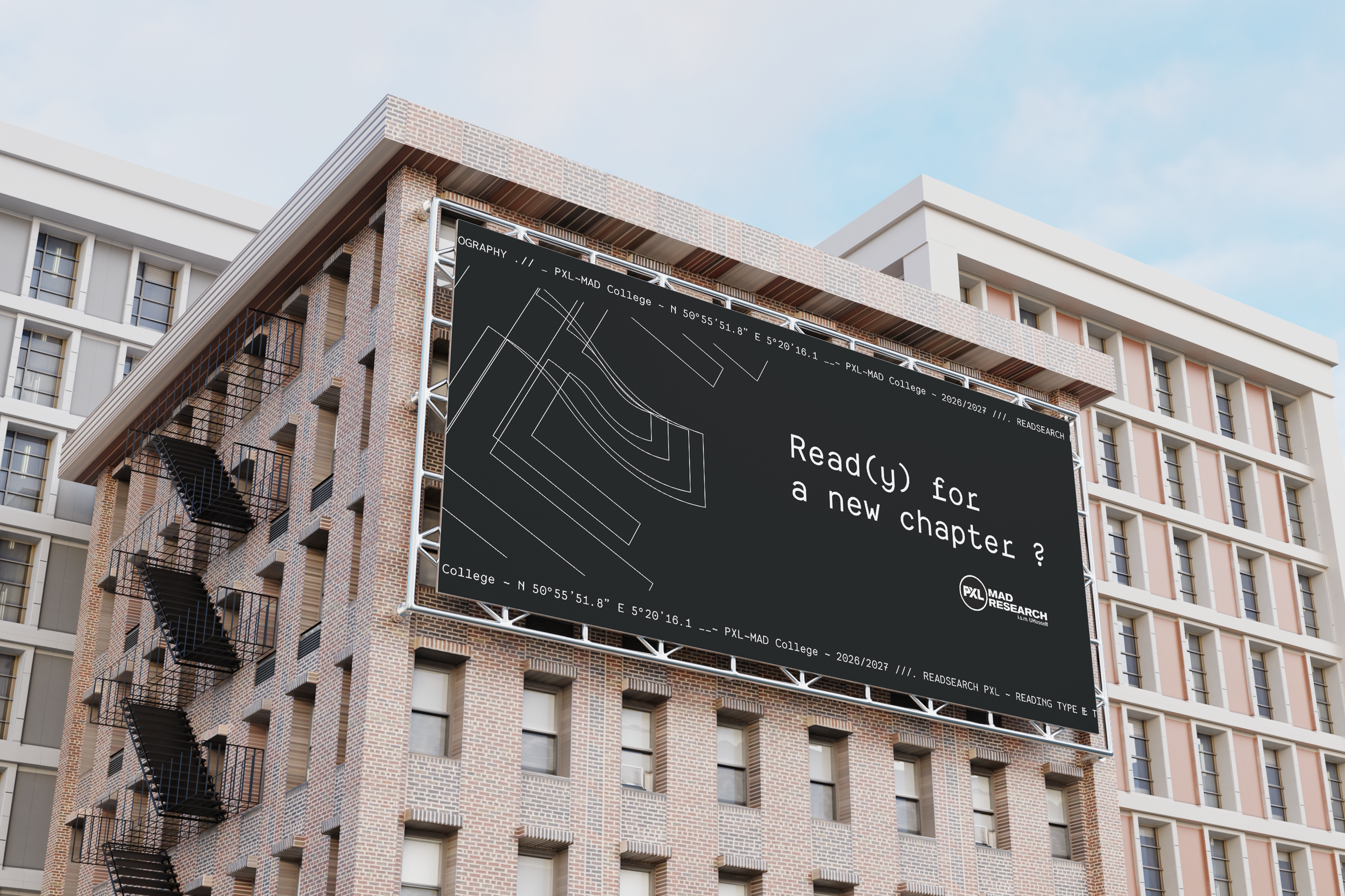
NSEW - Promotional Materials
14
Let’s get in touch and expand your brand’s visual system together.